Creating the Perfect SaaS Landing Page Isn’t Enough. Here’s How to Map Your Pages to Your Sales Funnel.
Last updated: November 7th, 2019

While we agree with the commonly accepted guidelines for crafting landing pages, there is an additional layer to setting up SaaS landing pages that seems to go under the radar.
The best practices for landing page structure (inspired by Oli Gardner’s “Attention Ratio”) still stand:
- The ratio of links on a landing page to the conversion goals of your campaign should be 1:1
- The call to action should be above the fold
- Content should be skimmable
- Social proof like customer testimonials are still relevant and effective
But what often goes missing from this conversation (and from the landing pages of SaaS companies we speak with) is how to tailor your landing pages to your target user’s stage in the buyer’s journey.
By failing to map out your landing page flow from click through to conversion, and based on your target user’s level of awareness about what you offer, you miss an opportunity to increase the likelihood your messaging and content will compel that user to opt in.
In this post we’ll discuss our approach to mapping landing pages to the sales funnel, and teach you the process we use to do it in practice with our clients.
But before we get there, we want to talk briefly about the mistakes we still see SaaS companies making, despite all the great advice out there. So let’s kick things off by looking at where we see SaaS marketers go wrong with their landing pages.
Where Things Fall Down with SaaS Landing Pages
From time to time we still encounter prospects who will ask, “Can’t we just use our home page as a landing page?” Or they might say, “Why can’t we make it so our site is so well structured that we don’t need landing pages?”
We do recommend setting up your home page around one or two priority goals (usually to collect an email address), but your home page and most of the pages on your website need navigation—top bar and footer menus.
And pages with menus and navigation give users too many options to choose from, distracting them from the one action you really want them to take, which is why you still need to use landing pages that are focused on a single action. This is mistake #1.
Other areas we see things fall down include:
- Mistake #2: Trying to target multiple personas on one page. We recommend different landing pages for different personas or stakeholders involved in the sale of your product.
- Mistake #3: Requesting too much information to become an SQL. We believe every phone call is a learning opportunity, and that unless your sales team is already underwater with calls, requesting less information through your signup forms will lead to more conversations and ultimately more customers.
- Mistake #4: Mismanaging the expectation of what happens after a form is filled out. If your prospect is being led to believe they’ll be able to talk to you today, and you leave them with a thank you page that reads, “Thanks, we’ll be in touch”—you’re going to lose people.
Getting each of these areas right is a good place to start improving your conversion rates. Now let’s look at our thought process for mapping landing pages to the funnel.
Take Your SaaS Landing Pages to the Next Level by Mapping Them to the Stages of Your Sales Funnel
Most people think about the funnel in terms of top, middle, and bottom—but these terms are subjective. Instead, we think about users in the different stages of the funnel as being “problem unaware”, “problem aware”, or “solution aware”.
Users are either aware of the problem, or they’re not. They’re either aware of solutions, or they’re not. We find binary terms like these are less ambiguous, and they’re more useful for understanding the mindset of the user.
In our approach to mapping landing pages to the funnel, we use two landing page flows to cover these three stages of the buyer’s journey:
- Landing Page Flow #1: For “Problem Unaware” and “Problem Aware” Users
- Landing Page Flow #2: For “Solution Aware” Users
When it comes to targeting with digital marketing campaigns, it’s often difficult to decipher between when you’re reaching users in the “Problem Unaware” camp vs. users in the “Problem Aware” camp.
We find that as long as you are clearly targeting one persona (not trying to appeal to multiple different stakeholders at once), the same landing page flow can be made to appeal to and convert with users who are in either of these first two stages of the buyer’s journey.
Let’s look at the first flow.
Landing Page Flow #1: For “Problem Unaware” and “Problem Aware” Users

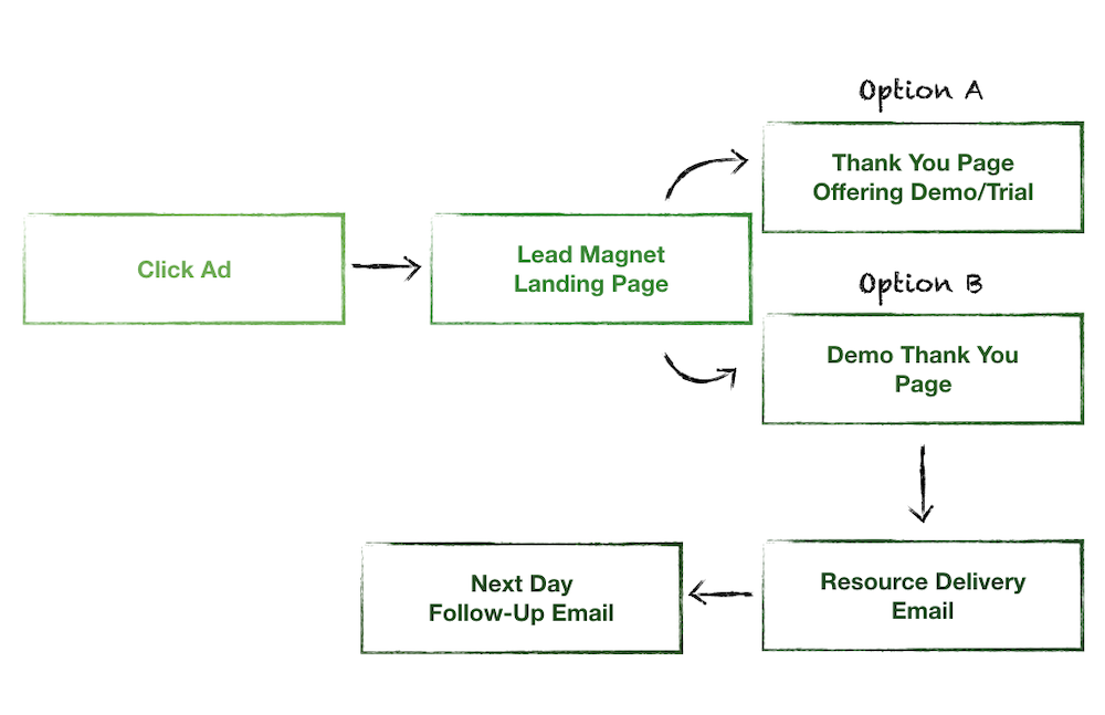
First off, look at all of the different elements involved in the click-to-conversion journey.
An advantage of mapping it out this way is that you can see all the different areas to test, iterate, diagnose problems, and make improvements along your conversion path.
You can schedule a Free SaaS Scale Session with our team to learn more about how you can improve your landing pages and increase your conversion rates.
Now let’s break this landing page flow down, starting with the lead magnet landing page.
Lead Magnet Landing Page
For both “Problem Unaware” and “Problem Aware” users, our goal is to guide these potential customers to become “Solution Aware.”
The way we do this is to offer them a lead magnet (a downloadable cheat sheet, calculator, case study, webinar, etc.) rather than a trial or demo, because it’s a softer way to build trust with users and make a tasteful first impression. We want to help educate them about the problem(s) they’re experiencing, or help to affirm for them that they aren’t alone.
For “Problem Unaware” folks, you help them get to that “Aha!” moment—nodding their heads, “Yes! This actually is a problem for me!”
For users in the “Problem Aware” camp, your lead magnet should help them reinforce that, “Yes, of course, I’ve been frustrated by this problem for a while.”
And then, on the next step of their journey, we want to expose them to our solution to help guide them into the “Solution Aware” phase.
Thank You Page Offering a Demo/Trial vs. Demo Thank You Page
In our experience, companies will put all of this effort into their ads and landing pages, and then put 1/10th of that effort into their ‘Thank You’ pages. Most thank you pages fall into one of three buckets:
- Thank you! We’ve received your submission (or some other default copy like this).
- A page offering a single link to download a PDF or other type of resource (that offers nothing else).
- A page that offers no helpful prompts or dialogue.
“We see thank you pages as the most underrated conversion opportunity on any website.”
There are two ways we present our solution in this first landing page flow.
Option A is to bring users who download the lead magnet to a thank you page that has a form where they can sign up to schedule a demo with our client’s team, or sign up for a free trial (depending on the complexity of our client’s software).
Note: Whenever possible, we want to include the option for the user to view a calendar and schedule a demo on the spot.
This page will present three “pros without cons” that users of the software stand to benefit from.
For thank you page Option B, which we’ll use less frequently, we’ll present users with a “Demo on demand.” This is a pre-recorded video that requires less commitment on behalf of interested prospects, and sometimes works for clients who are having an otherwise difficult time getting prospects to commit to a live demo.
The 2 Step Email Automation
We use a 2 step email automation to:
- Deliver the lead magnet to prospects who opt-in to receive it.
- Follow up with them with a broad question from a sales representative to begin a conversation with those who are interested.
Now let’s look at Landing Page Flow #2.
Landing Page Flow #2: For “Solution Aware” Users

Landing Page Flow #2 is reserved for users who we’ve determined are in the “Solution Aware” camp and it’s what we use for retargeting campaigns.
Indicators that users are “Solution Aware” include things like:
- They have engaged with our ads or downloaded our lead magnets.
- They’ve visited our website and viewed case studies or pricing pages.
- They’ve searched our client’s “brand name + reviews” or “brand name vs. competitor”.
For these users, because we’ve identified them as being closer to sales-ready, we can take a more forward approach by going straight to offering them a trial or demo.
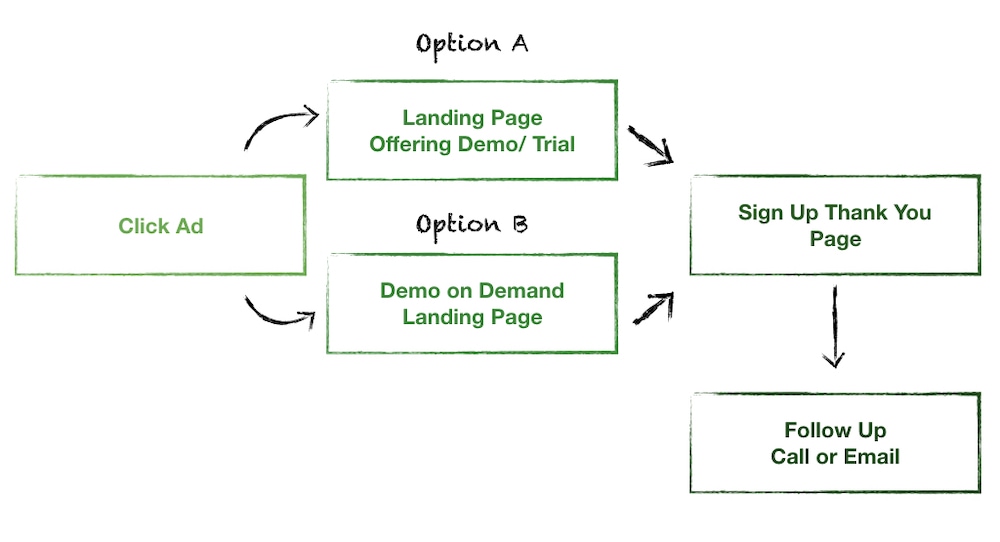
Similar to Landing Page Flow #1, we’ll bring users to either a landing page offering a demo or trial, or to an on-demand demo page.
Landing Page Offering a Demo/Trial or Demo On-Demand Landing Page
For choosing which of these two landing page types we’ll send users to, the logic is the same as we described above.
If prospects have been resistant to signing up for live demos, in some cases we’ll present them with the on-demand demo, but usually we’ll use a form to encourage signing up for a trial or live demo.
This page will look similar to the thank you pages from Landing Page Flow #1. We’ll use a different headline, but the content and strategy of presenting three “pros without cons” will remain the same.
Sign Up Thank You Page
The importance of your sign up thank you page can often be overlooked.
The key to getting it right is to make sure that it clearly describes what will happen next:
- Any additional actions the prospect needs to take.
- When they can expect to hear from you.
- Exactly what’s coming up next in the process.
This is a key opportunity to avoid the mistake of mismanaging expectations of what comes next, and to make sure the highest possible percentage of prospects who fill out your form follow through with taking the desired actions you hope they will take (eg. showing up for your demo).
So now that we’ve covered our approach to mapping landing pages to the funnel, we’ll walk through our process for actually creating landing pages.
How We Create SaaS Landing Pages at Powered by Search
The first thing to determine is which landing page flow we’re setting up: Landing Page Flow #1 or Landing Page Flow #2.
Once we have that, the next thing we consider is who is it for? This is a focusing strategy to make sure we aren’t trying to appeal to multiple target personas at the same time.
Remember, as a rule: One landing page, one target user.
Once we’ve decided on who that target user is (discussed at length in our article on targeting multiple SaaS personas), then we will choose our primary messaging angle for the page.
Choose Your Primary Messaging Angle
We see the three primary benefits of most SaaS products as being speed, certainty, and insight. Often a SaaS will have all three of these benefits.
So once we’ve chosen the target user that our page will be for, we go through a process to figure out which of these three benefits seems most relevant to that individual persona. The value proposition in the headline of the page will speak to that benefit.
Then, we’ll include the other two benefits as supporting benefits in our “pros without cons.”
When It Comes to Content, Copy Comes First
For us, copy always comes before design. And we like to think about copy as being assembled in the same way you would assemble lego blocks:
- First, we’ll draft the headline to speak to the primary messaging angle we’ve chosen.
- Then, we’ll draft the three “pros without cons”.
- Then, if we’re including trust indicators, we’ll choose and input compelling testimonials.
- Then, we’ll finalize the text of the CTA button.
We do all of this in a Google doc so that we can work together with our team and our client to make sure we are all on the same page and agree with the wording and structure of the copy.
Next up comes design.
Only Once the Copy is Dialed in Is It Time for Design
We save the actual page design for last because it’s easy to get caught up on the look of a page, but our stance is that what the page actually says is often the most important element.
It’s easy to make a nice looking landing page today. The hard part is communicating to your target persona through that page so that they clearly understand the benefits of what you offer, and know what they need to do next to experience those benefits for themselves.
For landing page design, we follow the common best practices. To reiterate:
- Skimmable content that’s easy to comprehend while scrolling (usually in the form of bullet points).
- One clear CTA near the top of the page.
- A hero image and visuals that complement the copy (eg. product screenshots).
If our client has a video overview of their SaaS, such as an explainer video, we’ll typically include it.
In a Competitive Landscape, Extra Effort Matters
If you’re going to the effort to craft your landing pages so they really resonate with your prospective customers, and you want to stand out from your competitors, taking the extra step to map your pages to the sales funnel is smart marketing.
By providing “Problem Unaware” and “Problem Aware” users with content and messaging that speaks to them and the stage they’re at, you can nudge your prospects towards the “Solution Aware” phase, and have more educated, sales-ready prospects come demo time.
You can schedule a Free SaaS Scale Session with our team to learn more about how you can improve your landing pages and increase your conversion rates.
What you should do now
Whenever you’re ready…here are 4 ways we can help you grow your B2B software or technology business:
- Claim your Free Marketing Plan. If you’d like to work with us to turn your website into your best demo and trial acquisition platform, claim your FREE Marketing Plan. One of our growth experts will understand your current demand generation situation, and then suggest practical digital marketing strategies to hit your pipeline targets with certainty and predictability.
- If you’d like to learn the exact demand strategies we use for free, go to our blog or visit our resources section, where you can download guides, calculators, and templates we use for our most successful clients.
- If you’d like to work with other experts on our team or learn why we have off the charts team member satisfaction score, then see our Careers page.
- If you know another marketer who’d enjoy reading this page, share it with them via email, Linkedin, Twitter, or Facebook.