How to Build B2B SaaS Landing Pages That Convert: Beyond A Pretty Design
Last updated: March 16th, 2026
If the right traffic visits your landing page and doesn’t convert, you’re not just wasting ad spend.
You’re also passing up the opportunity to convert the (roughly) 5% of prospects currently in market.
The problem is that most marketers don’t know what to change because they’re already following basic best practices, like:
- A CTA above the fold
- Skimmable content
- A testimonial or two
At this point, marketers either do nothing or run A/B tests based on random guesses.
Should we try a different headline?
Tweak the CTA copy?
Add more testimonials?
Change the testimonials?
Yet the more time you spend testing (and guessing), the more ad spend you waste and the more market share you lose.
To help you identify why your landing page is underperforming and resolve the issue as quickly as possible, we’ll guide you through the SaaS landing page construction process that we’ve spent years refining.
Our process is highly effective at increasing conversion rates because it accounts for not only the design and aesthetics, but also how well the message resonates with a prospect, depending on their pain points at their current stage in the buyer journey.
3 Reasons Why Your SaaS Landing Page Isn’t Converting
Mistake #1: Vague or Inaccurate Persona Targeting
How many landing pages do you have?
If you’re a B2B SaaS company and the answer is less than ten, your messaging isn’t sufficiently precise.
B2B SaaS companies often have multiple products, avatars, and stakeholders involved in each purchase decision.
To ensure the messaging is precise, you need to develop a unique landing page for every step of the buyer journey for each member of the buying committee, for each avatar/industry you serve.
Let’s say you serve three avatars/industries, each with a buying committee of three stakeholders, and it’s a 12-month buyer journey. You should ideally have three landing pages per stakeholder:
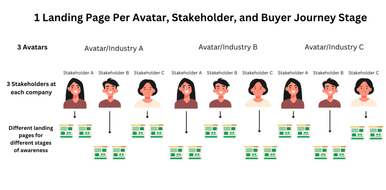
Creating multiple landing pages with small messaging tweaks may seem like overkill, but if you consider the value of a great prospect and the cost you’re already spending to acquire them, creating tailored landing pages that get them over the line is a no-brainer.
Mistake #2: Long Lead Forms
In the past, it was necessary to request a long lead form to ensure sales only spent time talking to qualified prospects.
However, long lead forms can reduce conversion rates, even from qualified prospects. And long lead forms simply aren’t necessary anymore because you can automatically enrich lead data with modern tools.
If you’re using HubSpot, it automatically enriches lead information with detailed information, such as company size, approximate revenue, a contact’s job title, and more.
If you’re using a different CRM, such as Salesforce, a quick enrichment via Clay will provide all the necessary information to qualify or disqualify a prospect.
Mistake #3: Poor Communication Post-Form Fill
If the thank you page says “Thanks, we’ll be in touch,” prospects will be wondering:
-
- When will you be in touch?
- What are the next steps?
- When will this problem actually get solved?
Remember that these prospects are currently taking action to solve their problem.
If you leave them a vague message without clear expectations of the timeline and process of how you’re going to solve that problem, they’re going to keep looking for another solution.
Take Your SaaS Landing Pages to the Next Level by Mapping Them to the Stages of Your Sales Funnel
The first (and most overlooked) step to building an effective landing page is ensuring it actually aligns with the prospect’s current stage of the buyer journey.
Most people think about the funnel in terms of top, middle, and bottom, but these terms are subjective. We think about users in the different stages of the funnel as being “problem unaware”, “problem aware”, or “solution aware”.
We discuss the buyer awareness matrix in more detail in a separate resource, but the key takeaway is to match the landing page’s offer and messaging to the prospect’s current stage in the buyer journey, as their pain points will change over time.
A right-fit prospect shown a relevant offer at the wrong time won’t convert.
In our approach to mapping landing pages to the funnel, we use two landing page flows to cover these three stages of the buyer’s journey:
- Landing Page Flow #1: For “Problem Unaware” and “Problem Aware” Users
- Landing Page Flow #2: For “Solution Aware” Users
In digital marketing campaigns, it can be tricky to determine whether you’re reaching users in the “Problem Unaware” camp vs. users in the “Problem Aware” camp.
As long as you are clearly targeting one persona (not trying to appeal to multiple stakeholders at once), the same landing page flow can appeal to and convert users who are in either of the first two stages of the buyer’s journey.
Let’s look at the first flow.
Landing Page Flow #1: For “Problem Unaware” and “Problem Aware” Users
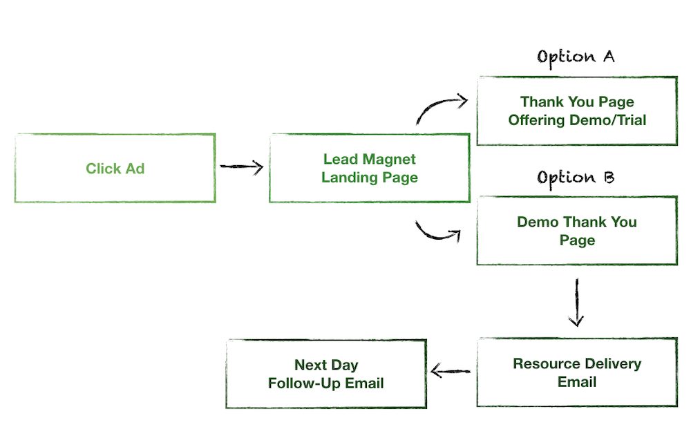
First, examine all the elements involved in the click-to-conversion journey.
Mapping out the buyer journey allows you to identify each point that may cause friction so that you can effectively diagnose problems and test improvements.
Let’s break this landing page flow down, starting with the lead magnet landing page.
Lead Magnet Landing Page
For both “Problem Unaware” and “Problem Aware” users, our goal is to guide these potential customers to become “Solution Aware.”
Therefore, we offer them a lead magnet (a downloadable cheat sheet, calculator, case study, webinar, etc.) rather than a trial or demo.
The lead magnet is a softer way to build trust with users and make a tasteful first impression.
We want to educate them on the problem(s) they’re experiencing and affirm that they aren’t alone – we’re here to help.
Here’s how we determine the type of lead magnet:
- Problem unaware: Help them have the “aha!” moment. This could be a quiz or symptom-focused article.
- Problem aware: This lead magnet should reinforce the pain point, like a checklist or a guide.
In the next step of their journey, we expose them to our solution and guide them into the “Solution Aware” phase.
Thank You Page Offering a Demo/Trial vs. Demo Thank You Page
Imagine how many more demos you’d have if your show rate increased to 100%.
In our experience, companies allocate about 9/10ths of their effort to their ads and landing pages, and only about 1/10th of their effort to their ‘Thank You’ pages.
Yet, the thank-you page is that critical transition to the next step in the buyer journey.
When prospects fill out your demo form, they’re actively trying to solve their problem, and they probably won’t stop until they have reasonable belief that:
- Your solution is capable of solving the problem.
- Your solution will slove it in a timely manner.
If your thank you page doesn’t answer those questions, prospects will continue searching for other solutions (i.e., your competitors’ products).
Unfortunately, most thank you pages fail to address those two concerns and instead fall into one of three buckets:
- Thank you! We’ve received your submission (or some other default copy like this).
- A page offering a single link to download a PDF or other type of resource (that offers nothing else).
- A page that offers no helpful prompts or dialogue.
Instead, here are two options to optimize your thank you page to increase the demo show rate.
Option A is to bring users who download the lead magnet to a thank you page that has a form where they can sign up to schedule a demo with our client’s team, or sign up for a free trial (depending on the complexity of our client’s software).
Note: Whenever possible, we want to include the option for the user to view a calendar and schedule a demo on the spot.
This page will present three “pros without cons” that users of the software stand to benefit from.
For thank you page Option B, which we’ll use less frequently, we’ll present users with a “Demo on demand.” This is a pre-recorded video that requires less commitment on behalf of interested prospects.
We use Option B for clients who are having a difficult time getting prospects to commit to a live demo.
The Two Step Email Automation
We use a two step email automation to:
- Deliver the lead magnet to prospects who opt in to receive it.
- Follow up with a broad question from a sales representative to begin a conversation with those who are interested.
Landing Page Flow #2: For “Solution Aware” Users
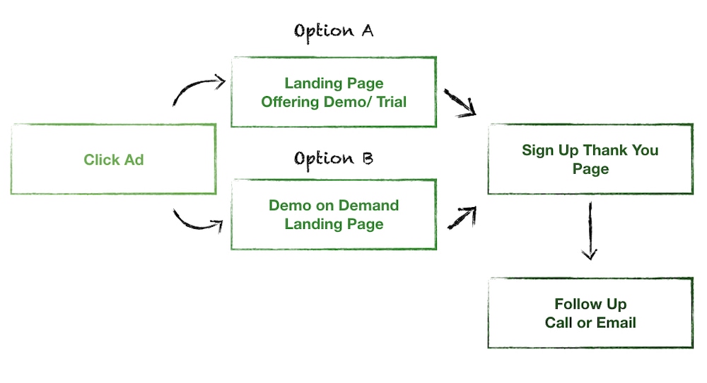
Landing Page Flow #2 is reserved for users who we’ve determined are in the “Solution Aware” camp, making it excellent for retargeting campaigns.
Indicators that users are “Solution Aware” include things like:
- They have engaged with our ads or downloaded our lead magnets.
- They’ve visited our website and viewed case studies or pricing pages.
- They’ve searched for our client’s “brand name + reviews” or “brand name vs. competitor”.
These users are nearly sales-ready, so we can take a more forward approach and offer a demo or trial directly.
Similar to Landing Page Flow #1, we’ll bring users to either:
- A landing page offering a demo or trial
- A landing page offering an on-demand demo
Landing Page Offering a Demo/Trial or Demo On-Demand Landing Page
We use the logic described above to choose which type of landing page to send users to.
If prospects have been resistant to signing up for live demos, we may offer an on-demand demo, but we’ll also use a form to encourage signing up for a trial or live demo.
This page will look similar to the thank you pages from Landing Page Flow #1. We’ll use a different headline, but the content and strategy of presenting three “pros without cons” will remain the same.
Sign Up Thank You Page
The thank you page is rarely optimized, but it’s actually a critical touchpoint, as prospects still haven’t solved their problem and want to know what happens next.
On the thank you page, clearly describe what will happen next by including:
- Any additional actions the prospect needs to take.
- When they can expect to hear from you.
- Exactly what’s coming up next in the process.
The thank you page is a key opportunity to avoid the mistake of mismanaging expectations of what comes next, and ensure the highest possible percentage of prospects who fill out your form follow through by taking the desired actions you hope they will take (e.g., showing up for your demo).
Now that we’ve covered our approach to mapping landing pages to the funnel, we’ll walk through our process for actually creating landing pages.
How We Create SaaS Landing Pages at Powered by Search
The first step is to determine which landing page flow we’re setting up: Landing Page Flow #1 or Landing Page Flow #2.
Once we have that, the next thing we consider is who is it for? This is a focusing strategy to ensure we aren’t trying to appeal to multiple target personas simultaneously.
As a rule: One landing page, one target user.
Once we’ve decided on the landing page flow and who that target user is, we begin crafting the landing page itself.
Step 1: Choose Your Primary Messaging Angle
After identifying who the landing page is targeting, we figure out which of these three benefits seems most relevant to that individual persona. The value proposition in the headline of the page will speak to that benefit.
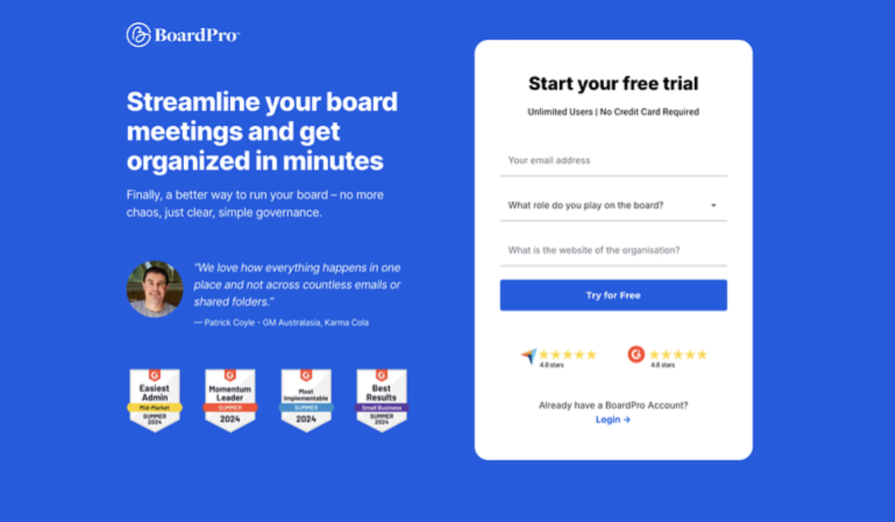
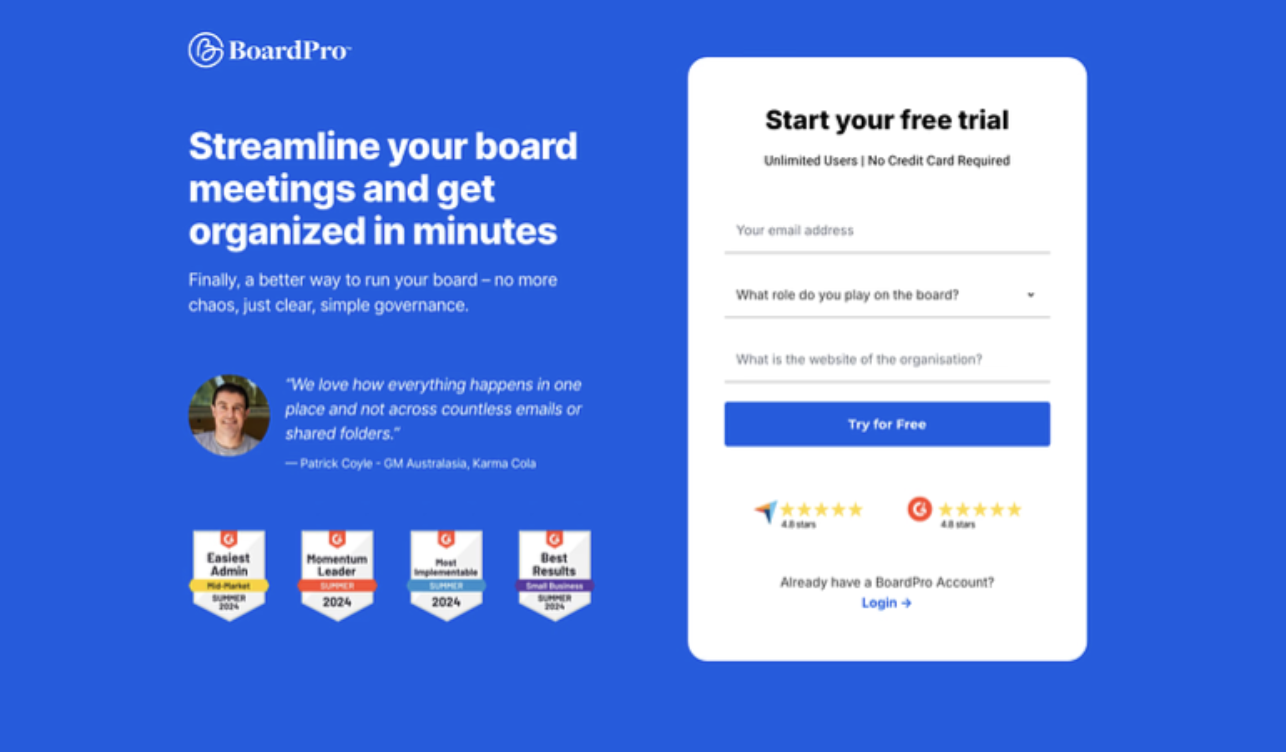
For example, the primary benefit we deduced for this SaaS company was speed. Therefore, we selected the headline “Streamline your board meetings and get organized in minutes.”
We also often use a “pro without con” copywriting framework to illustrate the additional benefits a product will provide without eliminating other important factors.
For example, below is another efficiency driven headline framed in a “pro without con” framework.
Instead of just saying “Unlock Efficiency” (the primary benefit), we also stated what they won’t lose (fidelity).
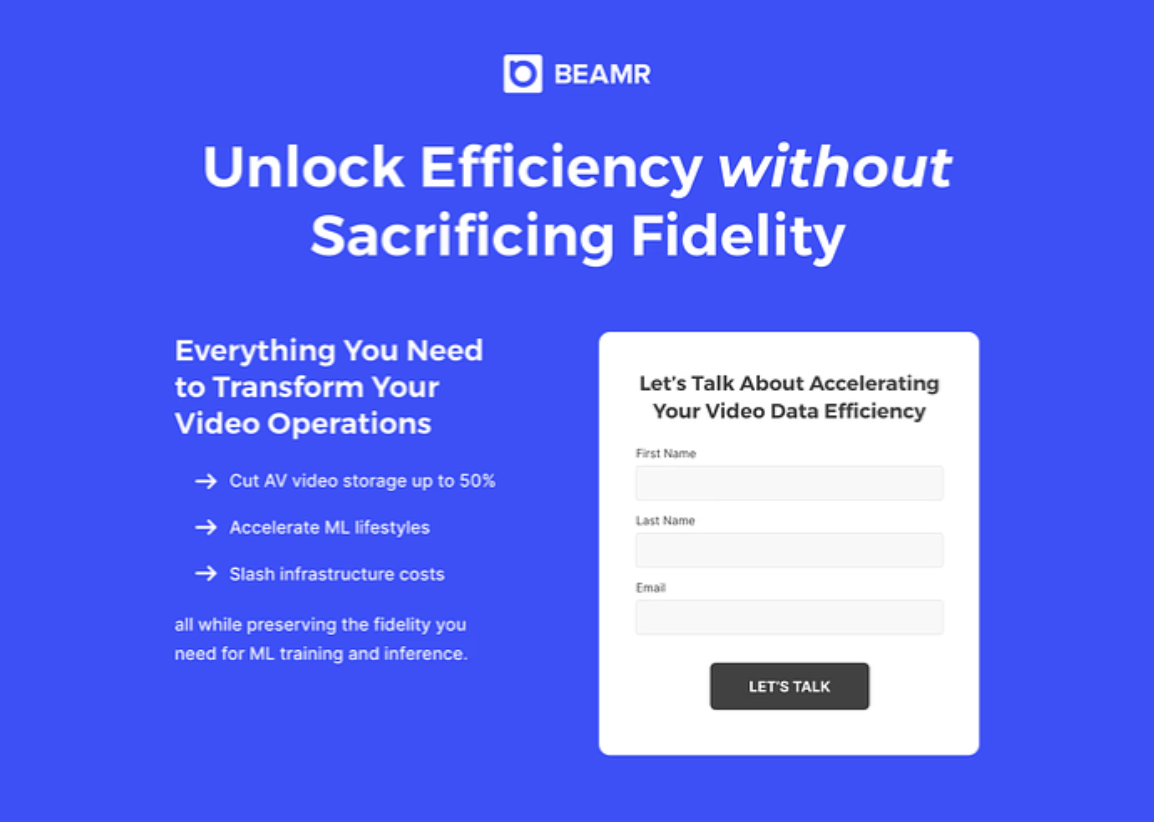
The “pro without con” framework is often an excellent way to elevate the impact of your headline.
Step 2: Assemble The Copy
You’ve probably seen plenty of beautifully designed landing pages that don’t clearly communicate what the product does or how it solves a problem.
Completing the copy before touching the design avoids this problem and ensures the value of the product is communicated clearly.
To ensure the copy itself is clear and effective, we assemble the copy similar to how you might assemble lego blocks:
- Headline that speaks to the primary messaging
- Benefits that elaborate on the primary benefits
- Trust indicators, including testimonials
- CTA
Let’s walk through an example of this process.
In the following client example, the opening headline highlights the primary benefit, which is speed (streamlining your board meeting and get organized in minutes).
The H2 is also a great opportunity to elaborate on how the product solves the primary problems, which can help the message resonate more deeply with prospects.
Next, we carefully selected a testimonial that not only matched the ICP, but also reinforced the primary benefit from the title.
The rest of the landing page elaborates on the primary benefits of reduced effort and speed.
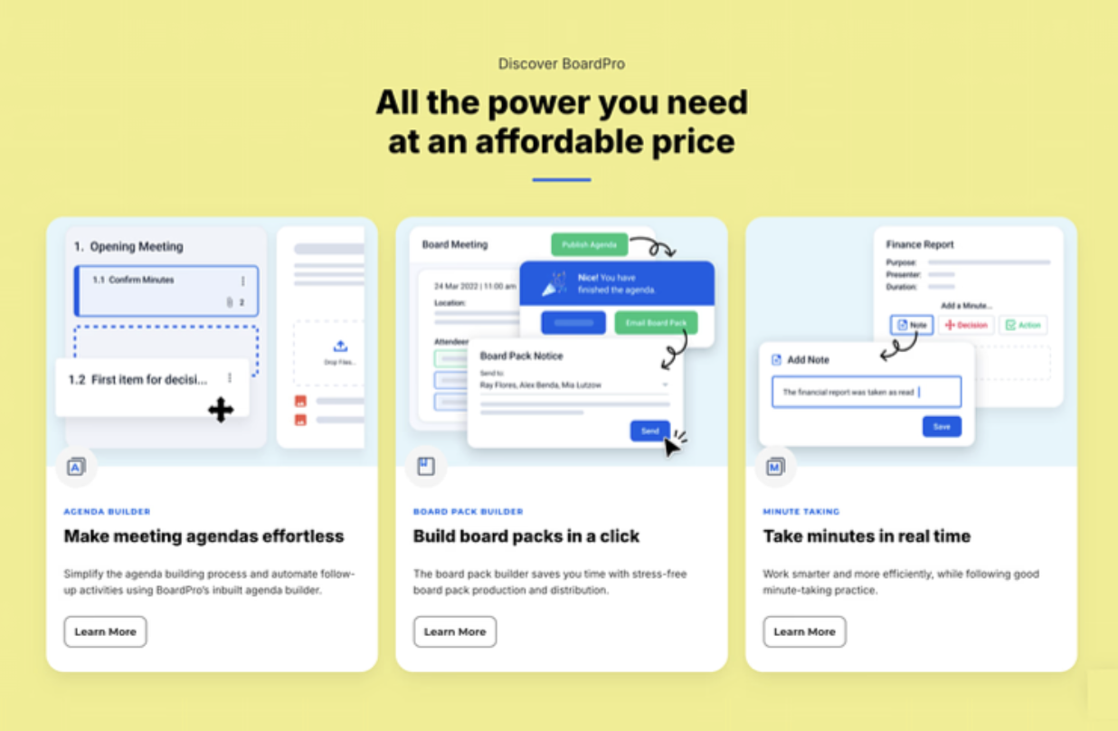
We often write all of the copy in a Google Doc first to ensure everyone is in agreement on the messaging before beginning the design.
Step 3: Constructing a Clear Design
It’s easy to create a visually attractive landing page, but the design should also reinforce the benefits your product delivers and how to take action.
Far too often, we find landing pages with beautiful graphics that don’t provide any context as to what the product does, or so much text crammed into one space that nobody reads it.
For landing page design, here are a few best practices to follow:
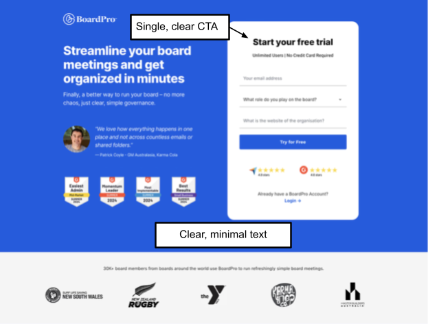
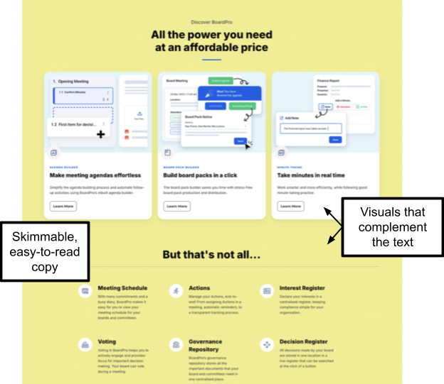
- Ensure the content is skimmable and easy to comprehend (bullet points can help with this).
- Implement one clear CTA near the top of the page (and again at the bottom).
- Use visuals that complement the copy (e.g., product screenshots and graphics).
You can see how we implemented these tips in the following landing page:
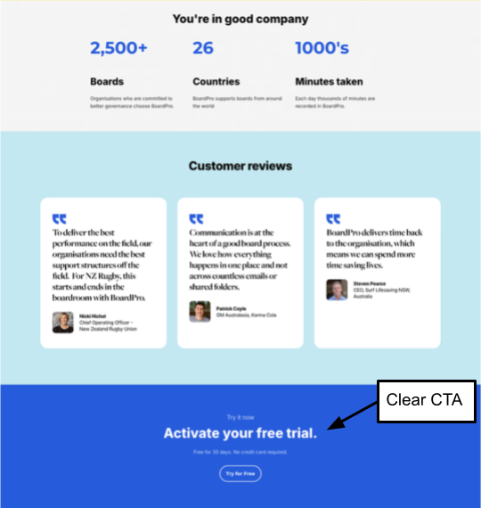
We also incorporate video whenever possible, as it’s easier to gain trust when prospects can connect a face with your brand. If you have an explainer video that provides a clear overview of the product, consider adding it to enhance product understanding.
Another engagement tip is to add a hover effect to your CTA to increase clicks.
Finally, you probably already have a mobile-responsive landing page, but since most traffic arriving on your page is likely mobile, it’s better to opt for a mobile-first design.
The most common issue we see with mobile landing pages is that they load too slowly.
You can conduct a simple speed test using PageSpeed Insights to assess your current speed and then optimize your mobile landing page by implementing lazy loading images, deferring non-critical scripts, and optimizing script loading.
A faster-loading mobile landing page will keep people reading your content and ultimately increase your conversion rates. Additionally, a slow mobile page creates a poor impression of your brand and doesn’t start the relationship in your favor.
Step 4: Implement Conversion Optimization Elements
There’s a lot of competition in SaaS, and often, customers choose the brand they work with simply because they trust one company more than another.
Here are a few tactical ways we maximize trust:
- Adding ROI stat sentences like “saved 200 hours/month”
- Adding privacy assurances
- Adding trust badges of our partners
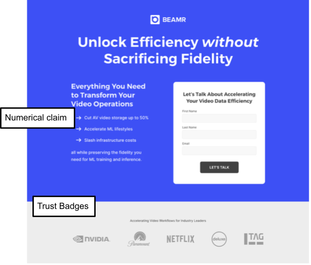
Below is another example of a landing page we designed with these conversion elements. First, you’ll see plenty of trust badges as well as a numerical claim (“Cut AV video storage by up to 50%”):
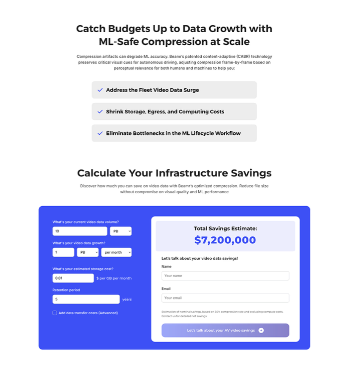
Scrolling down, we also added a calculator so that prospects can determine the exact ROI of partnering with this SaaS company:
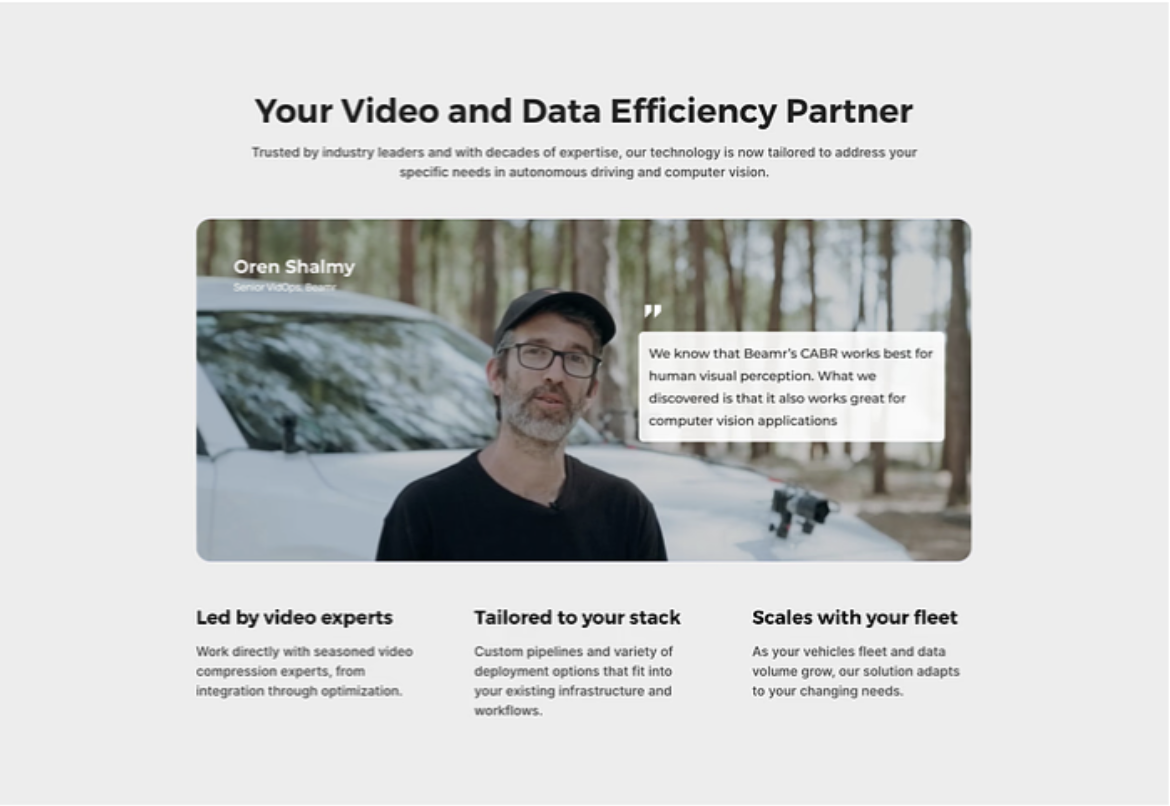
Following this calculator is a testimonial to further support the company’s claims:
Here’s another example of a landing page where we included G2 awards, a testimonial, and the G2 and TrustPilot ratings:
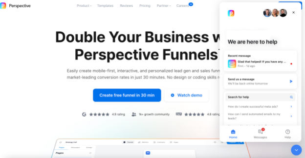
Live chat widgets are also an excellent way to not only answer last minute objections, but also immediately show prospects (rather than telling them) that you’ll be there with them throughout the process.
Here’s a great example from Perspective:
Another option to further boost conversion rates is A/B testing minor optimizations, like the CTA. For example, test “start free trial” against “see pricing.”
We also test the placement of sections or even removing a section altogether to see if we can improve the message clarity and impact. For example, we might test a detailed explanation of features and benefits against a briefer version.
We also test the placement of testimonials on the landing page.
Step 5: Tech and AI Integration
AI enables dynamic personalization, and in addition to adding the prospect’s company or name to the landing page, we also personalize the message by industry.
For example, let’s say you’re a parts management software company and someone from BMW clicks on your landing page. You can dynamically change the landing page to target that person:
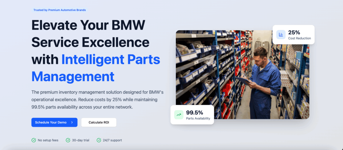
Dynamic landing pages are common practice in ABM, but they’re still often underutilized.
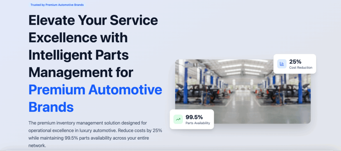
Even if you don’t have information on the specific customer you’re targeting, at least tailor your landing pages to their industry.
Here’s an example:
Get More Help Building a SaaS Landing Page That Converts
Your landing page is a critical touchpoint that determines whether you waste your ad budget acquiring visitors or turn them into revenue generating customers.
This guide outlines the exact process we implement for clients, although there’s plenty of nuance to each step, as well as extensive work beyond the landing page itself (e.g., developing an accurate customer avatar, identifying their primary pain points, driving the right traffic to the landing page, etc.).
If you’re still struggling to boost your landing page conversion rates, reach out to our team today. We can assess your landing page to understand why it isn’t converting, identify opportunities, and execute a plan to solve those issues.
Related Resources
Deep Dives
- 10 Examples of The Best SaaS Landing Pages
- 20 Examples of The Best SaaS Pricing Pages
- 11 Examples of the Best SaaS Demo Pages
- B2B SaaS Trial Conversion Rate Benchmarks
- B2B SaaS Landing Page Statistics & Benchmarks
- 10 Best Examples of Competitor Comparison Landing Pages in SaaS
Related Articles
- Landing Pages vs Web Pages: Which Should You Use?
- Competitor Comparison Landing Pages: A Strategic Approach for B2B SaaS
- Webinar – How to Create Landing Pages that Actually Convert
What you should do now
Whenever you’re ready…here are 4 ways we can help you grow your B2B software or technology business:
- Claim your Free Marketing Plan. If you’d like to work with us to turn your website into your best demo and trial acquisition platform, claim your FREE Marketing Plan. One of our growth experts will understand your current demand generation situation, and then suggest practical digital marketing strategies to hit your pipeline targets with certainty and predictability.
- If you’d like to learn the exact demand strategies we use for free, go to our blog or visit our resources section, where you can download guides, calculators, and templates we use for our most successful clients.
- If you’d like to work with other experts on our team or learn why we have off the charts team member satisfaction score, then see our Careers page.
- If you know another marketer who’d enjoy reading this page, share it with them via email, Linkedin, Twitter, or Facebook.