10 Best Examples of Competitor Comparison Landing Pages in SaaS
Last updated: August 23rd, 2024
A compelling SaaS comparison page should directly showcase your product’s unique value and how it differs from the competition, and guide prospects toward conversion. If your company website’s comparison pages lack in this regard, then it’s time for a revamp. Competitive comparison pages are essential tools for improving SEO and guiding potential buyers during their purchasing journey.
To help you perfect your SaaS comparison pages, we’ve selected ten excellent examples that showcase best practices in SaaS comparison page design, so let’s get right into it.
Duda vs Squarespace
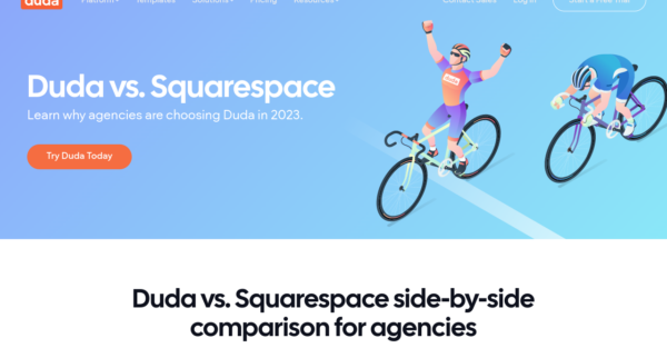
Both Duda and Squarespace are codeless website builders that enable just about anyone to build and manage a website with ease.
Duda’s Duda vs Squarespace comparison page shows a quick side-by-side comparison of the features and functionality of each platform. The page also includes a competitor comparison chart to enhance authenticity and build trust with the audience. As you scroll down, you’ll find a more detailed explanation of each feature presented in a point-by-point comparison.
The page then focuses on answering the most common questions that potential customers have, highlighting the advantages of choosing Duda over Squarespace. Finally, there’s a summary statement and a call-to-action to start a free trial, which is also displayed at the beginning of the page.
ActiveCampaign vs MailChimp
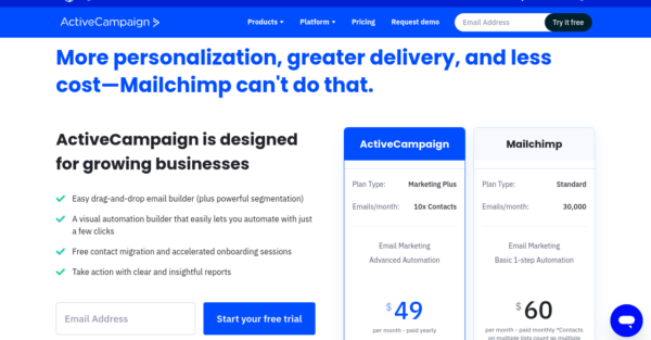
Mailchimp is a very popular and well-known email marketing platform, making it one of the biggest ActiveCampaign competitors.
The ActiveCampaign vs Mailchimp comparison page starts with a basic overview of two similar plans, but there’s a twist! As you can see by the side-by-side comparison, ActiveCampaign’s Marketing Plus plan is more advanced and provides more features and functionality compared to Mailchimp’s Standard plan, yet it costs less. This marketing strategy is particularly effective as it emphasizes the idea of customers receiving more value for less money.
Additionally, the page includes customer reviews from G2 that demonstrate the positive experiences of ActiveCampaign users. You’ll also see case studies and user stories that highlight the benefits of choosing ActiveCampaign.
The comparison page concludes with more detailed explanations of why ActiveCampaign is the superior choice and encourages visitors to sign up for a free trial or schedule a demo.
BambooHR vs Namely
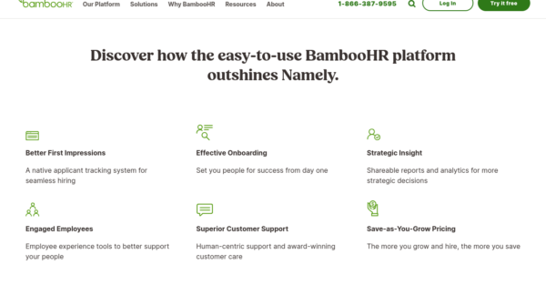
BambooHR is a complete all-in-one HR software designed to make some parts of business management a little easier.
Instead of going for the comparison table route, their comparison page uses simple text blocks that briefly outline why BambooHR is better than their biggest competitor, Namely. This can be just as effective as the side-by-side comparisons because it focuses on customer pain points and demonstrates exactly how the product can resolve them.
While they do delve into more detailed explanations of the available features, they also discuss how the platform can be used for hiring, onboarding, data analysis, and so on, and touch on customer support and pricing specifics. There are also several CTAs to encourage visitors to schedule a demo, as well as a customer testimonial alongside social trust badges.
Shopify vs WooCommerce
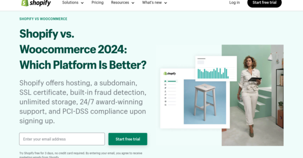
Shopify is one of the biggest names in e-commerce, and just like other big companies, they have a fair share of competitors. As a result, they have developed many comparison landing pages to maintain their competitive advantage over the likes of Wix, BigCommerce, and Square.
One such page is the Shopify vs WooCommerce comparison page, which includes a neat table that highlights Shopify’s advantages over WooCommerce. It then details ten areas where Shopify outshines its competitor, like the all-in-one pricing as opposed to paying for add-ons or extras.
The page also includes a customer testimonial, an FAQs section, and plenty of links to additional resources, like other product comparison pages and the help center. As visitors scroll down the page, they’ll find strategically placed CTAs for a free Shopify trial and ample informative content that’ll help them make a decision.
Webflow vs Squarespace
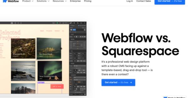
The Webflow vs Squarespace comparison page is a prime example of how to integrate eye-catching design and animations into a comparison page. Instead of a simple comparison table, they have designed a scale bar that highlights which platform offers superior features in each category.
They compare a range of aspects from design capabilities and content marketing to the buyer and the store owner experience. The page then goes into more detail on the design features before concluding with a dedicated section that highlights customer testimonials.
Asana vs Monday.com
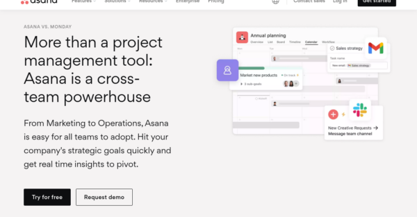
Asana is a major project management platform whose main competitor is Monday.com. They’ve taken a very unique approach with their comparison page that seems to be highly effective – as you navigate the page, you’ll notice the content is written from the perspective of a potential customer asking questions about Asana.
They explain some of Asana’s great features in more detail and display badges from the major brands that use their platform. After answering some commonly asked questions, you can immerse yourself in the feature comparison table. You’ll also find some case studies and, lastly, an FAQs section in case you still have unanswered questions.
ZenDesk vs FreshDesk
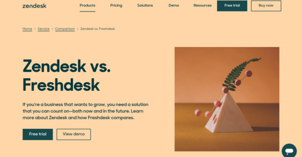
ZenDesk and FreshDesk are competitors in the customer service SaaS industry.
This ZenDesk vs FreshDesk comparison page starts by highlighting the advantages of ZenDesk and showcasing its superior features and functionality compared to FreshDesk. The page includes detailed tables comparing the product capabilities, features, and pricing of both platforms.
There is a lot of information on this page, so potential customers can easily find answers to their questions. Additionally, the page features customer testimonials and an FAQ section that can be expanded for further details. Towards the end of the page, there are additional resources and links to other comparison pages for those interested in exploring alternative options.
Klaviyo vs Mailchimp
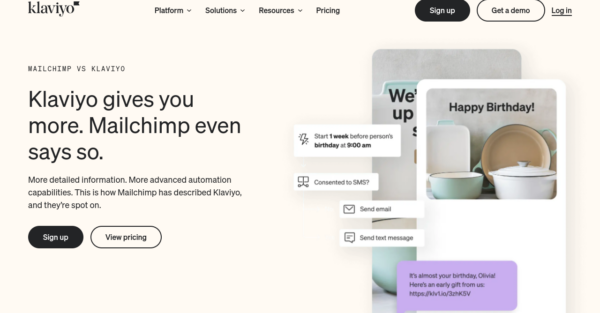
Klaviyo and Mailchimp run head to head in the world of email marketing, so much so that they both have comparison pages that highlight their unique features, pricing structures, and user experience advantages.
This SaaS comparison landing page includes feature highlights, which you can expand on for more detail, and an FAQs section.
They also include customer testimonials and some additional links for a guide on migrating from Mailchimp, a course on SMS marketing, and Kliviyo case studies. It’s a shorter comparison page than some of the other examples but it’s nicely designed with CTAs in all the right places.
Monday.com Comparison Page
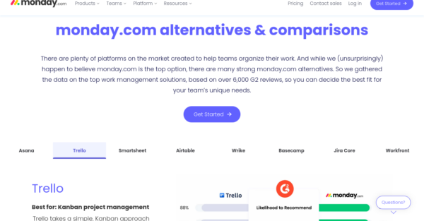
Monday.com have put a significant effort into developing a SaaS comparison page that shows a collection of platforms that you can tab between rather than one page for each. Creating competitor comparison pages is a strategic move to control the narrative around their brand and products. You can select from various competitor platforms like Trello, AirTable, or Basecamp and see how they differ from Monday.com.
Unlike the other examples here, they don’t start with a comparison table for features; instead, they have a bar chart displaying customer review scores where they strategically use color to highlight how Monday.com has the highest review scores for every category.
Afterward, you’ll find a carousel displaying the features offered by Monday.com. Towards the bottom of the page, there is a concise FAQs section and links to related content.
Unbounce Comparison Page
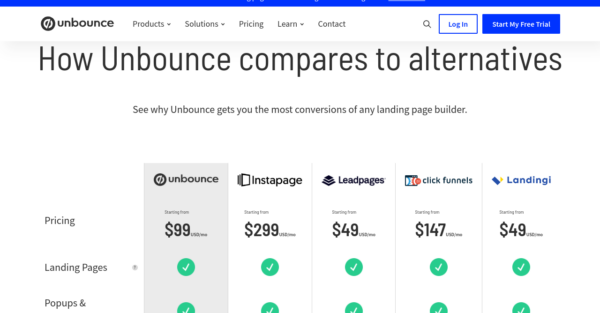
Similarly to Monday.com, Unbounce has one page that compares a selection of their major competitors in one go. This page features a side-by-side table that showcases Unbounce in comparison to Instapage, Leadpages, ClickFunnels, and Landingi.
They’ve included a section dedicated to customer testimonials, where you can see detailed explanations as to why marketers prefer Unbounce over the other options. At the bottom of the page, there’s a snippet from their pricing page that provides an overview of the available plans, along with a link for more information on their enterprise package.
Why Develop Competitor Comparison Landing Pages?
Developing competitor comparison landing pages is a strategic marketing tactic. Creating your own comparison pages can significantly enhance the organization and presentation of information, making it more effective for consumers. This approach allows you to optimize your content with long-tail keywords, which can generate high-quality organic traffic.
When purchasing SaaS products, potential buyers often conduct extensive online research before making a decision. By targeting these individuals through organic search, you can capture leads at the ideal moment in their buying journey when they have a genuine interest in making a purchase. So, if you are not utilizing this strategy, you are missing out on a valuable opportunity.
Wrapping Up
There are plenty of great ideas to pull from these competitor comparison landing pages. Most of them use a side-by-side comparison table, but not all. Understanding search intent is crucial when designing comparison pages, as it helps target specific keywords related to alternatives and comparisons. Tables make it easier for a user to absorb and process comparable information, which is why this is the preferred display format. It’s also possible to create a page that showcases a comparison of various SaaS platforms instead of just one.
In some cases, it’s not a bad idea to go back to the drawing board and look at some SaaS website best practices when designing new pages – especially landing pages. After all, having a good understanding of how your customers move through the buying process is essential to building high-converting landing pages.
Feel free to reach out to Powered by Search for content marketing and strategy advice. We offer a wide range of services to assist SaaS companies in scaling efficiently. Additionally, you can take our self-assessment to determine how your company compares to the competition. This self-assessment considers multiple revenue accelerators to evaluate how effectively your company attracts, engages, and converts customers.
What you should do now
Whenever you’re ready…here are 4 ways we can help you grow your B2B software or technology business:
- Claim your Free Marketing Plan. If you’d like to work with us to turn your website into your best demo and trial acquisition platform, claim your FREE Marketing Plan. One of our growth experts will understand your current demand generation situation, and then suggest practical digital marketing strategies to hit your pipeline targets with certainty and predictability.
- If you’d like to learn the exact demand strategies we use for free, go to our blog or visit our resources section, where you can download guides, calculators, and templates we use for our most successful clients.
- If you’d like to work with other experts on our team or learn why we have off the charts team member satisfaction score, then see our Careers page.
- If you know another marketer who’d enjoy reading this page, share it with them via email, Linkedin, Twitter, or Facebook.