A Proven Formula For High Converting B2B SaaS Product Pages
Last updated: March 17th, 2026
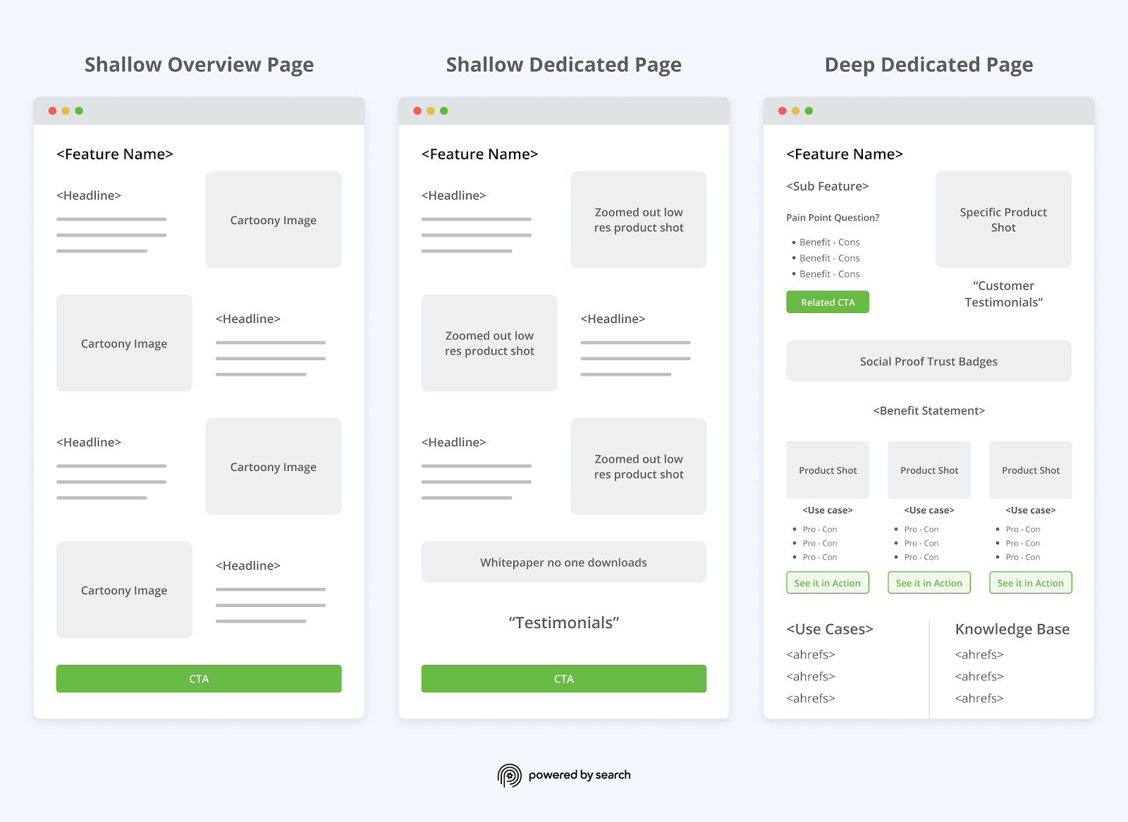
The process of developing a B2B SaaS product page often looks like this:
- Look at competitors’ product pages for inspiration.
- Compile various elements from competitors’ pages to create a wireframe.
- Test different elements and hopefully increase conversions.
SaaS product pages designed using this approach may look aesthetically pleasing but usually don’t convert because this process isn’t designed from the standpoint of how the product solves the customer’s pain points.
Instead, high converting SaaS product pages are developed using the same approach a sales person would use to craft a pitch for a particular product feature.
Specifically, the product page should answer the following questions (and in the order in which they arise in the prospect’s mind):
- Does this product solve my problem?
- Is it the cheapest, fastest, or most effective solution?
- Is there proof that it actually works as described?
We’ve developed a SaaS product page blueprint that addresses these questions and allows prospects to clearly understand your product’s value and proceed to the next step of the buyer journey (i.e., book a demo).
In this article, we’ll walk through this blueprint and explain:
- Common mistakes and lesser-known implications of poorly crafted product pages.
- Our framework for improving the key elements of your product pages.
- Screenshot examples of a B2B SaaS product page we built.
Are you looking for guidance on how to improve your B2B SaaS product pages? Get your Free Marketing Plan here to learn more about how we can help.
If you prefer audio, here’s a spoken version of this article:
Common Mistakes That Hurt SaaS Product Page Performance
Many SaaS product pages that convert poorly are doing all the basics correctly. The problem is usually just one or two subtle mistakes.
Instead of restating the basics you need in place, here are a few of the most common problems that make SaaS product pages convert poorly.
#1. Addressing Pain Points and Benefits Irrelevant to Your Avatar
SaaS marketers don’t knowingly advertise the wrong pain points/benefits, but this mistake often occurs if marketers don’t use solid data to create their buyer persona.
For example, you may assume prospects buy your product because they’re experiencing Pain Point A, when they actually buy it to solve Pain Point B.
As a result, discussing Pain Point A rather than Pain Point B would hurt your conversions.
To avoid this mistake, we reference sales calls, CRM data, and qualitative data to complete the SaaS positioning canvas at the beginning of each client engagement.
This exercise ensures we accurately identify the highest-value customer and their problems and pain points.
Once we have accurate data, it’s easy to correct this mistake and adjust the pain points and benefits on the product page accordingly.
#2. The Value Proposition Lacks Specificity
Many SaaS product pages describe a pain point or benefit that’s so broad, it could be applied to any product.
For example, “close more deals in less time” is a benefit that could be applied to hundreds of SaaS products.
This value proposition is so vague that it’s unclear what this product even does.
Is it cold email software? Sales coaching software? A full CRM?
Even if prospects can deduce what the product is (e.g., cold email software, sales coaching software, etc.) they won’t buy it if they don’t understand how it accomplishes the promised benefit and why it’s better, faster, or cheaper than the competitors’ products.
An easy solution to clarify a vague value proposition is explaining how the specific product feature accomplishes the broader benefit for your customer avatar.
For example, a more specific version of the initial statement (“close more deals in less time”) is:
“Our product helps B2B sales reps close more deals in less time by automatically following up with prospects two days after the initial call.”
This specific version is more effective at converting prospects because:
- B2B sales reps understand that the product is designed for them.
- It’s logical to assume that following up with prospects after the call will increase the likelihood of the prospect closing.
- Automated email follow-ups are less time-consuming than manually sending follow-up emails.
#3. Lack of Depth Hurts SEO Traction
It’s common to fill a SaaS product page with graphics, customer logos, and other elements that don’t provide search engines context as to what your SaaS product does or the pain points it solves.
Of course, this doesn’t mean you should add meaningless copy to your product page. Adding copy to increase word count will hurt your conversion rates.
Instead, our SaaS product page framework fills the product page with relevant context that helps search engines understand the product and gives users the context they need to understand the product’s value and take the next step forward in the buyer journey.
#4. The Mobile Version is an Afterthought
Historically, the biggest issue with mobile design was ensuring all the content was legible and formatted correctly.
Today, most mobile designs are easy enough to read from a user experience perspective, but they aren’t always well optimized to convert.
For example, the above-the-fold experience on a mobile may not contain all of the elements that the above-the-fold experience on a desktop can display.
Therefore, you’ll have to make conscious design decisions about which elements are most important and ensure the user continues scrolling to see the rest of the content on the page.
Our Agency’s Framework for Creating B2B SaaS Product Pages That Convert
To demonstrate how we approach optimizing page structure, imagery, and copywriting for B2B SaaS product pages, let’s look at an example of a web design project we recently did for a client.
Starting at the top of the page, we’ll walk through each section a reader sees when scrolling down the page.
Section 1: The Above the Fold Experience
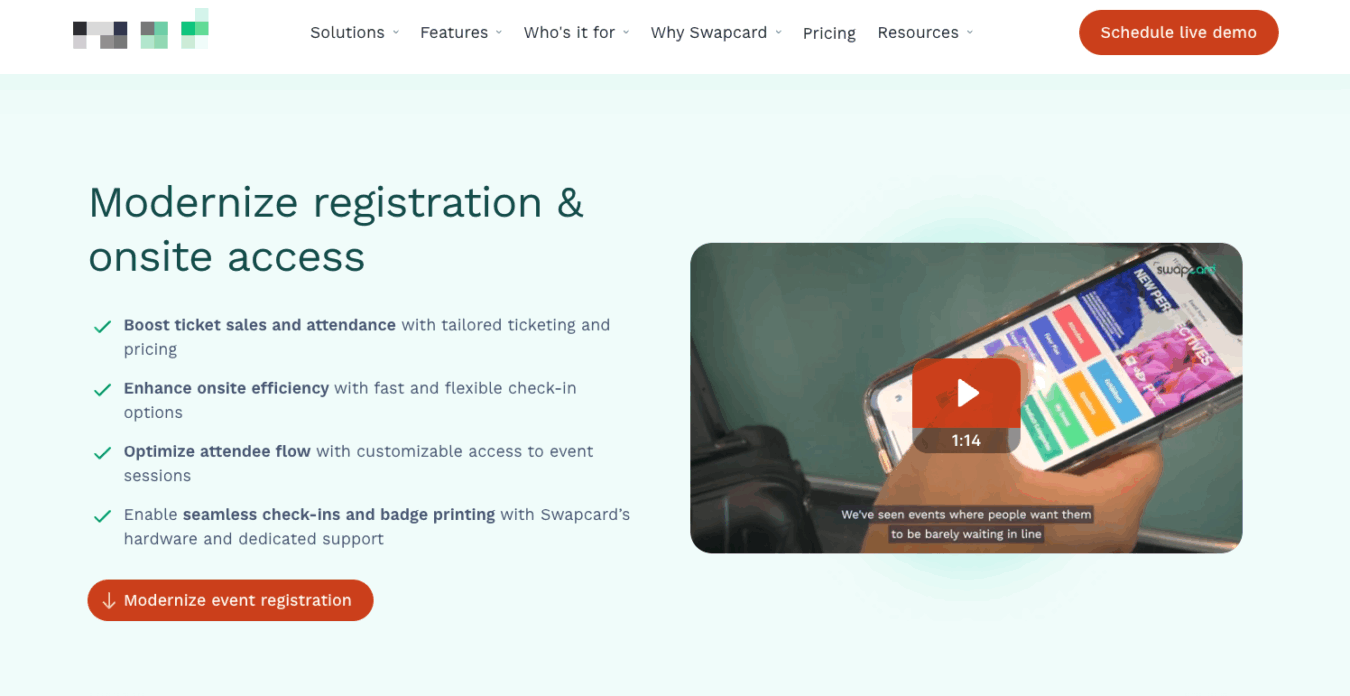
Before users begin scrolling, there are four questions that an effective product page must answer to capture the prospect’s attention and intrigue them to continue scrolling.
The first section of your page should communicate clearly to your target audience:
- Does this product match what they’re looking for?
- Can this product do what they need and solve the problem they have?
- Would investing in this product be worthwhile for them?
- What should they do next?
This is a lot of information to communicate in a small space, which is why there is an art to building above the fold experiences. But we’ve developed a repeatable formula for doing this.
Note: These same “above the fold” concepts apply for landing pages. Check out our in-depth critique on two landing page examples from top SaaS companies.
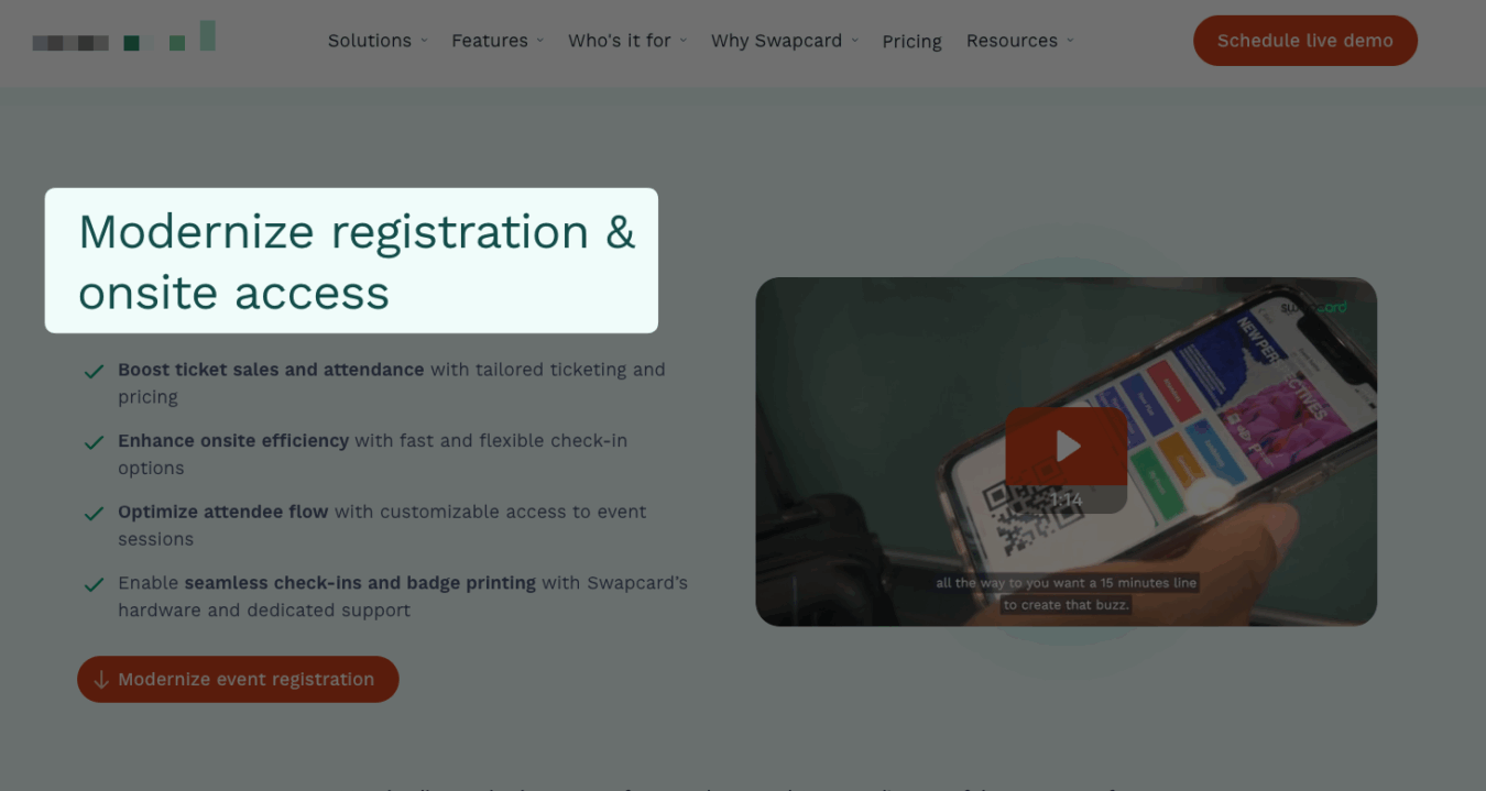
In this client example, we answer the first question in the headline.
Then, we use a bulleted list of benefits supported by specific features to answer questions two and three (Can this product do what they need? And would investing in it be worth it?).
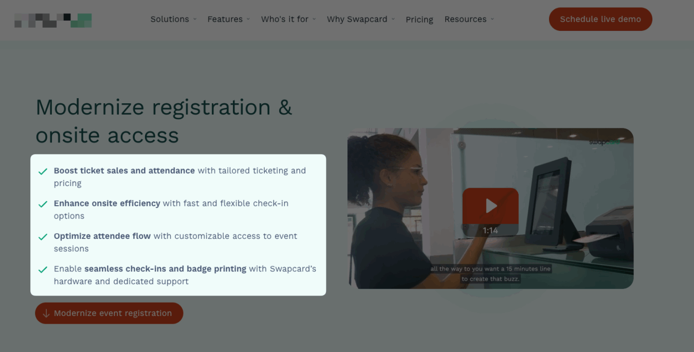
This “benefit supported by feature explanation” framework ensures your product explanation is clear and illustrates the value users will receive from this feature.
We also pulled each of these benefits from the SaaS positioning canvas performed earlier during the client engagement.
Finally, the CTA reinforces the desired result users will achieve if they take the next step.
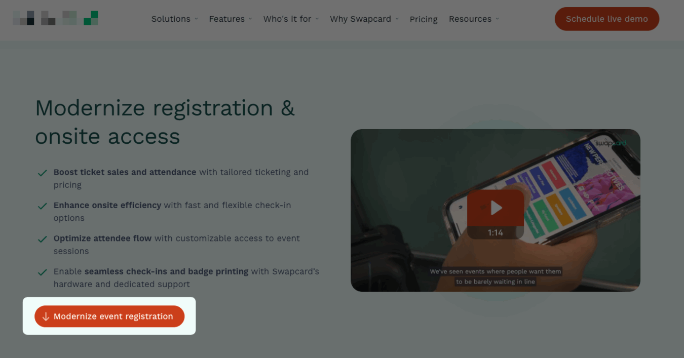
Instead of just saying, “schedule a demo,” the CTA is “modernize event registration,” implying that they’ll achieve that result by taking the next step.
Many SaaS product pages are designed with text on the left hand side and an image on the right hand side to avoid overwhelming the reader with too much text.
However, the visual takes up 50% of the page’s real estate and is an often overlooked opportunity to further illustrate the value of your product – especially as many people are visual learners.
Instead, we took advantage of this real estate by including a product explainer dedicated to this particular feature.
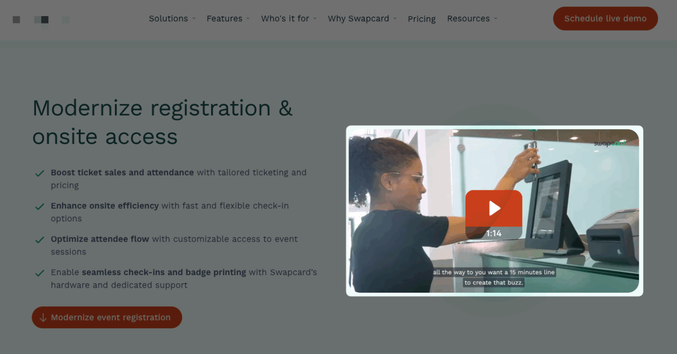
You’ll also notice that the demo video is well optimized to encourage users to watch. Specifically
- The video auto plays just the first few seconds on loop (this is better than playing the entire video as users may not pay attention from the start).
- The video contains closed captions.
- There’s a large play button.
- The footage is relevant to the product.
However, always have the sound off if the video is set to play automatically (obviously, the sound will turn on if users click the video). If the video starts playing with sound, users may click away from the website altogether as the sound can be jarring.
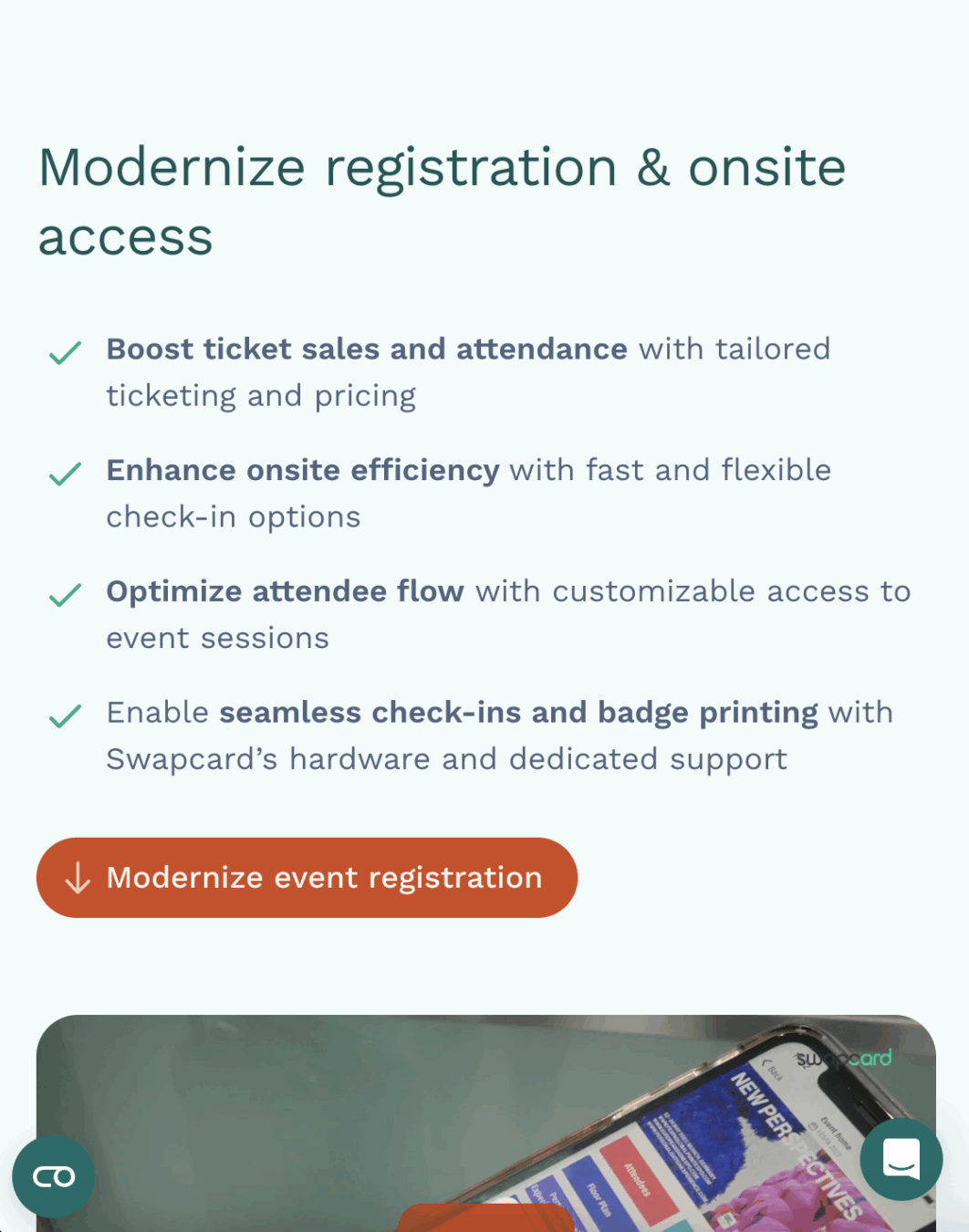
Note that in the mobile version of this product page, the main bullet points and CTA are still above the fold, and the top of the video is also present to keep users scrolling. We prioritize the main bullet list and headline because those elements answer the first three questions.
Then, we insert a brief section of social proof for readers who want to scroll and learn more before expanding on the product feature set.
Section 2: The Trust Badge Banner
Most SaaS marketers believe the sole purpose of the trust badge banner is to prove your company’s legitimacy.
But prospects don’t just want to know if you’re legitimate.
They want to know if you can solve their pain points. Has your solution helped other companies just like them? Or better yet, is their competitor using your product?

Instead of just including your biggest customers in the trust badge banner, include the companies that best match your target persona.
In this case, our best customers are large trade shows, so we still feature primarily the largest clients, but we do include a variety of industries, from NAVC (a veterinary conference) to Informa (a wealth management conference).
Section 3: Detailed Feature Expansion
The next section of the page is where we provide more depth and context for each of the features listed above the fold.
In fact, you’ll notice that the headlines (H3s) used for each section are simply abbreviated versions of the bullets outlined above.
There are four steps to nailing the feature explanation section.
1. Present Each Feature In The Order They’re Used
We sometimes see SaaS companies present key differentiating features or the most valuable features first, but presenting features out of order can confuse prospects.
Instead, we intentionally present each feature in the order that prospects use them so they can see how to use the product and understand that it’s a comprehensive platform.
2. Resonate With The Pain Point
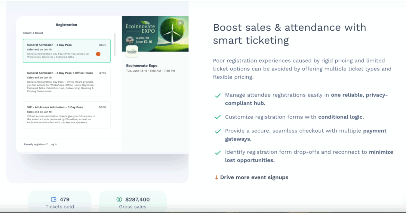
The purpose of the first paragraph is to reassure prospects that this feature is indeed the solution to their pain point (“Poor registration experiences caused by rigid pricing and limited ticket options”).
Then, we explain how the product eliminates the pain point (“can be avoided by offering multiple ticket types and flexible pricing”).
This level of specificity makes the feature and its value very clear to prospects.
Of course, it’s important to make sure you’re addressing the right pain points and benefits, so we always refer back to the SaaS positioning canvas during this process.
3. Present Each Sub Feature as a Benefit
If you simply state a feature, it doesn’t give the prospect context that illustrates how they can use that feature to automate or improve their workflow.
For example, “payment gateways” is a feature.
Yet if you simply list that feature without any context, prospects likely won’t know why payment gateways are something they need.
On the other hand, all prospects want “secure seamless checkout.”
However, if you simply state, “we offer secure seamless checkout,” a prospect’s first question will be, “how do you offer secure seamless checkout?”
By marrying the benefit with the feature, prospects will understand how using your product will improve their current process.
You may think the value of your feature is obvious, and for some prospects, that may be the case. Yet for many prospects, especially those who have never used similar software, the value of a feature may not be obvious.
4. Incorporate a Visual Illustration
Many people simply won’t take the time to read more than the headlines on your page, so the visual is a great tool to communicate the product’s value.
In fact, most people pause when they see the visual and then read the copy after the visual captures their attention.
In this particular case, we created an animation of the software executing the feature (building a registration form using the software).
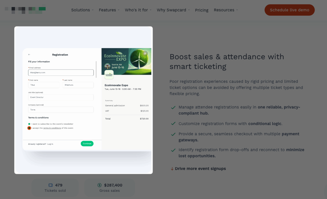
You’ll notice we also include a call to action tailored to the feature’s benefit. For example, the call to action for the registration feature is “Drive More Event Signups” – the customer’s desired end result.
Section 4: The CTA
Many right-fit prospects don’t want to book a demo because they don’t understand that booking the demo is the best and most efficient next step to solve their problem.
This means that the solution to increase demos is simply telling them what the next steps will look like so that they can see how scheduling a demo or signing up for a free trial is the first step to solving the problem.
Here’s an example of a CTA we created for a student relationship management software company:
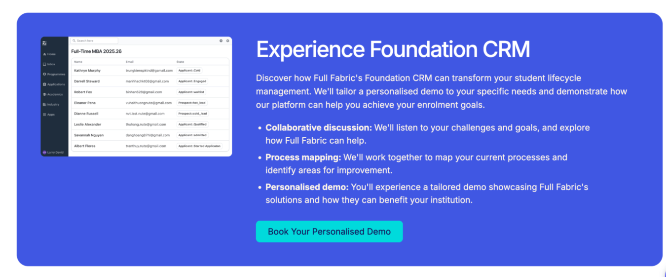
It clearly spells out the three step process that happens when they book a demo and paints the picture of how doing so will solve their end problem.
Section 5: Testimonials
Most SaaS product pages have testimonials, but most of them are generic and don’t reinforce any of the claims made on the product page.
To maximize the impact of your testimonials, consider these two factors:
- Who the testimonial is from: Similar to the trust badges, a testimonial from the prospect’s competitor or a parallel company confirms that your product is indeed a valid solution for their type of company or industry.
- The content: An average testimonial will say that the product is good, but a great testimonial proves the benefits mentioned earlier on the page. For example, if a primary benefit of your event software is that it increases attendee satisfaction, a great testimonial is, “We increased attendee satisfaction scores by 60%.”
How To Further Improve The ROI of Your SaaS Product Pages
This blueprint is the exact step by step process we use to implement SaaS product pages that convert, though there are plenty of other factors beyond the product page copy and design itself that impact conversions.
For example, the accuracy of your customer research, the traffic landing on the page, and other factors all impact conversions.
If you want a team of SaaS experts that can assess your entire marketing funnel and identify the highest impact opportunities, reach out to Powered By Search.
We can help you pinpoint why your product pages aren’t converting as well as you want and recommend a solution.
Related Resources
Deep Dives
- 20 Examples of the Best SaaS Testimonials Pages
- The Ultimate SaaS Rebrand Checklist: Steps to a Successful Business Transformation
Related Articles
- How to Create a Great Infographic with No Design Skills
- InboundTO 31 Recap: An Introduction to UX/UI Design
- Your Product Is the Marketing: How to Build a Testimonial Flywheel That Sells for You
What you should do now
Whenever you’re ready…here are 4 ways we can help you grow your B2B software or technology business:
- Claim your Free Marketing Plan. If you’d like to work with us to turn your website into your best demo and trial acquisition platform, claim your FREE Marketing Plan. One of our growth experts will understand your current demand generation situation, and then suggest practical digital marketing strategies to hit your pipeline targets with certainty and predictability.
- If you’d like to learn the exact demand strategies we use for free, go to our blog or visit our resources section, where you can download guides, calculators, and templates we use for our most successful clients.
- If you’d like to work with other experts on our team or learn why we have off the charts team member satisfaction score, then see our Careers page.
- If you know another marketer who’d enjoy reading this page, share it with them via email, Linkedin, Twitter, or Facebook.