SaaS Website Redesign: How We Used the Authority Architecture Framework to Rebuild This POS Software Company’s Website
Last updated: March 17th, 2026
We’ve talked before about how a B2B SaaS website redesign can go wrong. But a common mistake we haven’t mentioned with SaaS websites: they try to communicate too much at once.
This turned out to be the case for one of our current clients, IQ Interactive. They’re a B2B SaaS company who’ve been in the digital signage business for more than a decade. But in 2018, they began shifting their attention to point of sale systems. The result of their labor was a formidable piece of software that works gangbusters for restaurants.
One of its most popular features enables restaurants to create their own online ordering and delivery systems. Their POS software costs restaurants about 7% per transaction. In comparison, meal delivery apps like Uber Eats or Postmates take a 20 to 35% cut.
In normal times, profit margins are already slim for most restaurants. But in the middle of a pandemic that’s devastated their industry? Giving away 20 to 35% of revenue is a losing proposition for most restaurants.
Even though IQ Interactive built this powerful software that helps restaurants cope with the aftermath of COVID-19, sales struggled. One of the reasons for this was their website. The browsing experience presented visitors with too much to consider. As a result, lead generation was stagnant.
IQ Interactive knew that it was time for a change. But if they were going to do their SaaS website redesign the right way, they knew they needed help.
So they came to us.
They reached out after discovering our work with one of their competitors, TouchBistro. Since we improved web pages for one of the biggest POS software companies in Canada (which has since gone global), they thought they should probably work with us, too.
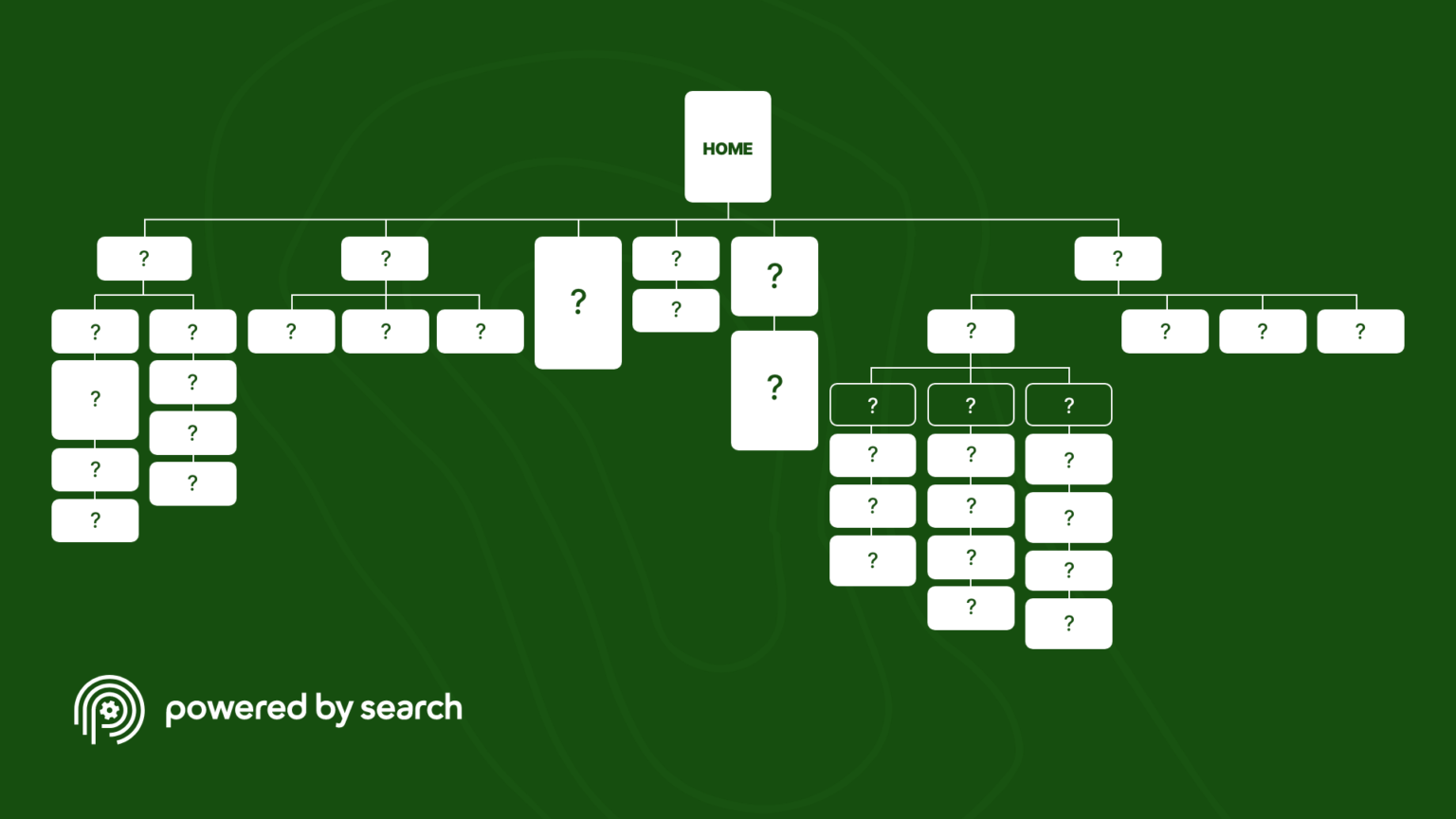
We told them that websites with great design use what we call the Authority Architecture Framework. It’s a map we use to guide SaaS companies through the process of structuring the placement of resources on their website. The framework provides design inspiration for SaaS businesses to build their home on the web to connect and leave a lasting impression on prospects.
IQ Interactive bought the concept and chose to follow our lead. As a result, their redesigned website is getting more traction than ever before. In the first two months alone since relaunching, they’ve managed to generate 25 demo requests from eager prospects.
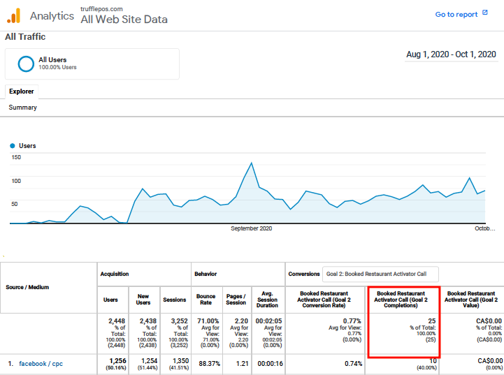
In this article, you’re going to learn how we helped IQ Interactive design a new website for their SaaS product, which they rebranded as Truffle POS. We’ll show you how we optimised their conversion rate using some of the best practices we recommend in the Authority Architecture Framework and how we helped them turn their target customers into actual customers.
The Authority Architecture Framework in Action: How Our SaaS Website Design Strategy Helped Transform IQ Interactive into Truffle POS
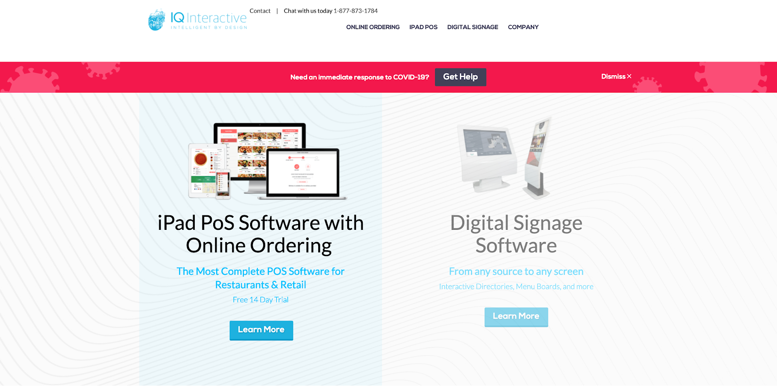
Before we started the website rebuild, we needed to diagnose improvements from IQ Interactive’s website. From our analysis, we found a recurring issue. Though their site was fine aesthetically, it featured too many choices and melded too many things at once. For example:
- Even though they wanted to sell more subscriptions to their POS SaaS, their homepage was still prominently featuring their digital signage solutions. This was splitting a visitor’s attention between two products that solve very different problems.
- When it came to moving visitors down their sales funnel, they presented two different bottom-of-funnel offers: a free 14-day trial and a chance to book a demo. One was more popular than the other yet they chose to offer both.
- They wanted to target restaurants with their POS software. But from grocery stores to hotels, they were still positioning themselves as a generalist.
- To complicate matters further, we noticed that they were trying to create a whole new category for themselves. To stand out from their competitors, they called their solution a “restaurant operating system”.
From our perspective, it was obvious why the old site struggled to stir interest in their POS software. IQ Interactive gave visitors too much information to process and not enough whitespace to breathe. As a result, the user experience likely left prospects overwhelmed.
But we knew that this was fixable. The next version of the site just needed to be better in its messaging and structure. Here’s how we used the Authority Architecture Framework to make that happen:
AAF Action Item #1: Improve the Value Proposition
Website visitors needed to understand right away what Truffle POS is and what it does. So first, we advised them to stop calling it a “restaurant operating system” because no one in their industry knew what that was. Instead, we encouraged them to position it as point of sale software. This was a much more familiar concept for restaurant decision-makers.
To do this right, they needed to update their value proposition. As we note in the Authority Architecture Framework, a great value proposition talks about a benefit in relation to a major pain point it relieves. At the same time, it must be worded in a way that frames both concepts in positive terms.
See the screenshot below. Notice how the new tagline above the fold on the Truffle POS homepage accomplishes this in a simple and clear way:

AAF Action Item #2: Capture Prospect Details with a Homepage Lead Magnet
While researching, we were able to segment Truffle POS’s customers into different groups. We found that their best-fit customers were actually franchise businesses. These kinds of restaurants had achieved massive results after becoming customers.
With that information in mind, the new website needed to prioritize marketing to chains over mom and pop shops. One way we helped them do this was by creating a homepage lead magnet that highlighted a case study on Press’d Sandwich Shop. As a restaurant with several locations around Canada, Press’d’s success was the perfect story to share and attract qualified leads.
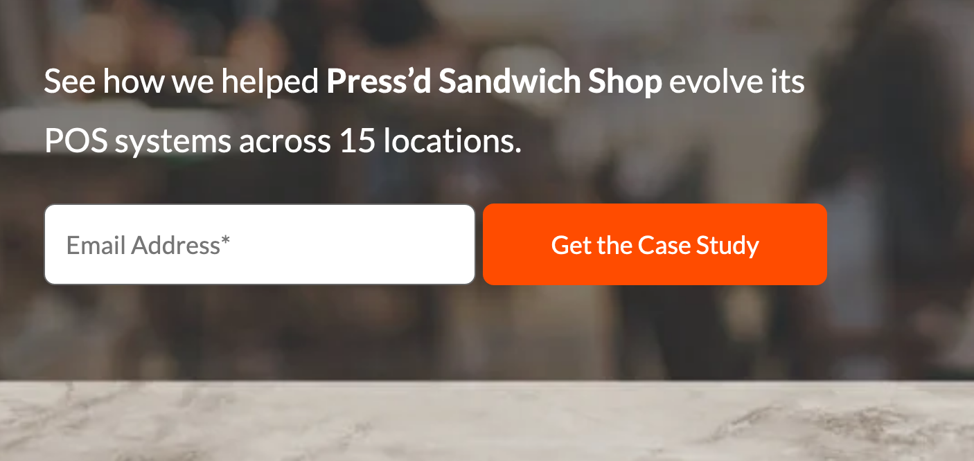
Most SaaS companies don’t offer lead magnets to people who land on their homepage. But we encourage businesses to do the opposite because it’s a good inbound marketing tactic. Offering a lead magnet is a chance for companies to educate prospects about their SaaS product. It also offers them an opportunity to build their email marketing list.
AAF Action Item #3: Better Social Proof
Most SaaS companies know about the benefits of including social proof on their website. These are assets like testimonials or customer logos. IQ Interactive was already doing this, but we did identify a few ways that they could improve.
First, we told them to showcase the logos of both well-known and under-the-radar restaurants that used their software. Having a mix of businesses on their site would give visitors a sense of who they worked with while also showing the diversity of their customer base.

For testimonials, we encouraged them to use the bullseye method. This called for them to create testimonials that tell the stories their prospects need to hear. The bullseye method is much more effective than asking a customer to give you their thoughts. Because they aren’t copywriters, customers often won’t give you the content your SaaS company needs to showcase most.
To do this yourself, you can follow these four steps.
- Step 1: Find the customer who meets the use case you want to share.
- Step 2: Write the testimonial that reflects their true experience.
- Step 3: Get what you wrote approved by the customer.
- Step 4: Once you’ve received your customer’s blessing, go live with the testimonial on your site.
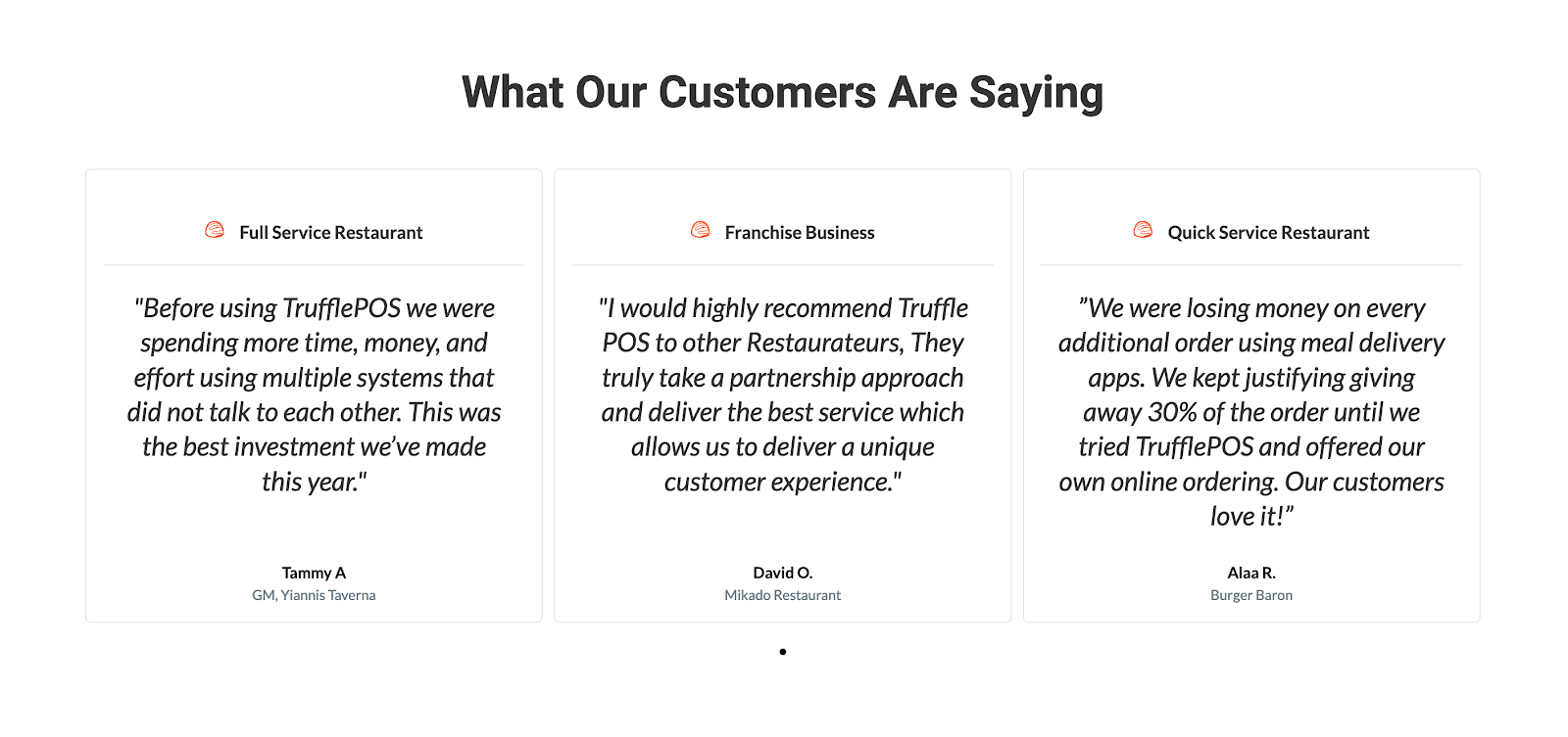
In Truffle POS’s case, we encouraged them to speak to customers from three different verticals: full service, franchise, and quick-serve restaurants. They then wrote testimonials that detailed how their POS software streamlined their businesses. After getting those customers’ approval, we posted those testimonials to their website.
AAF Action Item #4: Conversion Tracking
Remember earlier when we mentioned that IQ Interactive presented two different bottom-of-funnel offers to visitors? During the redesign, we decided to ask them more about this. Specifically, we wanted to find out which call to action led to more conversions: the free trial or the demo call.
IQ Interactive told us that most of their mid to low-funnel prospects wanted to see the software in action first. There was little desire for the CTA that offered prospects a free trial. With that in mind, we encouraged them to make booking demos their primary offer to visitors on the new website.
But narrowing down to a demo offer was just the first step. Another issue we needed to fix in version 2.0 was the lack of a landing page for this offer. On the old site, the book-a-demo button sent anyone who clicked straight to Calendly.
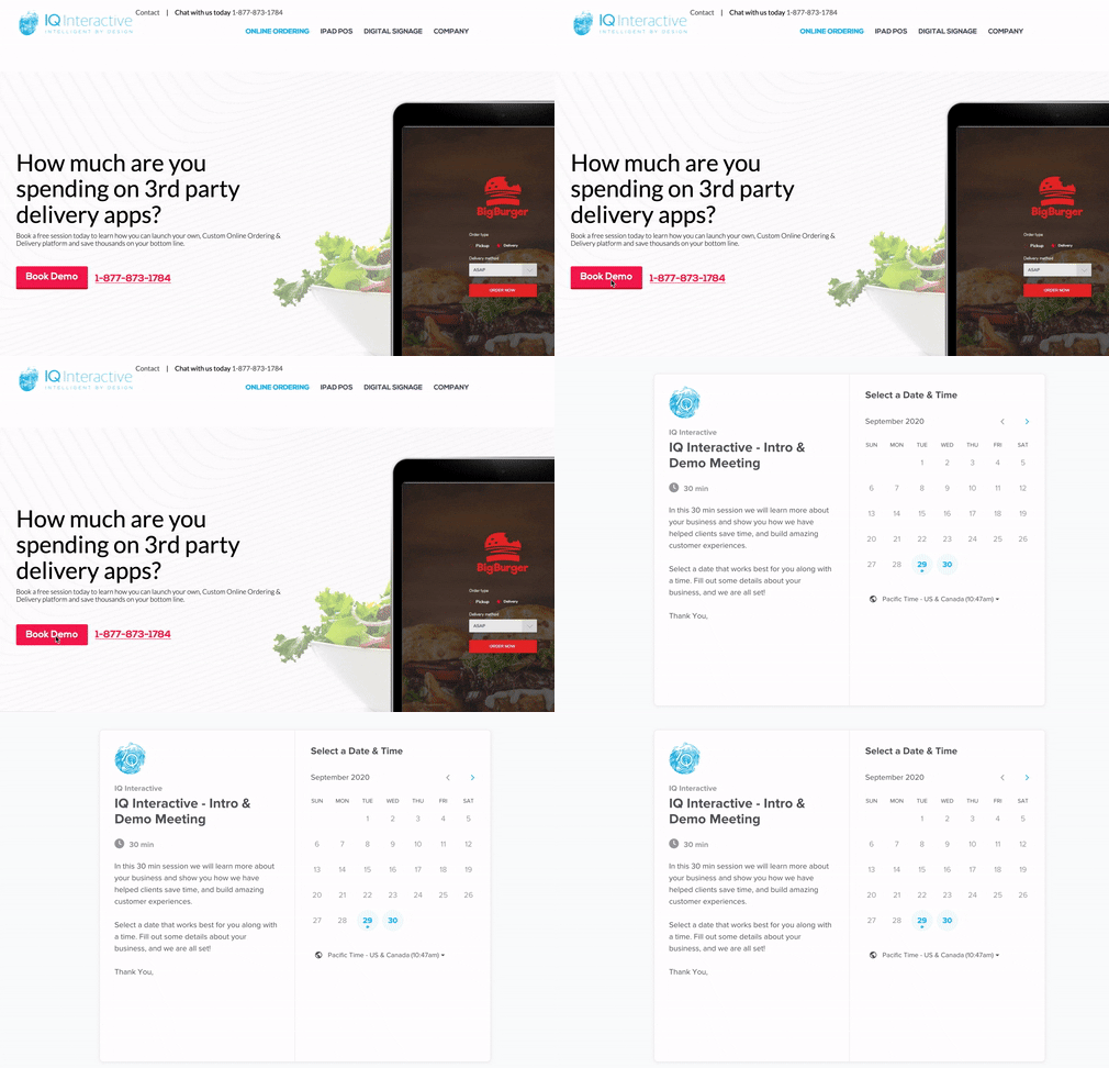
Without a landing page, IQ Interactive wasn’t tracking anyone that expressed interest in a demo. It didn’t help that the button on their old website wasn’t tagged as a trackable event in Google Tag Manager, either. This caused a missed opportunity to remarket to anyone that clicked to the Calendly page, but didn’t book at the last second.
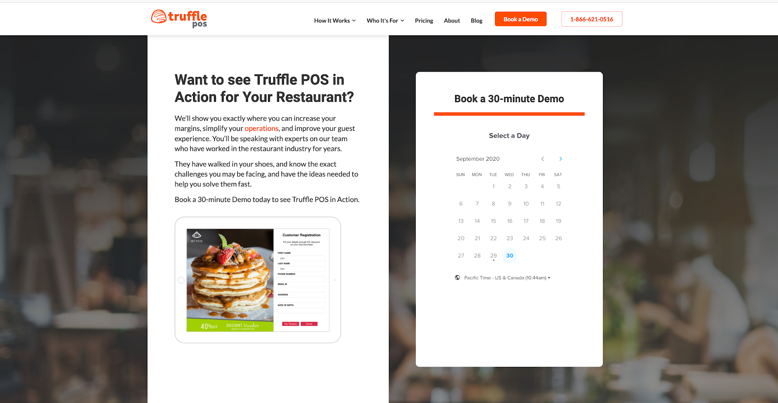
So we fixed this when we built the Truffle POS website. We created a landing page where visitors could still book an appointment through Calendly. But now the request form was embedded on their website, which they could track.
AAF Action Item #5: Enhanced Visuals
Another common problem of most SaaS websites is how they showcase their products. Many companies include screenshots and videos that demonstrate what they’re selling. But what they highlight isn’t clear enough.
The IQ Interactive website encountered this same issue. It included a variety of product shots and visuals. But because they were too small, visitors were unclear about product features or use cases.
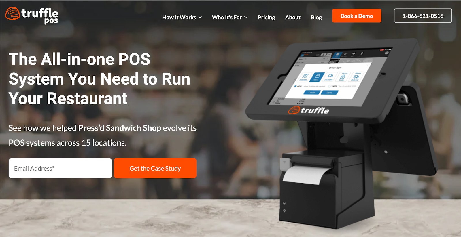
To solve this, we told them that the new site had to show visitors a POS system that looked more familiar. As you see in the screenshot below, visitors see a device they recognize when they land on Truffle POS’s home page for the first time.
We also encouraged them to create better videos. One video they made appears on this thank you page that visitors land on after they book a demo. It features the real person that prospects will speak to on the call. This allows Truffle POS to introduce a level of intimacy and legitimacy to potential customers.
If you’re a lean company that places a lot of attention on customer care, then talk like that on your website. You can gain an edge over your competitors who are big corporate drones when you do.
What makes a good B2B SaaS design?
Good B2B SaaS websites think about how each element on the site helps prospective customers in the target audience build their awareness through content and well aligned calls to action. Of course, it’s also necessary to give users a good user experience (UX) by making all the pages user friendly, accessible as well as keeping customer acquisition in mind.
A best in class B2B SaaS website will cover all of those things as well as the broader information architecture that we’ve discussed in our SaaS Authority Architecture post
AAF Action Item #6: Created “How It Works” Pages with Specificity
Another issue with the old website was the fact that product features and use cases were mixed together. As you see in the following screenshot, IQ Interactive had a page that highlighted features such as “easy registration” and “quick processing”. But displayed near it was the use case of tableside ordering.
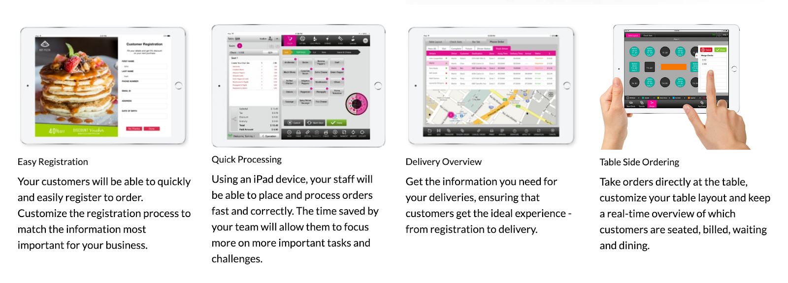
Following the Authority Architecture Framework, our recommendation was to create three categories of pages for the Truffle POS website. We also consider the website redesign SEO impact by thinking through the relevant keywords we might want to rank for. Additionally, it’s important to consider paid media landing pages too.
Let’s take a look at how we kept all this in consideration for our client:
Product Features and Benefits
We created eight different pages based on this category. For example, one of them focused on online ordering.
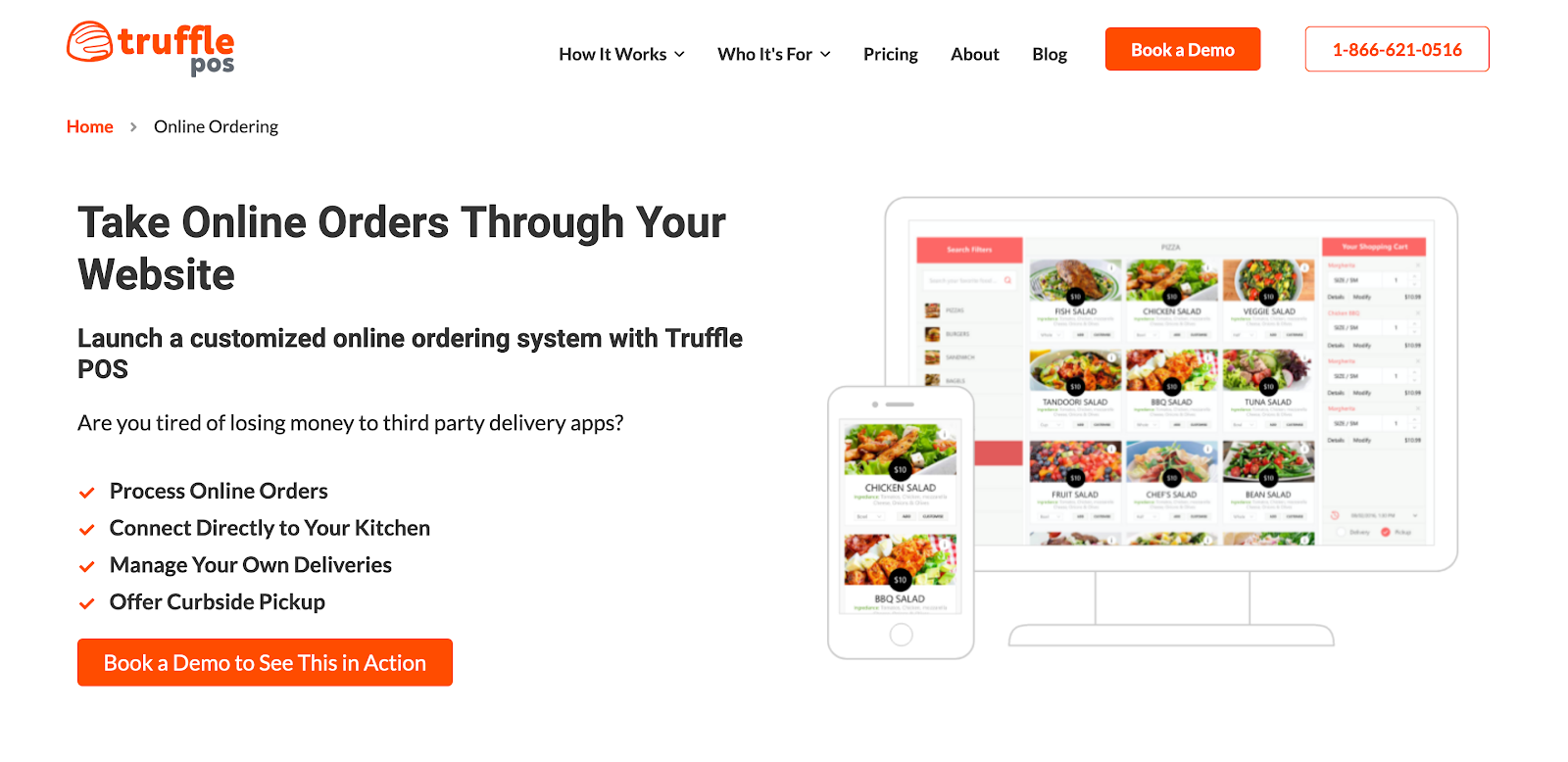
We had our copywriters create the messaging for these pages based on four design elements. We explain them below using the copy from the online ordering page as an example.
- Product Feature: “Launch a customized online ordering system with Truffle POS.”
- Pain Point Question: “Are you tired of losing money to third party delivery apps?”
- Benefit: “Manage Your Own Deliveries”
- Proof: “Book a Demo to See This in Action”
The first two elements pair the product feature with the pain point it fixes. This allows Truffle POS to discuss how the product feature delivers value and can resonate with a prospect who feels this problem. The benefit hits what we call the “pro without con” line, which echoes the severity of the pain point. The proof is the finishing touch in the copy to show how the POS software can make a customer’s life easier.
Who It’s For
We also knew that they needed to create pages that spoke directly to the people who’d use the software. For Truffle POS, we made pages for four kinds of restaurant decision-makers:
- Franchise Owner
- General Manager
- Kitchen Manager
- Restaurant Owner
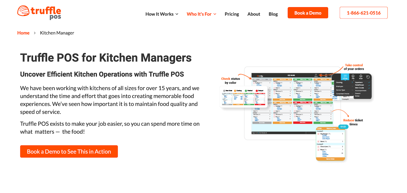
Each page included copy and content that would likely matter to those decision makers. For example, the page for kitchen managers emphasizes “the importance of maintaining food quality and speed of service”. It also featured an image of the software’s dashboard highlighting the statuses of orders and other relevant details.
Use Cases
Finally, pages in our new SaaS web design illustrated Truffle POS at work. We highlighted use cases for the following kinds of restaurants:
- Cloud Kitchens
- Food Trucks
- Franchises
- Full Service
- Hotels
- Pizzerias
- Quick Service
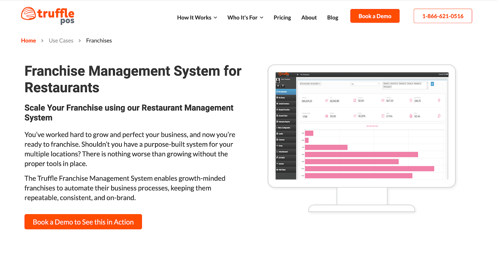
These pages expand on details shared on the feature pages, but for these specific scenarios. For reference, take a look at the copy and imagery for franchise restaurants.
Now contrast that to the copy and imagery for pizzerias.
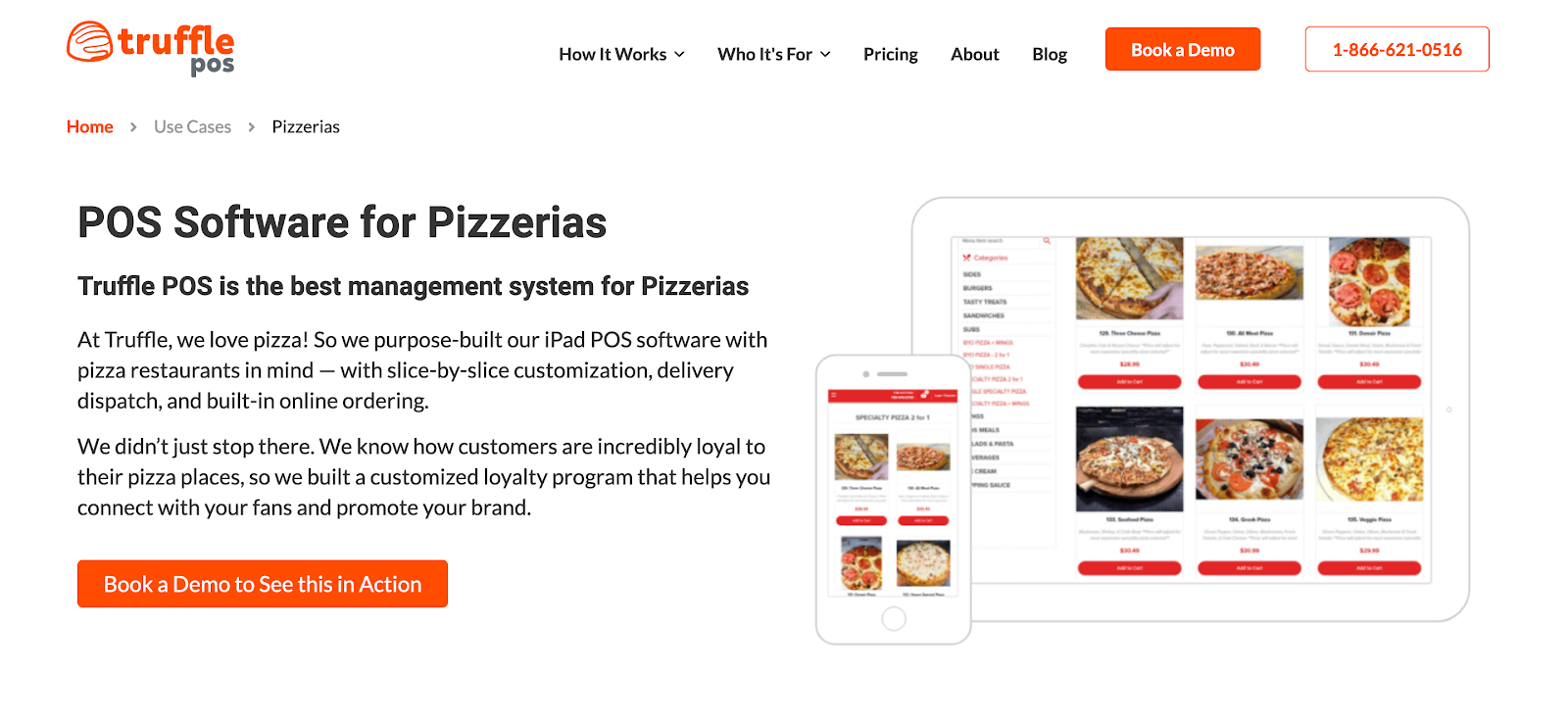
Notice the subtle differences? The franchise management page includes messaging that speaks to an audience of franchise owners (“Shouldn’t you have a purpose-built system for your multiple locations?”). Meanwhile, the pizzeria page does the same for prospects that run pizza places (“slice-by-slice customization”).
AAF Action Item #7: Added FAQs to Pricing Page
When it came to pricing, the IQ Interactive website had a solid foundation in place. They offered a three-tier pricing structure, which is something we recommend most SaaS companies do. Whether they expressed these details in dollars or not, the best SaaS website designs include information about costs.
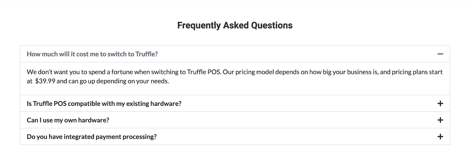
We incorporated their existing good-better-best structure for pricing on the Truffle POS site. But we also decided to include a section that answered FAQs from potential customers. Adding this handles common objections that prospects might have on their way to purchase. We’ve found that adding FAQs to pricing pages increases sales for most SaaS websites.
The Last Word
The Authority Architecture Framework is a living, breathing guide for how to structure content on your SaaS Website. Using some of its best practices will allow you to hold your prospects’ attention span and connect with them in a more meaningful way. The results often equal more qualified leads.
The way you structure your website should be revisited on a consistent basis. That’s something IQ Interactive knew and a reason why they came to us. We helped them become more specific about what Truffle POS does and who it benefits. Today, their new website engages visitors in a way that their old site didn’t.
Need an audit of your website run under our Authority Architecture Framework? Then, reach out about working with us today.
Related Resources
Deep Dives
- B2B SaaS Website Redesign Checklist
- B2B Website Design Trends and Best Practices to Enhance Engagement and User Experience in 2025
- 14 Examples of the Best B2B SaaS Homepages
- 20 Examples of the Best SaaS Testimonials Pages
- The Ultimate SaaS Rebrand Checklist: Steps to a Successful Business Transformation
Related Articles
- 7 Steps to a Successful Website Redesign
- How to Tackle SaaS Homepage Design for Your B2B SaaS Company
What you should do now
Whenever you’re ready…here are 4 ways we can help you grow your B2B software or technology business:
- Claim your Free Marketing Plan. If you’d like to work with us to turn your website into your best demo and trial acquisition platform, claim your FREE Marketing Plan. One of our growth experts will understand your current demand generation situation, and then suggest practical digital marketing strategies to hit your pipeline targets with certainty and predictability.
- If you’d like to learn the exact demand strategies we use for free, go to our blog or visit our resources section, where you can download guides, calculators, and templates we use for our most successful clients.
- If you’d like to work with other experts on our team or learn why we have off the charts team member satisfaction score, then see our Careers page.
- If you know another marketer who’d enjoy reading this page, share it with them via email, Linkedin, Twitter, or Facebook.
