The Anatomy of the Ideal SaaS Website: Best Practices from Our Authority Architecture Framework
Last updated: March 17th, 2026
Is updating your website really going to meaningfully boost conversions?
Many marketers don’t know when they should invest in a website redesign as it can often seem like a vanity cost.
Instead of just hoping that rearchitecting the website magically drives more demo signups, we first identify if the company is experiencing any of the following three pain points, as a website redesign may be a viable solution to solving those problems and increasing conversions:
- The website is underperforming: There are multiple reasons why your website might not receive enough traffic or visibility, but a poor website architecture is certainly one potential cause. If search engines can’t intuitively crawl the website, it probably won’t rank. Confusing navigation can also frustrate users and harm demo signup conversion rates.
- The “look and feel” is noticeably dated in comparison to competitors: The brand design is a prospect’s first impression of the company. Unfortunately, if a competitor’s website design is noticeably better than your brand’s design, that competitor will automatically have an edge before the prospect even begins the buyer journey.
- The website is difficult for marketing stakeholders to maintain: Some websites are built by developers for developers, meaning that it isn’t easy for non-technical people (like marketing stakeholders) to quickly make important changes and adjustments. This slows growth by creating project bottlenecks as marketers can’t immediately implement necessary changes.
If you’re experiencing any of the above three issues mentioned above, a website redesign may be the best solution to improve performance.
However, simply changing the design and feel of the website won’t magically increase conversions. Instead, you must identify the user experience issues costing conversions and then adjust the website accordingly.
Identifying these issues and diagnosing them can be tricky, so we created the authority architecture framework. It’s a proven SaaS website architecture framework that consistently turns mediocre SaaS websites into demand generation machines that attract, engage, and convert your ideal customers. In this post, we’ll explain:
- Why the traditional approach to building and architecting a SaaS website is ineffective.
- How our authority architecture framework works and why it consistently delivers results.
- Real results we’ve produced by using the authority architecture framework.
Why The Traditional Approach To Building a B2B SaaS Website is Flawed
The process of designing a SaaS website usually goes a little like this:
- Collect random inspiration from other SaaS websites for a mood board
- Ask product, engineering, customer service, and sales teams what they need
- Design the website by committee
As a result, the website probably looks visually identical to thousands of other SaaS sites (pastel colors, vectors, etc.) who have also Googled ‘SaaS website design tips,’ making your brand immediately appear undifferentiated.
However, the bigger problem is that there’s no strategy built into the website to accommodate visitors at different stages of the customer journey.
This is a problem, because not everyone visiting your website is ready to schedule a demo. For some people, the next step in the user journey may be learning about how the product works while others may need to learn why your product is better or different from competing products.
So if a CTA to schedule a demo is the only clear next step on the website, you’ll likely permanently lose all of the other prospects in earlier stages of the customer journey.
Additionally, every prospect starts the customer journey by educating themselves on how the product solves their pain points. If that information isn’t clearly available and they aren’t able to progress to the next step of the customer journey, you won’t have any late stage prospects coming to your website that are ready to schedule a demo.
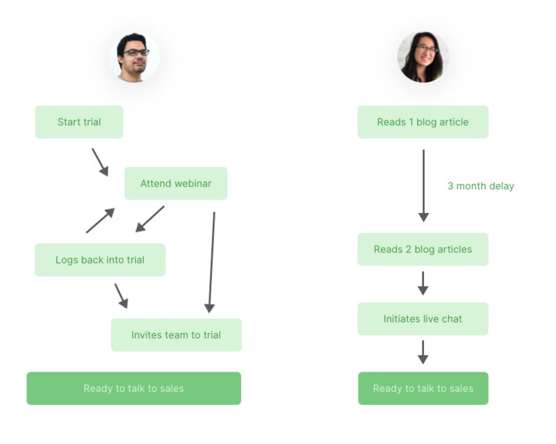
Two different customer journeys for a SaaS product
As a result, you probably won’t receive any demo signups. Or, if you do receive some signups, they probably aren’t qualified prospects, meaning the website still probably won’t generate paying customers.
In addition, if the information on your website isn’t organized in an orderly fashion, it will also be difficult for search engines to crawl the website, which can negatively impact search engine rankings.
The Solution – B2B SaaS Authority Architecture Framework
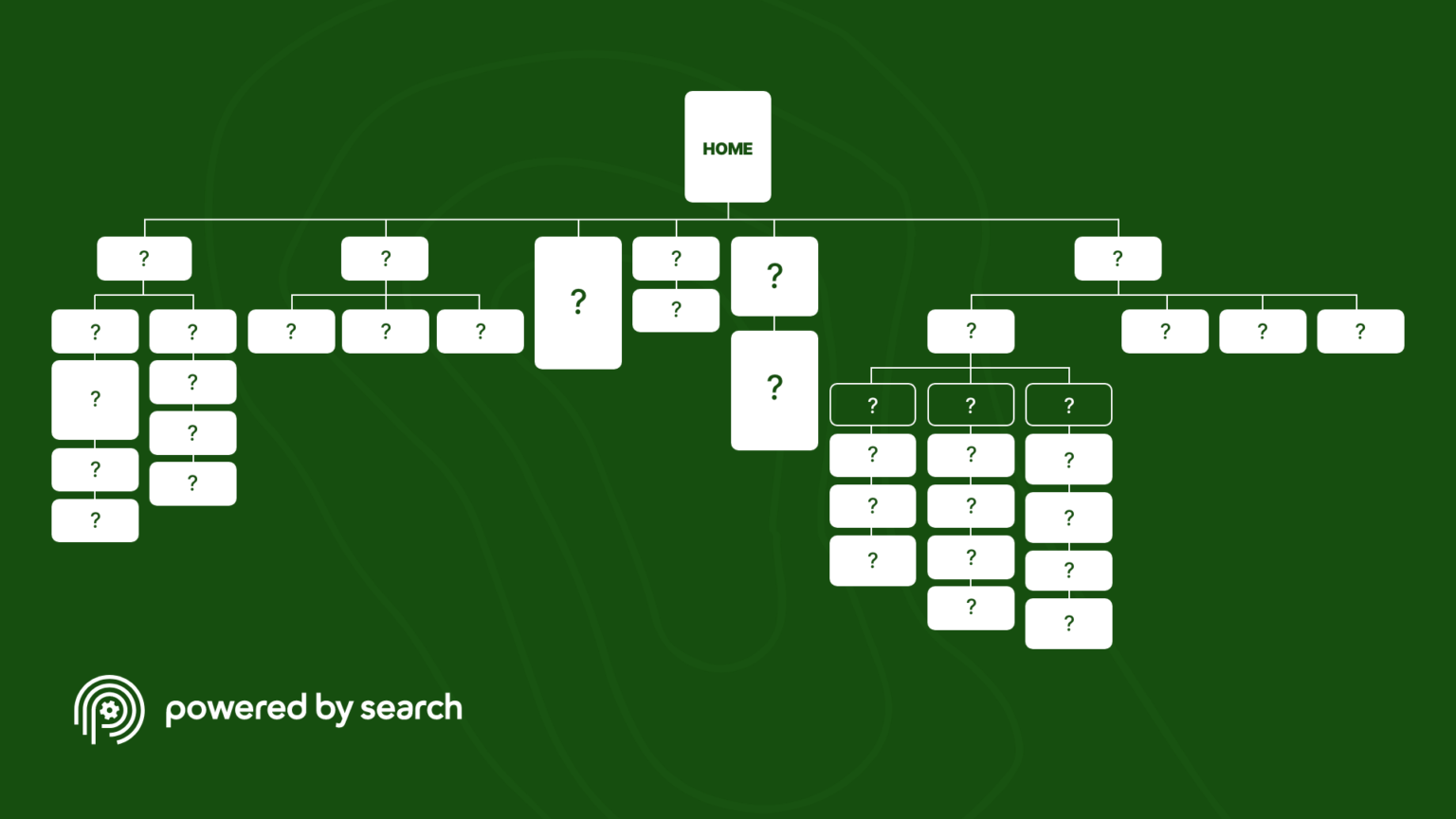
In response, we’ve created the Authority Architecture — a practical site map that we’ve used to produce high converting SaaS websites for dozens of clients.
Unlike the traditional methods of constructing a SaaS website, the first step of the authority architecture framework is considering the various stages of the customer journey. Then, we structure the website to accommodate the main user journeys. As a result, the website is not only unique from other SaaS websites, but it also is highly effective at moving users through the buyer process and ultimately drives conversions.
This visual framework is designed to show SaaS companies how to structure their site, but also helps marketers see where content and resources should be strategically placed.
Get the SaaS Authority Architecture Framework
Optimize Your SaaS Website for Maximum Conversions.
Results We’ve Produced Using The Authority Architecture Framework
Before showing the step by step process of executing the Authority Architecture framework, here are a few results we’ve produced by using it on our own clients.
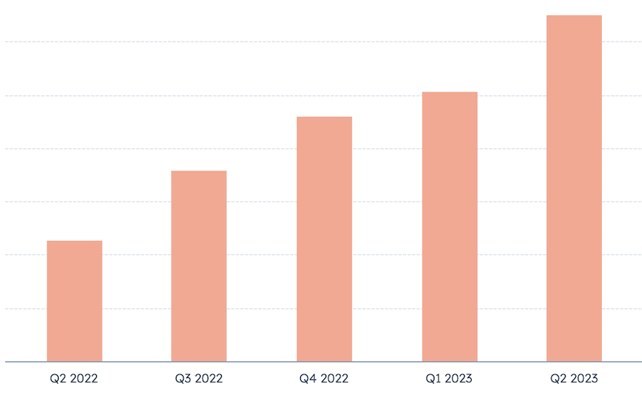
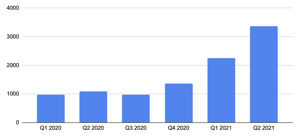
One SaaS client we implemented it on in early 2022 experienced a strong increase in organic-sourced leads quarter-over-quarter:
We also implemented it for an enterprise relationship management SaaS, and it helped them achieve a near-immediate 4x increase in non-branded organic impressions.

Another one of our clients, a SaaS in the field service industry, was running an outdated website that required significant developer maintenance and drove minimal visitor engagement.
We deployed our B2B SaaS Authority Architecture in early 2021 to completely overhaul their website experience and installed a clean CMS that the marketing team could use daily without involving the web team.
Here are the year-over-year results these changes helped them achieve:
- 2x demos from organic search
- 186% increase in organic traffic
- 800% increase in organic impressions
 Want to learn more about how to improve the performance of your SaaS website? Get your free marketing plan here.
How We Deploy The Authority Architecture Framework
At Powered By Search, we think in terms of attention, connection, and conversion. In this article, we’ll go through each section of this Authority SaaS Website Design Map, with screenshots, and focus on how to build a connection by using SaaS website best practices to speak to prospects in a way that will make a lasting first impression.
If you prefer to listen to this article, you can check it out on our podcast, SaaS Marketing Bites or listen here:
Homepage
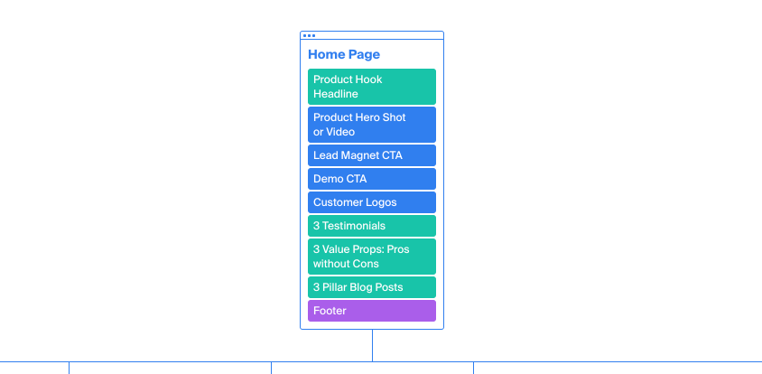
We all know the basics of a SaaS homepage: a compelling headline, an eye-catching product hero shot (or explainer video clip), an obvious demo or free trial Call-to-Action (CTA), along with a clean user interface — focusing on providing a simple user experience. And most SaaS companies also know about the impact of social proof elements — such as testimonials and customer logos.
These are standard best practices and key design elements that build trust and convert visitors.
However, we often find that many SaaS website homepage designs are poorly optimized for doing the one thing that really matters – transforming an anonymous website visitor into a known prospect.
Specifically, most SaaS homepages are very vague in an attempt to not turn off any potential customers, but it actually has the opposite effect. Instead of igniting curiosity, many visitors are simply confused about what the product is and how it will help them solve their problems, so they simply leave the website.
Another common mistake is that the homepage tries to accomplish too many things at once. For example, if you’re trying to accommodate each customer journey, you might end up overloading the user with too much information, which turns them off and causes them to leave.
While this is a well-intentioned mistake, there’s a better method to accommodate the different user journeys without overloading the prospect.
To solve these problems, here’s the Homepage formula we use:
- Headlines: We turn declarative statements into a question-based value proposition that answers “Why should I choose you over your competition?”
- Lead Magnet CTA: Offering a lead magnet on your home page guides top and middle funnel visitors further down the funnel.
- Value Propositions: Home page copy that talks about the benefits of your product and the pain points it alleviates.
- Pillar Blog Posts: Internal links to top content that targets each stage of the funnel so no visitor is left unsure of the next step to take.
- Enhanced Visuals: Showcasing your actual product in action, and not generic stock images
We’ll expand on these in more detail below.
Headlines
Many headlines are declarative statements that fail to communicate the value proposition of the company or touch on a key pain point the product solves. For example, a tagline like “Changing the world one entrepreneur at a time” doesn’t really tell you what the company does.
If the visitor doesn’t immediately understand what your product does or how it solves their problems, they’ll likely leave.
Another issue is that the tagline doesn’t communicate how you’re different from the competition.
For example, any CRM solution could have the tagline “All-in-One Customer Relationship Management.”
While this tagline clearly communicates that it’s a CRM platform, it doesn’t communicate the pain point it solves and how it is different from other CRMs.
So instead, we construct headlines by asking the following questions:
- What does the product do and what’s the main pain point it solves?
- How is it different from other competitors?
If you’re selling an enterprise CRM, a better tagline might be something like, “Are your enterprise leads going cold?”
This taps into a clear pain point that someone shopping for an enterprise CRM might experience.
Once we have the reader’s attention, we’ll dive deeper into the pain point below the headline to keep their attention. For example, we might mention something like, “Buyer cycles for enterprise companies are usually 6-9 months minimum, and a key reason why most leads go cold is because you don’t have a way to efficiently track leads and follow-up with them in a timely manner.”
Once the prospect understands that you can solve their problem and they can see how you’re different from the competition, they’ll be intrigued enough that you can direct them to the next step of the buyer journey.
Lead Magnet CTA
For many SaaS companies, creating a homepage lead magnet CTA is an afterthought. They miss the opportunity to educate people or provide added value to prospects who are in the middle of the funnel.
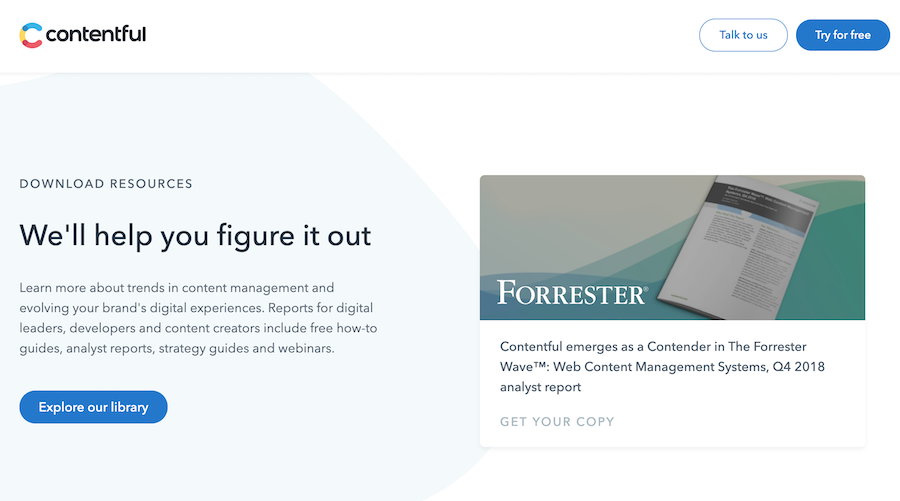
If your SaaS product is relatively low Annual Contract Value (ACV) — say, circa $1200 — you should showcase a free usable template or toolkit in your lead magnet Call-to-Action (CTA). This is a functional and valuable offer. It’s not quite the software, but it gives a preview for the real benefits the person will experience once they’ve signed up to a free trial or demo.
For higher ACV SaaS products — say, $50,000 or more — the buying decision is more complex. In this context, the lead magnet CTA should provide detailed pre-purchase education. This could be a “State of the Industry” report, a playbook for integrations, or a comparison between enterprise-level solutions.
Value Props: Pros Without Cons
We got this idea from Conversion Rate Experts, who talk about writing value propositions to talk about a benefit and the pain point the benefit alleviates — but worded in a way in which both are positive.
So, for example, a chatbot or support automation software might say something like:
“Resolve complaints in minutes, without having to hire a customer service team.”
The “resolve complaints in minutes” is the benefit, and the “without having to hire a customer service team” is the pain point that it resolves. This is a concise alternative to focusing on the pain point negatively, for example “it’s an expensive hassle to hire and train a customer service team, but…”.
SaaS product marketers often want to bury the pain points and instead highlight the benefits of the solution. However, highlighting the pain point is actually a great way to create deeper connections with website visitors and earn their trust.
Pillar Blog Posts
Many SaaS companies list the most recent blog posts on their homepage.
However, the homepage real estate is the most precious and the blog posts on it tend to generate the most traffic. So we take advantage of this by always listing the best performing blog posts (those that drive the most engagement, demos signups, or lead magnet downloads) on the homepage.
Alternatively, you can feed in your best three blog posts that target each stage of the funnel — top, middle, and bottom.
Each one of these will provide a unique journey for the prospect.
For example, a top-of-funnel blog post could feature a story of a customer solving problems that you know many of your prospects face — which can help visitors that need to become problem-aware. A bottom-of-funnel blog post could be one that discusses your pricing, or compares your product to a competitor.
How It Works
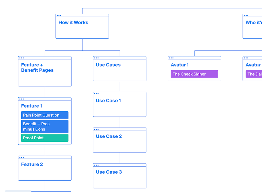
If a prospect visits the How it Works page, they’re interested in the logistics of the solution.
In an effort to hide critical product details from competitors, many SaaS companies talk about the product on a vague high level and hide the most compelling details of how the software works for the demo.
The problem with locking the most critical information behind the demo signup gate — plus requiring the prospect to turn up and watch it — is that most prospects will just leave and purchase from a competitor that does clearly state how the product works and how it will solve their problems.
You can’t really blame prospects – if one brand shows them exactly how they can solve their problem, why would that prospect go to the trouble of signing up for a demo with a brand that may or may not be able to solve their problem?
To give prospects the details they need to make an informed decision, we believe the most important elements of How it Works are the Feature & Benefit pages and the Use Case pages.
So, let’s dig into how the best SaaS companies can get these elements right.
Feature & Benefit Pages
An effective Feature & Benefit page (a Product Page) for a B2B SaaS website needs to address 4 key questions:
- Does the product match what the visitors are searching for?
- Can it do what they need and solve their problems?
- Would purchasing this product be a worthwhile investment?
- And finally, what should they do next?
As we mentioned in the How It Works section, many SaaS websites keep the information on the dedicated feature and product overview pages shallow in an effort to conceal key information from competitors.
For example, there might be a generic screenshot of the product and a high level overview of how it works, but as a result, prospects don’t actually understand what it does.
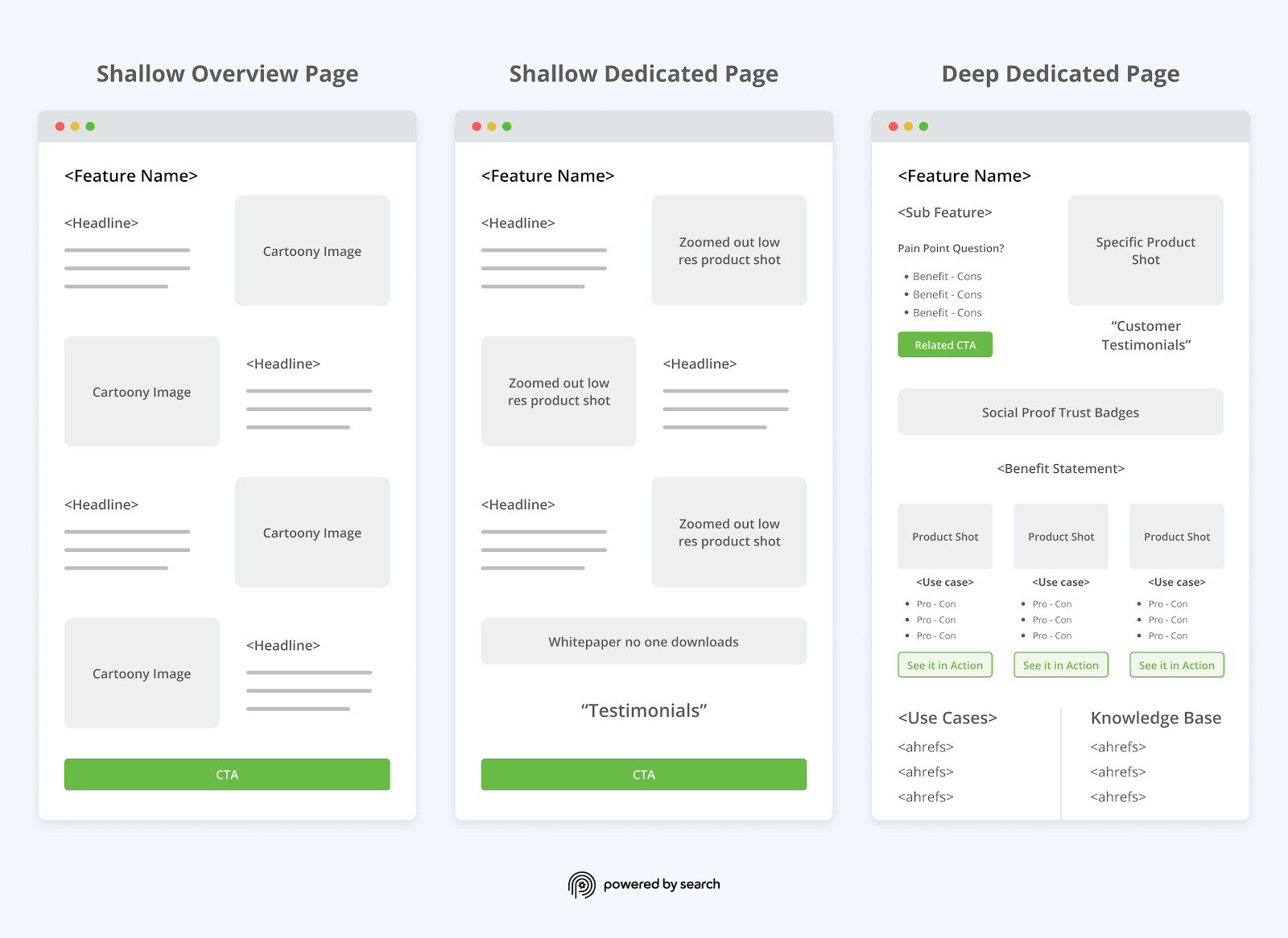
Instead, you want to create a B2B SaaS product page that answers the questions of every person at each stage of the buyer journey.
Therefore, here’s the basic framework we use:
- Point 1: State The Feature
- Point 2: Pain Point Question
- Point 3: Benefit of Using The Feature
- Point 4: Proof to Support Benefit Claim
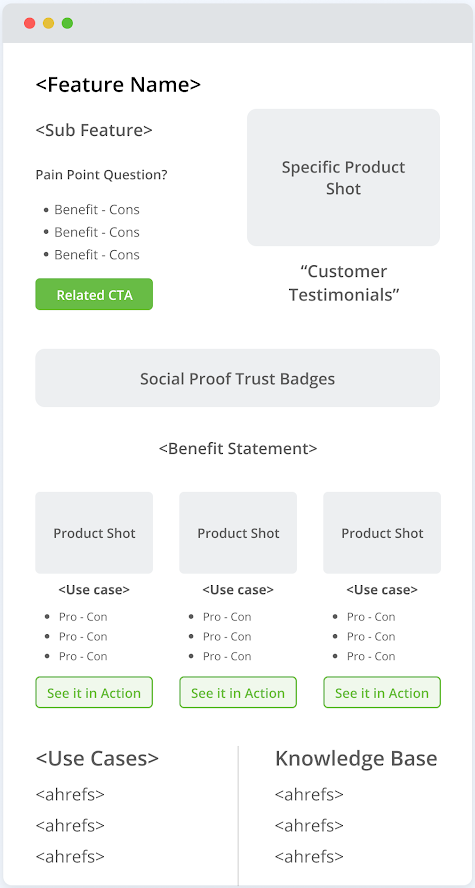
To help you visualize this concept, let’s assume we’re talking about a web-based accounting software. In this case, the Feature & Benefit pages should be structured as follows:
- Feature: “Send invoices effortlessly!”
- Pain Point Question: “Are you wasting time by sending invoices manually?”
- Benefit: “Get paid faster, without having to chase clients every week.”
- Proof: A customer story or testimonial that supports your benefit claim. “I used to spend hours each month manually sending invoices. Sometimes I would get busy and send them late or forget to send them altogether. Now that I use (brand name), it only takes me a few minutes per month to send invoices and I’m always paid on time.”
Here’s why we recommend this structure:
Firstly, point #1 (Feature) and #2 (Pain Point Question) pair the feature with the pain point it solves. This lets you talk about a feature in the context of its benefit and will resonate with the prospect who has a pain point.
Point #3 (Benefit) hits the “pro without con” line, doubling down on the pain point. Finally, point #4 gives credibility and backup to show how the product has been practically applied, with great results.
To help you visualize this structure in action, here’s an example we did for a client.
It starts with the feature; An API protection solution that just works.
Then, it discusses the pain point; Most API security starts with a complex product that requires headcount to manage. The next paragraph introduces how the solution solves that problem and provides more details on the feature itself.
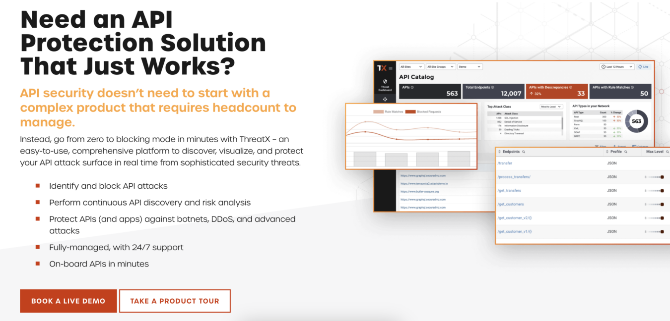
As you scroll down, you’ll see that the customer testimonial supports the claims made above (that ThreatX makes it super easy to identify and block API attacks).
Finally, we drive it home with a “pro without con” style benefit. In this case, the pro is detecting and blocking threats in the APIs, and the “without con” is that your team doesn’t need another tool to manage.
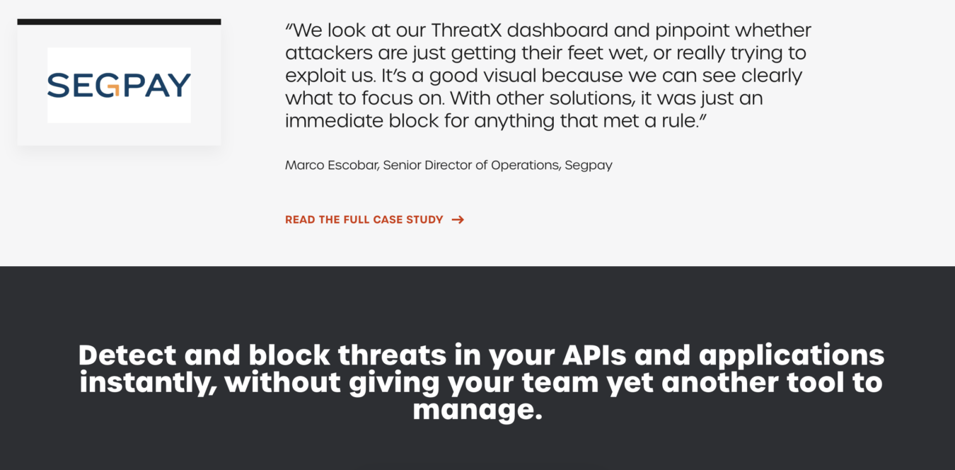
Note: A lot of SaaS clients come to us and say they don’t have a customer testimonial like this. If that’s the case for you, write one and find an existing customer that matches. Actually go to them and ask if they’re willing to write a similar testimonial or stand behind this one, tweaking it to however it applies to them. Don’t wait for it — look at your customers and find a quote that matches the story you want to tell. Honesty in the testimonial is paramount.
Use Cases
Often, the fastest way to quickly communicate how something works and its value is by giving an example of it in action.
This is the job of the use case page.
For example, let’s say you have a membership management software (like our friends at Wild Apricot). Users are typically teachers, local associations, little leagues, and community groups. They often start in Excel, but as their membership database grows, the document keeps crashing. This is a real and acute pain point.
In this scenario, one Use Case would tell the story of how Wild Apricot has eased the pain for real customers by giving them a reliable, smooth, and fast way to manage members. It would talk about how Excel would crash at inopportune times, and show how this messed up operations. SaaS to the rescue!
Use Case pages expand on the information in Feature & Benefit pages — which usually don’t have space for such a detailed story. They also tap into the Who It’s For section of the website — which is something we discuss in the next part of this article.
Who It’s For (i.e. Not Just Solutions or Verticals Pages)
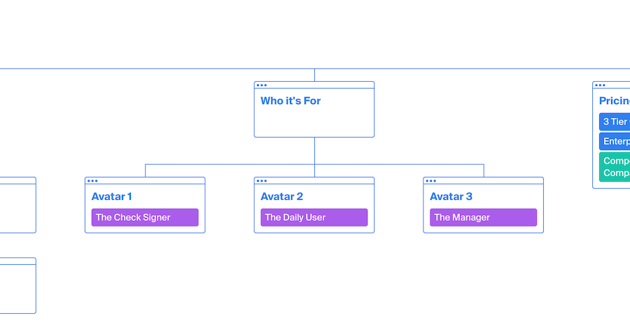
Many SaaS websites build pages that address the solution it provides or a particular vertical it serves (e.g., healthcare, finance, etc.).
However, addressing a single vertical is insufficient because there are typically multiple different people involved in the buyer journey for an enterprise B2B SaaS product, and ignoring one or multiple avatars involved in the purchase process can cost you a conversion.
For example, if the person who will use the product understands how it will make their life easier, but the stakeholder signing off doesn’t understand how it will make the company more money, the sale might fall through.
To solve this problem, we ensure each “who it’s for” page speaks to a specific buyer persona (e.g., the specific role or job title) involved in the purchase process.
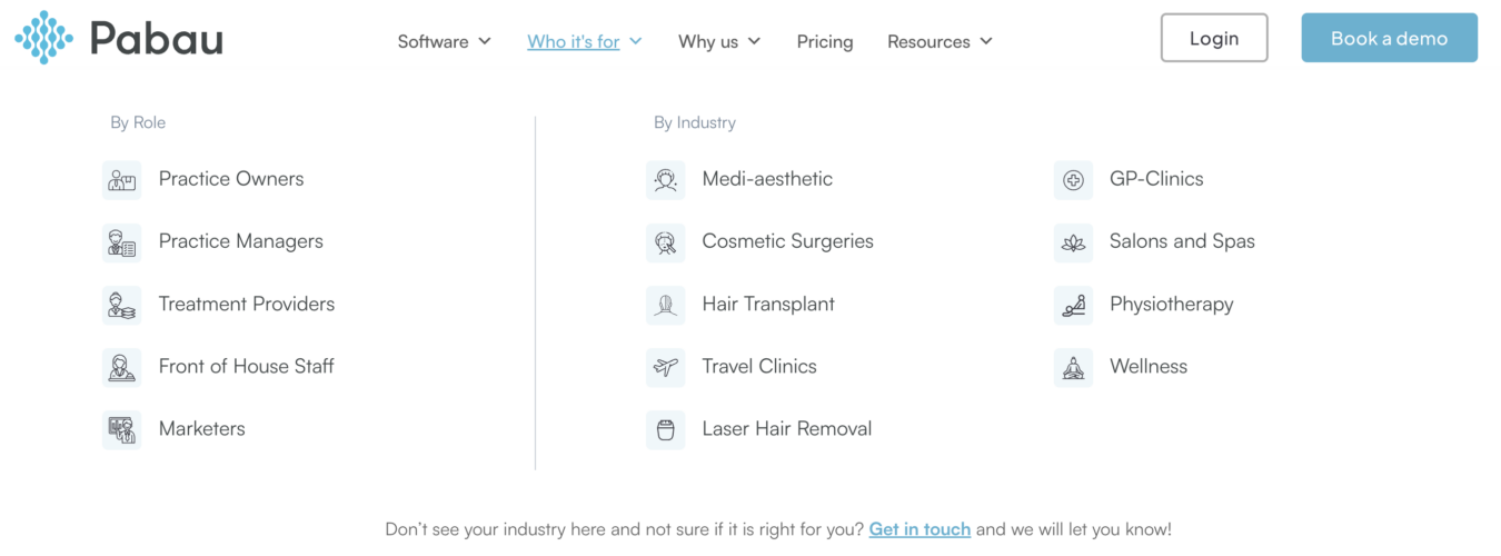
Here’s a great example from one of our clients, Pabau.
You can see that we have “Who Its For” pages by role (practice owners, practice managers, treatment providers, etc.) as each of them will use the product differently and receive different benefits from it.
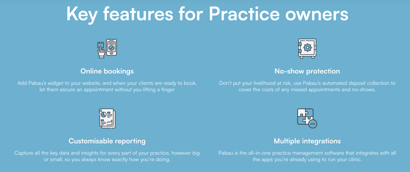
For example on the page for practice owners, we show how the product will help them drive more revenue (reducing no-shows, improving online booking conversions, etc.), as revenue is what they care about the most.
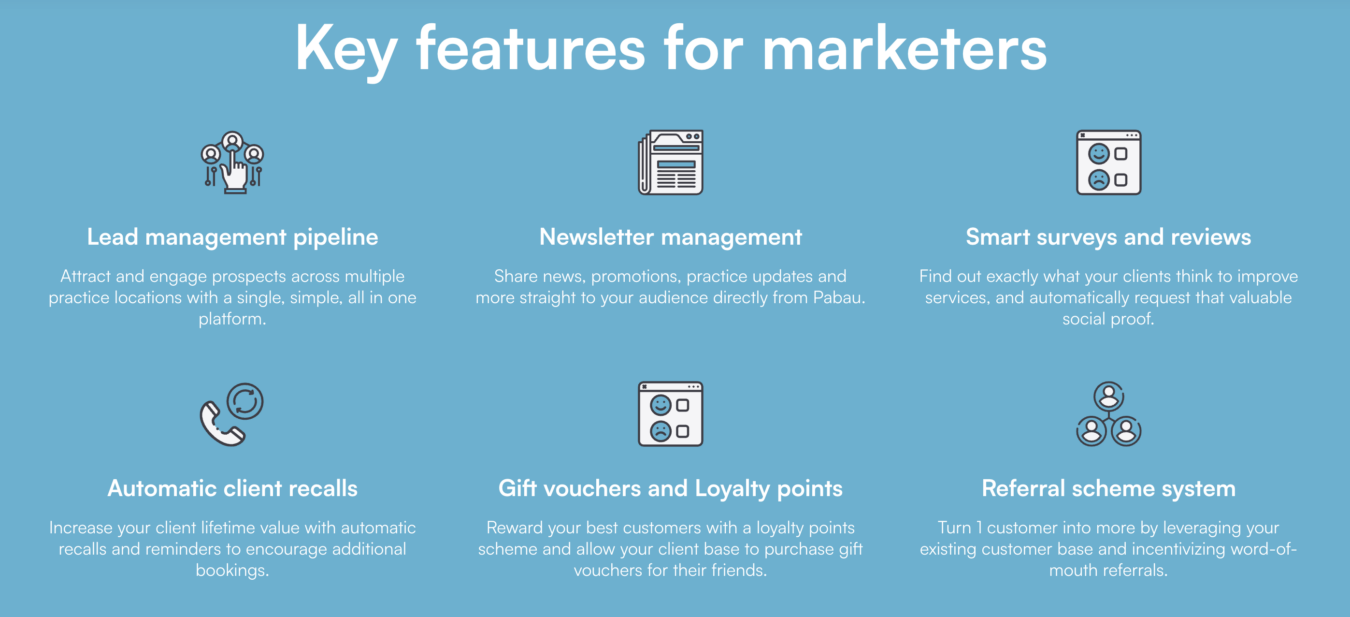
In contrast, the page for marketers shows how the product will make them more efficient by automating tasks and provide the data they need to improve their marketing strategy.
There is also a “Who Its For” page by industry (e.g., medi-aesthetic, cosmetic surgeries, etc.) so that each industry can see how the product will aid their specific use case.
How Is Who It’s For Different from Features and Use Cases?
These pages are different because they are explicitly geared towards a particular individual persona. There’s no subtlety — just obvious examples of how the software positively impacts their job.
This is the key thing to remember: we often use the same stories, features, and use cases as on other pages, but the information is angled more precisely to an individual. In my opinion, most SaaS websites are too paranoid about repeating the same content in various areas. On the contrary, we believe that you should double-down on the most compelling stories, and apply them in ways that make sense for each area of the site. If you look at what we include in the Feature & Benefit pages, the Use Cases, and the Who It’s For section of a website, you’ll see a lot of overlap. This is purposeful.
It’s not about only using one message once. Instead, you should be shaping your value proposition in different ways, with a different emphasis for different pages. It’s website personalization without the tech.
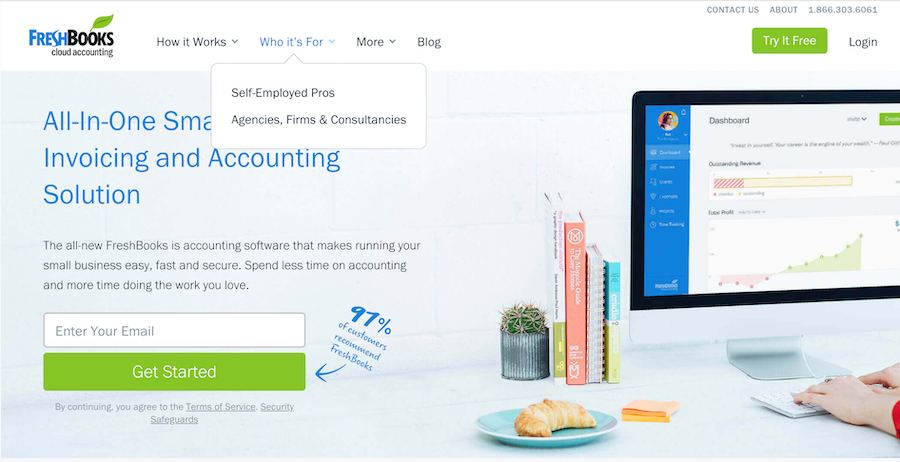
Source: FreshBooks
The Remarketing Benefits of Who It’s For
The Who It’s For section can also power your remarketing engine, because you can target specific audiences after they’ve been on the site.
When they hit one of the avatar pages — and/or spend a certain amount of time on a page, you can retarget them with relevant pain point focused content in their feed. We call this strategy the Boomerang Method and discuss it in more detail in our remarketing guide.
This can also be applied to the Use Cases — where you can glean that a user is particularly interested in a certain application of the SaaS product to solve a certain problem.
Pricing Page
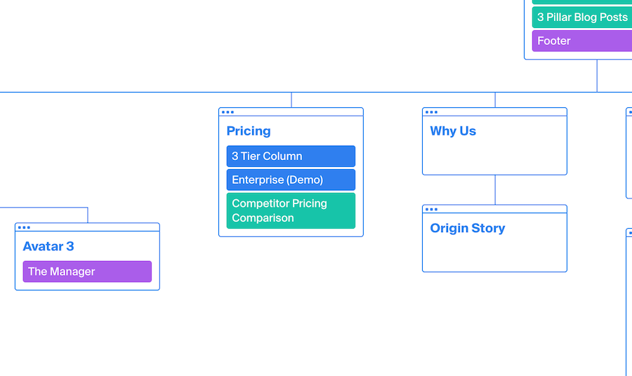
All SaaS websites should feature information about pricing, whether it is explicit in dollars or not. For higher level enterprise SaaS products, it’s often not even possible to give numbers due to the complexity of custom integrations. But that doesn’t mean you shouldn’t have a pricing page.
The workaround might be something to pre-qualify prospects, like:
“We don’t have standardized pricing options, but we might be a good fit for you if you have a growth team of more than ten people and you’ve already invested in [Expensive Solution X] or [Expensive Solution Y].”
This sends an implicit message that your SaaS product is geared towards bigger teams and hefty budgets.
However, for most lower-ACV SaaS companies, we recommend the standard 3-tier pricing structure. And without exception, in our opinion every SaaS pricing table should include a non-priced “Enterprise” (or similar) field. This can simply lead to a contact form to get in touch with your sales team.
Someone who fills this out is signaling that they want to “fly business class” — and that they couldn’t possibly take their boss an invoice for $99. By not having this option, you might be missing out on revenue, or you might even dissuade the highest-tier potential customers from signing up.
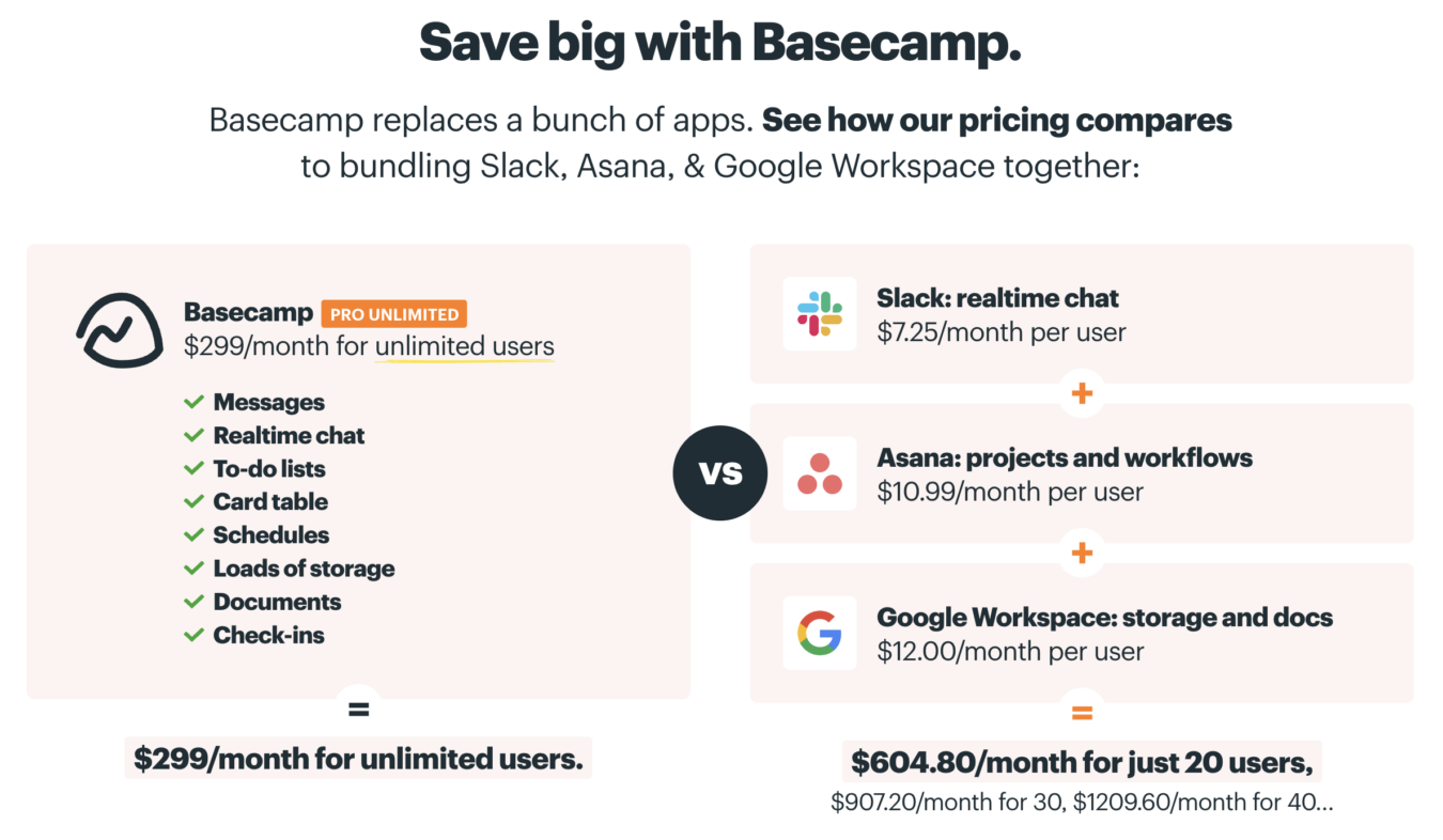
Finally, if possible, you should show how your pricing compares to competitors. Basecamp does this better than any other SaaS product I’ve seen:
Why Us & Origin Story
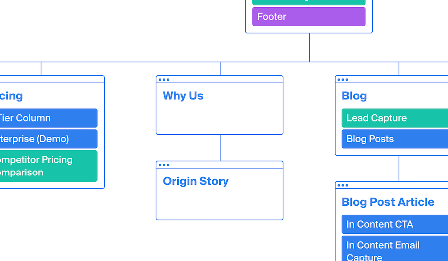
Next up in the SaaS website architecture: Why Us and Origin Story.
This is where you pitch your brand as something more than just a software product. A lot of SaaS companies get blinded by the black and white of wanting conversions, and they get obsessed with selling the product’s value proposition. They don’t invest a lot of time or energy in these “softer” parts of the website.
But a lot of buyers are looking for more. They want to understand the culture behind the organization, the commitment to social responsibility, and the bigger long-term mission.
Remember: the customer is entering into a subscription model, so they’ll be interacting with your brand on an hourly, daily, or weekly basis. They need to know what you stand for — because you’re becoming a colleague.
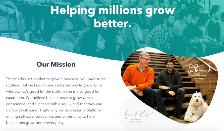
Source: HubSpot
Blog
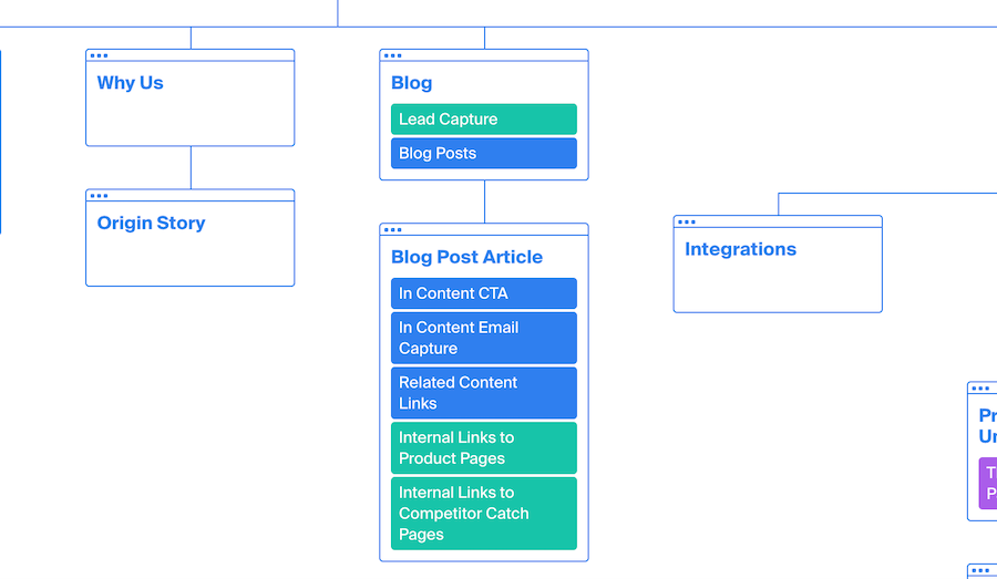
Blog pages can quickly become the most trafficked webpages of a B2B SaaS website, but few SaaS blog posts are well optimized for conversions.
We have a separate resource detailing our approach to B2B SaaS blog design, but the main elements of optimizing a blog post for conversions include:
- Minimizing the header to guide the user journey to high value resources.
- Adding last updated dates to signal content freshness for search engines and visitors.
- Simplifying the sidebar menu with jump links for a clean user experience.
- Internally linking to product pages, use cases, and gated offers to increase website engagement.
- Driving action with “What you should do now?” next steps
This approach removes distractions from the blog posts while clearly pointing the reader towards the next step of the buyer journey and is therefore a highly effective method for increasing blog post conversions.
Additional Pages
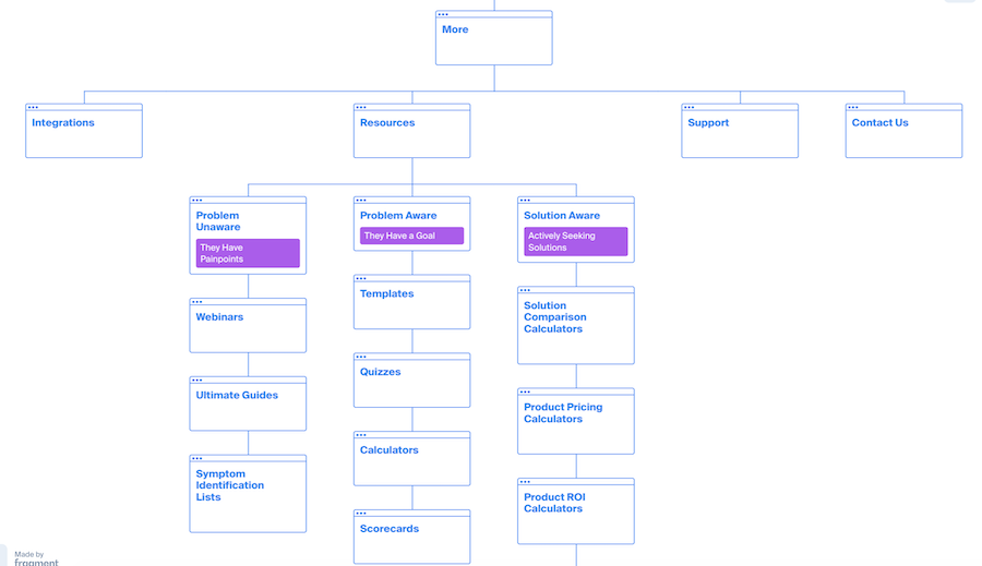
Here, we’ll discuss a collection of additional pages that most SaaS marketing sites have: integrations, resources, support, and contact pages.
The first decision to make is placement of these pages on the website.
We typically make these decisions on a case by case basis, but as a rule of thumb, we don’t want to clutter the main navigation.
Therefore, we often recommend to our clients to include Support pages, and even sometimes the Resource pages, in the second-tier structure on their websites.
However, this isn’t a hard and fast rule. For example, if the product is very developer focused, it might make sense to have resources and support documents readily available in the main header. In contrast, if the product is typically purchased by and for non-technical stakeholders, it likely makes sense to place these pages in the footer.
The same logic applies to the Integrations pages.
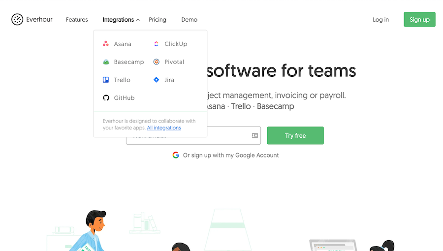
In most cases, we’ll place the Integrations page in the website’s footer, but if the software depends heavily on other integrations, it might make sense to add it to the header.
For example, Everhour (see below) is a time tracking software that needs to be plugged into a project management tool — so integrations are a key selling point:
Now that we’ve discussed where to place these pages on your website, let’s discuss how we approach structuring them.
Integrations
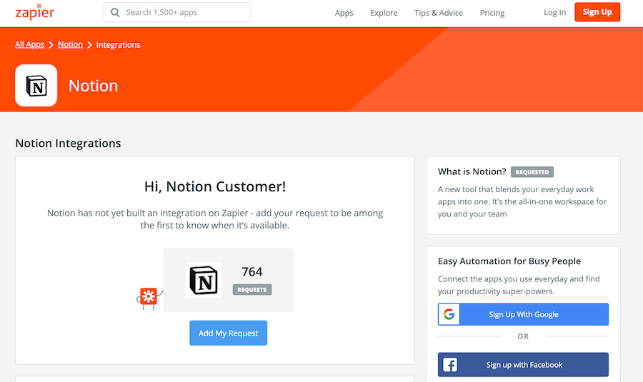
First, your integrations page(s) should target the technology’s keywords with your content, even if your solution doesn’t yet integrate with a particular tool. If it’s on the roadmap, get it onto the site with a “coming soon” or “do you need this integration? Let us know…” message.
The danger of not doing this is that a tool like Zapier will get a handle on these keywords. You’ll miss out on traffic, and as a result you’ll lose the opportunity to easily remarket to people on your landing page.
For example:
Resources
I’ve seen a lot of SaaS companies produce new resources without considering where the gaps are in their funnel. In the Resources section of the Authority SaaS Website Design Map, we have 11 different content types, split between awareness stages: Problem Unaware, Problem Aware, and Solution Aware.
The role of the resources in this section is to move people from Problem Unaware to Solution Aware.
Marketers think “if a webinar went okay last year — why not do another one?”, but this is haphazard and not strategic enough. Instead, we use a methodical approach for planning SaaS marketing resources, using a traffic light system to figure out what works and what doesn’t:
- If you’ve never done webinars, that’s a red.
- If you’ve done webinars and they went okay, that’s a yellow.
- If you’ve nailed webinars and they successfully generate leads on a consistent basis, that’s a green.
We do this for every resource, and by the end of the exercise it’s clear which areas need improvement.
Next, we work backwards through the list to improve resources from the bottom of the funnel to the top. In other words, we start with double down on greens (resources that have been proven to work) and optimize them or find ways to get more demo requests or signups from them, before moving to yellows and reds. Note that this is contrarian to most growth hacking lore, which focuses on how to get more traffic, rather than converting the traffic a company already gets.
Footer
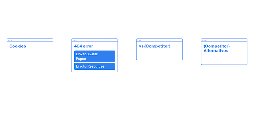
Don’t miss an opportunity with the 404 Error Page. Can you direct them to an avatar page, or can you identify their pain points and/or motivations in another way?
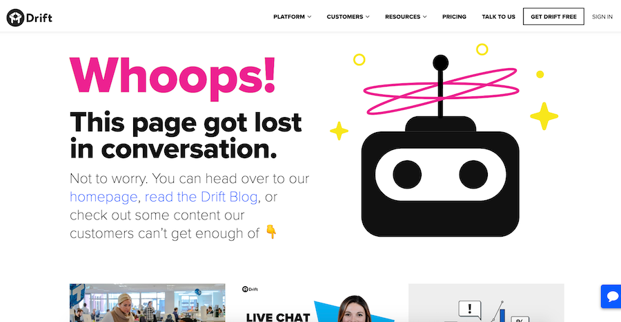
Source: Drift
The footer is also a useful place to host content about competitors and alternatives. Whether you like it or not, your prospects will be surfing around and comparing solutions. These pages should be designed to rank organically for keyword terms — to make sure you have your say in the conversation.
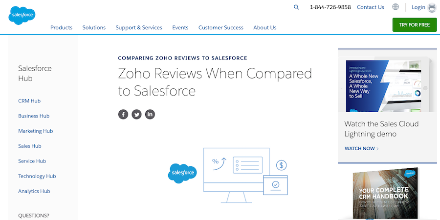
Source: Salesforce
How to Drive More Conversions from Your B2B SaaS Website
The key to boosting website conversions isn’t just about making the design look pretty. It needs to also take into account the user journey and be structured in a way that compels the visitor to take the next step towards scheduling a demo.
This is why the websites we’ve built for clients are very effective at driving conversions. We aren’t just a design agency focused on improving the look and feel of the website – we’re a performance based marketing agency that specializes in demand generation for B2B SaaS, so we understand the intricacies of each step of the buyer journey.
In addition, using a single partner to build your marketing channels (SEO, PPC, etc.) and your website leads to a more seamless, branded, user experience, which ultimately moves prospects through the buyer journey with less friction.
As an added bonus, our web development team specializes in developing websites on popular marketer-friendly Content Management Systems like WordPress, HubSpot, and Webflow. This means any marketer can implement new strategies immediately without waiting on IT backlogs. As a result, you’ll see faster time to value and experience less frustration.
Want to learn more about how we can help you improve conversions by redesigning your website architecture? Reach out about working with us here.
What you should do now
Whenever you’re ready…here are 4 ways we can help you grow your B2B software or technology business:
- Claim your Free Marketing Plan. If you’d like to work with us to turn your website into your best demo and trial acquisition platform, claim your FREE Marketing Plan. One of our growth experts will understand your current demand generation situation, and then suggest practical digital marketing strategies to hit your pipeline targets with certainty and predictability.
- If you’d like to learn the exact demand strategies we use for free, go to our blog or visit our resources section, where you can download guides, calculators, and templates we use for our most successful clients.
- If you’d like to work with other experts on our team or learn why we have off the charts team member satisfaction score, then see our Careers page.
- If you know another marketer who’d enjoy reading this page, share it with them via email, Linkedin, Twitter, or Facebook.
