The SaaS Blog Design Template We Use To Lift Conversions
Last updated: March 17th, 2026
Aesthetic improvement is often the primary focus of most SaaS blog designs, but a visually appealing blog doesn’t necessarily convert.
For many SaaS blogs, the only option for prospects to take the next step in the buyer journey is a CTA to book a demo at the bottom of the blog post.
Yet most readers won’t take that action because they either:
- Don’t make it to the bottom of the blog post, or
- They simply aren’t at a stage in the buyer journey to schedule a demo.
As a result, you only retain a fraction of the traffic visiting your blog and this pattern also sends a negative user experience signal to search results, harming your SEO.
In this article, we share our Authority Blog Post Architecture for B2B SaaS.
It’s a basic template or foundation that helps solve these problems. It’s meant to support conversion and lead generation and can be used for inspiration when creating wireframes for your website.
Why Most SaaS Blog Designs Are Poorly Optimized
Most B2B SaaS companies have visually appealing, on-brand blog designs. Here are some of the more nuanced problems we encounter that aren’t always immediately obvious.
1: The Only CTAs Are Placed at The Bottom of The Blog
Most blog readers don’t reach the bottom of the blog post. So, if your CTA is only placed at the bottom of the blog post, only a fraction of your traffic will convert.
Now sure, you might have a CTA to schedule a demo in the website header, but first time website visitors likely have no idea what you offer. So it’s very unlikely they’ll click to schedule a demo for a product they know nothing about.
Instead, we include multiple CTAs throughout the blog content and provide context that illustrates how our product solves the problem they’re researching and why scheduling a demo is the next step to achieving the solution they need.
2: Lacks Alternative Content Links
You’ll encounter two problems if you don’t have a proper internal linking strategy implemented in your blog design.
- Negative SEO Impact
Internal links help search engine bots find your content and understand what you’re an expert in.
For example, suppose you have multiple blog posts about content marketing. If those posts are all internally linked, it will be easier for search engines to determine that you’re a content marketing expert. This is important because search engines prefer to rank websites that are known “experts” in the subject people search.
- Losing Website Visitors
After a blog post reader finds the answer to one of their problems, they’ll likely encounter another question.
Often, readers will return to Google and do another search for the new question, causing you to lose the visitor you invested in bringing to your website. However, you can retain that visitor if you offer an internal link to a blog post related to that question.
This also has indirect SEO benefits, as search engines will see that users enjoyed your content and stuck around.
3: The Blog Post Lacks Navigation Options and Is Difficult to Scan
Have you ever landed on a blog post that’s thorough and informative, but so long that you can’t find what you’re looking for?
If it’s an overwhelming wall of text without a sticky table of contents to navigate to a specific section of the post, you’ll probably just click back to the search results.
While it is important from an SEO perspective to create thorough content, it’s also important that people can easily find specific sections of your blog post, and that it’s visually easy to scan.
Therefore, we ensure clients have a sticky table of contents and include relevant visuals where it makes sense.
The Authority Blog Post Architecture for B2B SaaS
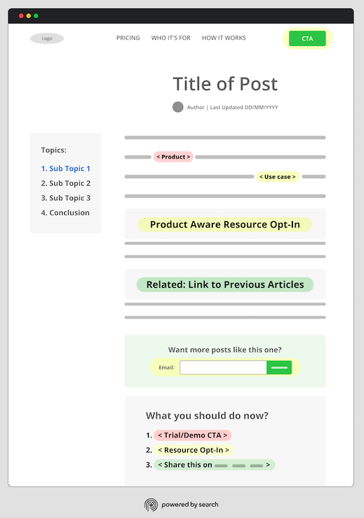
Below, we walk through the various elements of our blog architecture and describe how they differ from the traditional SaaS blog design approach.
We’ve broken the architecture down into 5 categories. Feel free to use these links to jump to a section that interests you, or keep scrolling to view them in order:
Note: We’ve used traffic-light-style color coding based on reader purchase intent. In the graphic above, elements highlighted in green require the lowest intent from the reader to click, ones in yellow require medium intent, and the ones in red require the most. We’ve positioned each link or CTA strategically based on these varying levels of intent.
1. Header Menu
Consider this header menu on a Shopify blog post:

At first glance, it’s not overwhelming. But when you take into consideration each of the drop-down menus, that quickly changes.

While Shopify’s scope makes them an exaggerated case, most SaaS companies consistently use their full header menu throughout their site, including their blog.
This is partly because content management systems like WordPress do this by default. But we believe SaaS companies are missing a CRO opportunity here.
What we think they should do differently is include only the links that matter most, taking inspiration from widely used best practices in landing page design.
The idea is to think of your header as an elevator pitch for the value proposition you want to communicate to somebody when they’re first meeting you.

For example, you could exclude elements like your resources and integrations. Instead, focus strictly on the fundamentals of your pricing, who you serve, and how your SaaS product works.
Then, rather than using a high-intent CTA like the standard trial or demo, we suggest using a medium-intent CTA. This will better match the intent level for the majority of your blog audience and allow you to guide more of them down the funnel from there.
For example, if you have an explainer video, you might consider viewing that as your Header menu CTA. It’s a 90-second commitment that helps with engagement and time spent on page.
And it’s likely to be more appropriate for most new site visitors, considering their stage in the funnel. You could even set up a trial or demo CTA to display once the video is over.
For more ideas on types of medium intent content you could use for your header CTA and, more broadly, how to build an effective SaaS content marketing strategy, check out our article on SaaS content strategy.
2. Blog Post Date
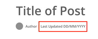
Refreshing content has become a commonly practiced SEO tactic, and savvy SaaS companies periodically refresh their pre-existing content to improve its performance in the search engine results pages (SERPs) and ensure it’s up-to-date with current industry trends and best practices.
However, it’s important to also update the originally published date.
Updating the publish date signals to Google and other search engines that you’ve refreshed those pages, allowing your post to satisfy Google’s “Quality Deserves Freshness” criteria.
In addition, readers are more likely to trust your page if they see it’s been updated recently.
You can use a plugin like WP Last Modified Info to automatically update the publish date.
3. Sidebar Menu
The sidebar is prime real estate to encourage your reader to take action, but many SaaS blogs underutilize this opportunity.
It’s common that the blog either:
- Doesn’t include any clear CTAs in the sidebar, or
- There are so many different options that the reader doesn’t know which one to click.
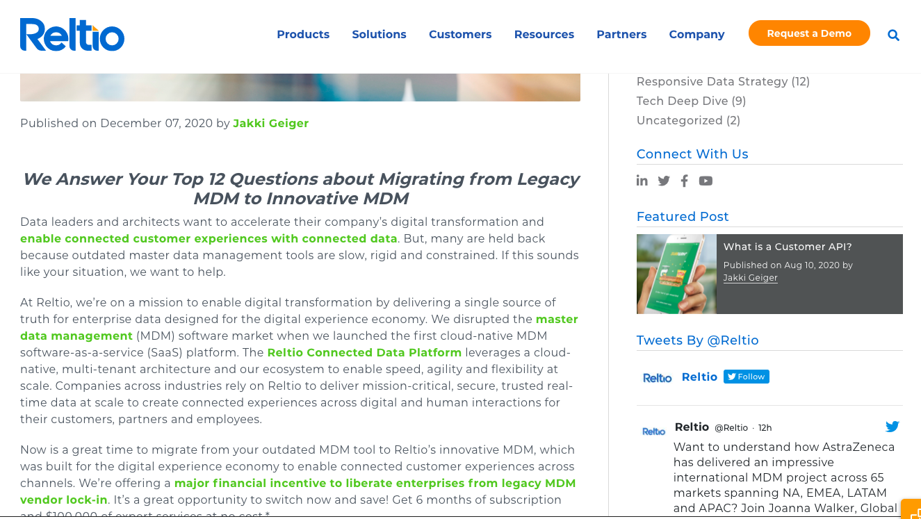
For example, you can see that the sidebar of Reltio’s blog is too crowded with social icons, featured blog posts, category pages, and other information, making it unclear what the user should do next.
This hurts conversions because the clutter overwhelms the user and they’ll simply ignore the sidebar.
Instead, look at your marketing funnel and include only an email signup and a single CTA for the next step in the funnel (e.g., schedule a demo, sign up for a whitepaper, etc.).
If you look at our right-hand sidebar, you’ll see that this is the structure we use.

On the left side, incorporate a table of contents to make it easy for readers to navigate the blog post. If you produce in-depth content, it can be overwhelming for readers to scroll through it and find the sections most relevant to their question. As a result, many of them will simply click back to the search results.
If readers immediately leave your blog post, you’ll not only lose them as customers, but it also signals to search engines that your blog post isn’t a great answer to the search query, which can cause it to drop in rankings.
A table of contents solves this by allowing users to easily jump to relevant sections of the article.

When users are more engaged with your content, they’re more likely to see more of your CTAs, and ultimately take the next step to convert into a customer.
When users are more engaged with your content, they’re more likely to see more of your CTAs, and ultimately take the next step in the buyer journey.
4. Blog Content
Informative blog content can drive traffic and satisfy user intent, but if there isn’t a compelling call to action that drives users to the next step in the marketing funnel, it won’t convert.
The good news is that you can significantly increase conversions by simply incorporating contextual CTAs.
Below, we’ll cover how we think about structuring links and CTAs within blog post introductions, body content, and conclusions.
4.1 Introductions: Linking to Product and Use Case Pages
A key reason SaaS content strategies often fail is that while the content may answer the searcher’s pain point, there’s no mention of the product as a solution to the pain point the user searched.
If users don’t understand how your product solves the problem they’re researching, there’s no reason for them to schedule a demo or start a free trial.
Alternatively, many SaaS blog posts only explain how the product solves the problem at the end of the blog post.
Yet most people won’t read to the bottom of the blog post. Instead, we introduce the product as a viable solution to the pain point the user is researching within the first few paragraphs.
If you’re worried about coming across as “salesy,” simply craft the copy to illustrate why the product is the most efficient solution to their problem.
Remember, readers are looking for the most efficient solution to their problem. Assuming your product is an efficient solution, readers will actually appreciate the product pitch.
Additionally, we’ll link out to more detailed explanations of the most relevant product pages that explain specific features relevant to the topic of the blog post.
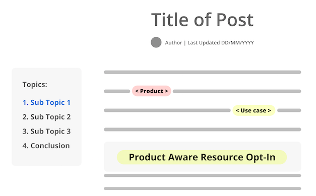
For readers with higher purchase intent, these internal links allow them to learn more about your solution and potentially book a demo or sign up for a free trial. At the same time, it gives readers with mid-level purchase intent an introduction to your product while also presenting a manual solution to their problem
Either way, you give readers a soft introduction to your product and move them from problem aware to solution aware, taking them to the next step in the buyer journey.
Internal links are also beneficial from an SEO perspective as they pass authority from one page on your site to the receiving page, and they also help search engine crawlers discover those pages.
4.2 Body Content: Contextualized Gated Offer
Most people reading your blog content aren’t ready to schedule a demo. Yet if they read the content and simply leave your website, it’s unlikely they’ll return or remember your brand when they are ready to buy.
To solve this problem, we insert a gated offer into the blog post to capture their email address. Then, we can remarket to them and move them through the buyer journey more efficiently.
The key to making gated offers work are:
- Placement
- Pain point relevancy
Placement
We typically place gated offers part-way through the post, though you can experiment with positioning anywhere in the first half of the content.
The CTA itself should only ask for an email in exchange for the resource.
Note: This could be a banner, or text with a CSS highlight box around it, but it should look different from the rest of the post.
HubSpot routinely implements this throughout its blog. Here’s a great example:

4.3 Body Content: Linking to Related Articles

However, you’ll benefit more from your internal links if users actually click on internal links. Specifically:
- SEO Benefits: Search engines will reward your website if they see users engage further with your website, because they assume your content was helpful.
- Retention Benefits: The more touchpoints a user has with your brand, the faster you can move them through the buyer journey.
While most SaaS blogs use plugins to display related articles in the bottom of the blog post, we find these internal links receive few clicks because:
- A low percentage of visitors reach the bottom of the page.
- Links to content related to the blog post topic aren’t as relevant to readers as links to blog posts that provide a deeper explanation of specific terms or sub-topics mentioned in the content itself. (e.g., A link to a blog post on link building in a broader guide on SEO that has a brief section discussing link building).
Instead of including related content at the bottom of the post, we include related content throughout the post.
Here’s an example from our own blog:
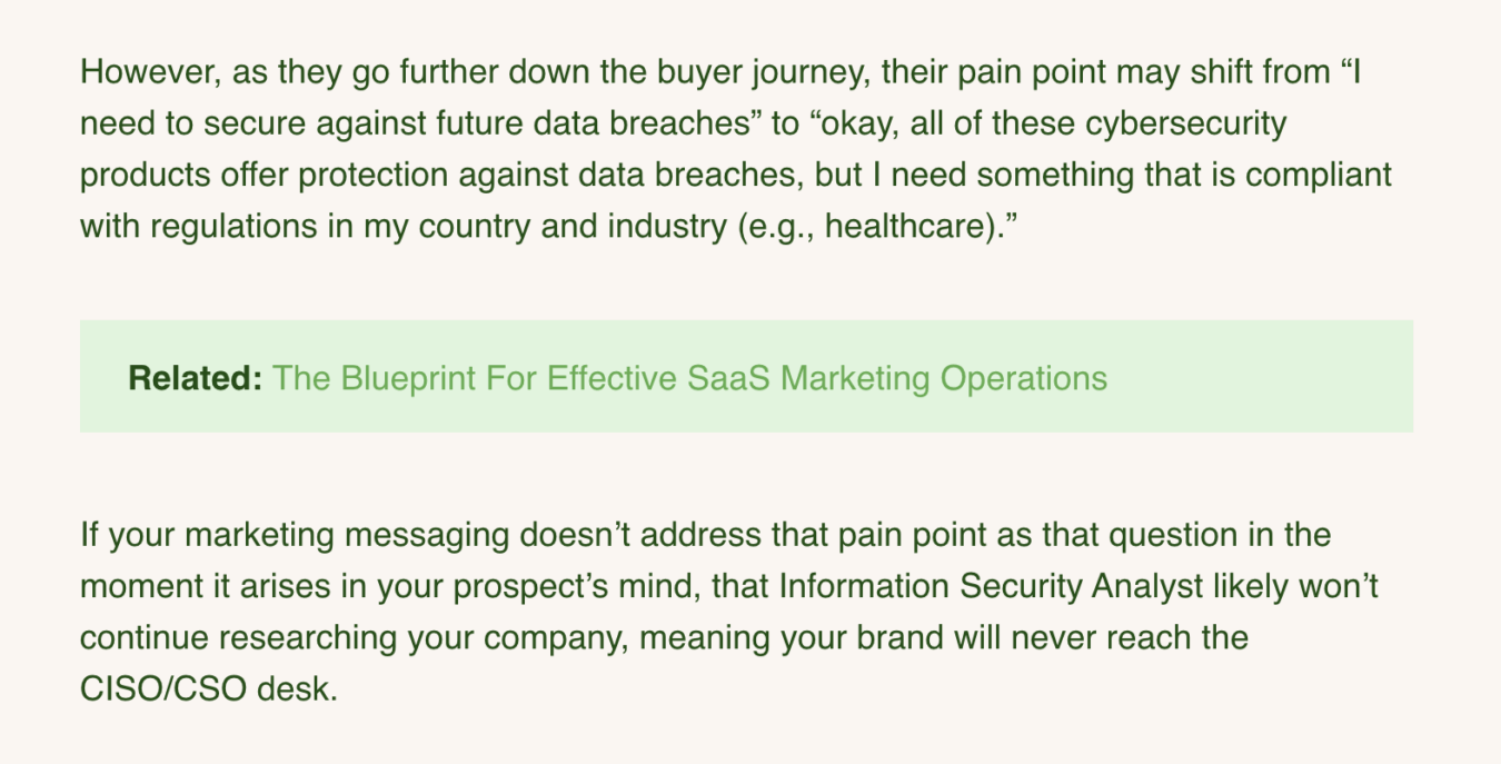
IntellyWP is one of our favorite WordPress plugins that automatically adds relevant internal links. Similar solutions are available for other CMS providers as well, but implementation may require more technical effort.
For example, if you’re using HubSpot, these community resources here and here may be useful.
Similar to the gated offer above, your related internal links should stand out from the rest of the post (design-wise). But don’t worry about images here. Simple text links are preferred.
4.4 Conclusions: Compelling Users To Take The Next Step
Most conclusions pitch the product, but the pitch is often just an ask without mentioning why the demo/free trial is a better solution to the manual implementation explained in the blog post.
Instead, a great conclusion highlights that while the blog post provides all of the instructions necessary to solve the problem, the software automates the process and allows you to save time, money, and accomplish the goal more effectively.
Highlight any additional benefits beyond just time savings so that users understand exactly why signing up for your software is a better option for them.
For example, even in this blog post, the conclusion highlights that while you can use this step-by-step guide to implement the SaaS blog design yourself, doing so is time-consuming, and you might make mistakes along the way because there are nuances for each company.
The conclusion is designed to highlight those nuances and then make the demo/free trial the no-brainer next step.
5. Footer Menu
The footer menu gives you one last chance to direct the user to the next stage of the buyer’s journey.
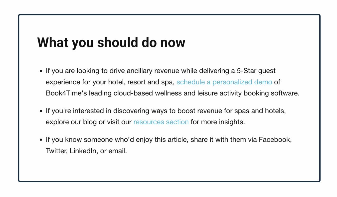
To retain the maximum number of readers from your blog and eventually convert them into customers, provide three different offers:
- Option #1 Schedule a demo/free trial signup: Of course, this is the best option and should be the most obvious choice.
- Option #2 Resource Opt-In: If readers aren’t ready to convert, offer the lead magnet again so you can capture their email and retarget.
- Option #3 Social Share: Offering a social sharing option can help maximize your content’s reach and also allows you to see what content resonates with your audience.
As you’re writing the copy for each of these options, frame them in the “pro without a con” framework.
To elaborate, let’s use accounting software like FreshBooks as an example. The pro without a con for the demo/trial offer would be something like the following:
“If you’d like to send invoices automatically, and never have to worry about manually following up on invoices again, sign up for a free trial today and get your first three invoices free.”
Follow a similar format for the resource opt-in.
For your social share CTA, keep it simple, saying something like:
“Did you enjoy this post and know a friend that might too? Share this on LinkedIn, Twitter, or email.”
Note: For the social share links, you shouldn’t include everything under the sun. Our philosophy is to pick which channels your B2B customers would be most likely to share through.
Design-wise, this section should be distinct enough to stand out from the post.

Here’s a common objection we receive when presenting this format:
Doesn’t offering multiple CTAs decrease conversions?
Yes, offering multiple CTAs could hurt demo/trial signups, but we find that it produces a better ROI in the long run, because not everyone visiting your blog is ready to convert.
So instead of just losing the traffic that isn’t ready to convert, you can at least capture their email address and retarget them. Additionally, blog traffic is typically organic anyway, so even if prospects don’t immediately convert, you aren’t wasting ad spend.
SaaS Blog Design Examples
Here are a few additional examples of SaaS blog designs we’ve implemented for clients using this blueprint.
Example 1: Practice Management SaaS Blog Design
We redesigned the blog for a practice management SaaS using this template, and you can see that it has the last updated date, a clean sidebar menu with a sticky Table of Contents on the left hand side and a single, clear CTA to schedule a demo on the right hand side.

We also introduce the product within the blog post and then link out to specific feature pages that are relevant to the topic of the post (attracting and retaining new clients).
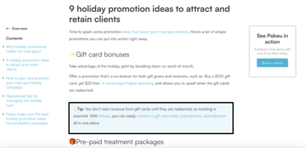
The topic of the content is also a pain point that the product solves, so we naturally include a discussion of the product and link out to specific feature pages that discuss specific features in more detail.
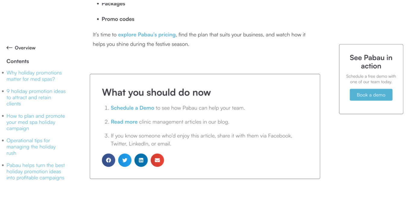
The conclusion reinforces how the product solves the pain point the customer is researching (attracting new clients).

Finally, we end with a three tiered call to action to schedule a demo, read more articles, or share the post with people you know. At the time of writing this article, we didn’t have a lead magnet, though creating one is on the roadmap.
Example 2: Salon SaaS Software Blog Design
We implemented our SaaS blog design template for a SaaS client in the spa and salon industry, and here’s a breakdown of our execution.
You’ll see that it has a “Last Updated” date at the top, a sticky table of contents, and a single CTA to schedule a demo on the side.
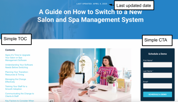
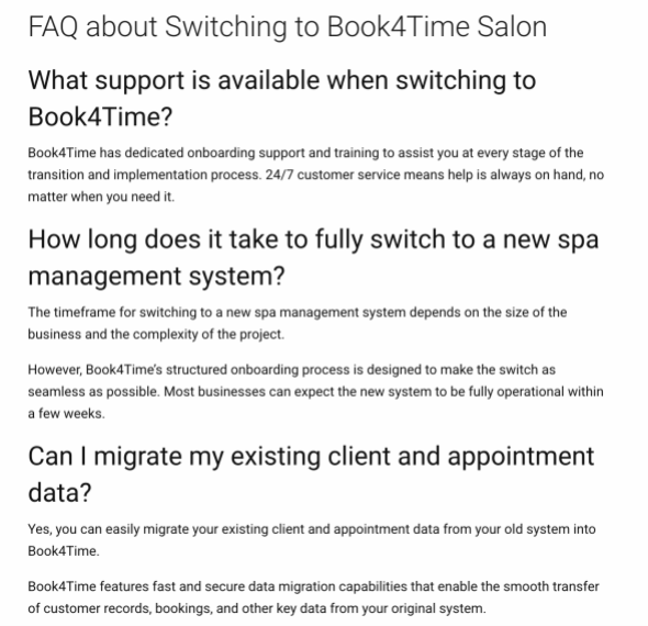
The pain point this blog post addresses is identifying and selecting a new spa or salon management software, so we introduce the specific features to look for in a solution and internally link to our product pages discussing those features.

Only after discussing the criteria of a quality solution do we introduce the client’s product and address how it meets the criteria and answer additional questions about the product:
Finally, the blog post ends with three different action items for readers to take.
SaaS Blog Design Checklist
To help you implement these SaaS blog design best practices, we created a checklist that you can download and send to your developer.
https://docs.google.com/document/d/1z3cJKTjucsIa-BOoR3fg7-GbsWGLFEhBHqlShUlS2MY/edit?tab=t.0
How To Take Your SaaS Blog Design To The Next Level
This is the step by step framework we use on all of our client’s blogs, but implementing it can be challenging both from a technical perspective and optimizing it for maximum efficiency.
For example, the type of gated offer and the specific internal links you choose all impact the effectiveness of your blog’s conversion rates.
If you want help from a team of SaaS experts who have redesigned multiple SaaS blogs, reach out to us at Powered By Search.
We can identify inefficiencies in your blog and implement a solution to help you capture more leads from your traffic and convert more leads into customers.
Related Resources
Deep Dives
- Top 18 Content Marketing Services for SaaS in 2025
- The Ultimate Guide to B2B SaaS Content Writing: Trends, Tips, and Key Strategies
- B2B SaaS Content Marketing Statistics for 2024
- B2B SaaS Content Brief Template
- B2B SaaS Content Audit Checklist
- B2B SaaS Landing Page Checklist
Related Articles
- The Future of Content Marketing
- The Buyer Awareness Matrix: A Content Strategy Tool for B2B SaaS
- How to Sustainably Grow Your Traffic Through Content Marketing
What you should do now
Whenever you’re ready…here are 4 ways we can help you grow your B2B software or technology business:
- Claim your Free Marketing Plan. If you’d like to work with us to turn your website into your best demo and trial acquisition platform, claim your FREE Marketing Plan. One of our growth experts will understand your current demand generation situation, and then suggest practical digital marketing strategies to hit your pipeline targets with certainty and predictability.
- If you’d like to learn the exact demand strategies we use for free, go to our blog or visit our resources section, where you can download guides, calculators, and templates we use for our most successful clients.
- If you’d like to work with other experts on our team or learn why we have off the charts team member satisfaction score, then see our Careers page.
- If you know another marketer who’d enjoy reading this page, share it with them via email, Linkedin, Twitter, or Facebook.