Competitor Comparison Landing Pages: A Strategic Approach for B2B SaaS
Last updated: March 17th, 2026
Most SaaS companies fall into two camps when it comes to competitor comparison landing pages.
Camp 1 doesn’t make them because they think they’re an unethical potshot at their competitors.
Camp 2 does create them, but the comparison itself isn’t very helpful to the reader, causing low engagement (i.e., they’ll focus entirely on themselves, or they’ll focus too much on discounting their competitors).
If you don’t create competitor comparison pages, you place your brand at a significant disadvantage because your competitors will and they’ll dictate the narrative of your brand (which probably won’t be favorable).
As we discuss in the buyer awareness matrix, evaluating multiple products is a key stage in the customer journey. Your Product Aware prospects at the end of the buying journey are already searching for content like this on third party aggregators like Capterra or G2.
If you Google your brand name vs. a competitor right now, is the search result that appears the narrative you want high value prospects to read?
Even if your competitors aren’t actively showing up for these specific terms, your prospects will find ways to compare you to your competitors before making a purchase.
To put your SaaS at the forefront, we incorporate these competitor comparison pages into our SaaS website architecture framework. These pages provide an excellent opportunity to educate prospects on your product’s key differentiators and help them understand why you’re the best choice for them.
If you don’t offer an honest comparison of your product vs. a competitor, prospects won’t understand the key differentiators that make your product a better choice than your competition. As a result, prospects will search for that information elsewhere, including on your competitors’ website, which can knock them off their path to choosing your product.
Your product exists because it solves an unmet need that competitors lack. So don’t shy away from providing an honest competitor comparison.
To help you create and optimize competitor comparison pages that are helpful to readers and drive conversions, we’ll walk you through:
- Common competitor comparison mistakes (and the implications that follow)
- Our blueprint for creating B2B SaaS competitor comparison pages with a real case study
- Common questions regarding B2B SaaS competitor comparison pages
Competitor comparison landing pages are one of the core types of bottom-of-the-funnel SaaS content we create for our clients. They’re highly valuable for lead generation from both a PPC and SEO perspective. To learn more, get your Free Marketing Plan here.
Common Mistakes We See with SaaS Comparison Pages
1. Not Creating Them All Together
Many SaaS companies avoid creating competitor comparison pages altogether because they worry that a direct comparison to their competitors is unethical and could negatively impact their brand image.
The reality is that your best prospects are already searching for these comparative terms. They want to be responsible buyers and they’ll do their due diligence before investing thousands of dollars on a product.
If you don’t create competitor comparison pages, your competitors will, and they’ll determine your brand’s narrative. If you Google your brand name versus a competitor right now, is the top post in the search results the narrative you want your best prospects to see?
Probably not.
The good news is that a competitor comparison page doesn’t have to be biased.
The searcher is actively trying to understand what differentiates one product from another, so by highlighting your product’s key differentiators (rather than just bashing competitors), you answer the searcher’s question and help them understand why your product is the best option for them, which ultimately drives conversions.
In fact, it’s incredibly frustrating for prospects if they can’t find a resource explaining how one product is different from another, so they’ll appreciate it if you break down the key differentiators for them.
Another objection that we often hear is: “How will we stand to compete with review websites like Capterra and G2 that dominate the search results for these keywords?”
It’s a great question and a valid concern, but we still recommend targeting these keywords because:
- These aggregators only take up a few spots on the top page, and ranking anywhere on the first page is still very valuable and can produce a lot of high quality traffic.
- These aggregators lack analysis. They often just offer reviews and some comparative metrics like pricing, but they don’t serve the searcher big picture takeaways that help them make an informed purchase decision. Google knows this and tends to diversify the SERPs with content that offer deep analysis.
2. Directing Traffic to Thin Pages That Don’t Make a True Comparison
Next, some SaaS companies create pages to direct traffic from Google search queries (whether through paid ads or organic search). But they’ll simply slap on an H1 heading with the comparison keyword and otherwise say nothing of their competitor.
The thinking is this: “We should bid on that term and just send people to this page we already have. All we really need to do is get people to sign up for a demo.”
But this is a very me-focused, short-term way of approaching comparison pages. Your best prospects are smart. And when they land on the page expecting to get detailed information about how your product differs from your competitor’s product, and all they see is a thinly veiled way of getting them to sign up for a trial or demo — you’ve lost them.
They can see right through you and are likely to bounce with a bad taste in their mouth.
3. Focusing Entirely on Themselves or Overly Discounting Their Competitors
Lastly, the other common mistake we see is when SaaS companies create comparison pages that are heavily focused on themselves or overly focused on discounting their competitors — both of which can lead to poor outcomes.
When these companies focus on themselves, the content of the page doesn’t actually match the pain point of potential customers searched for.
Their pain point was: “I want to understand the actual differences between these products.”
If you don’t answer this question by describing the differences of the products, you’ll naturally see lower conversion rates.
When companies focus on discounting their competitors, it appears that they’re compensating for something — like they don’t believe in their own service. This is typically perceived as tasteless and reflects poorly on the brand.
Above all, these are the mistakes we see and the ones you should avoid when creating your comparison pages. Now let’s look at how we typically go about creating these pages with our clients.
How We Create Competitor Comparison Pages for Our B2B SaaS Clients
When we’re creating comparison pages with clients, everything begins with understanding the nuances of how the products actually differ.
And this isn’t always easy to do. Many times, competing SaaS products do very similar things with very similar features.
So we’ll walk through our SaaS positioning canvas and ask our clients questions to surface the differences that do exist. We’ll ask them questions like:
- Why would your target customer buy your solution vs [top competitor]?
- What type of customer would your platform be a better fit for vs [top competitor]?
- How do you solve your customer’s core pain points differently from an approach or strategy perspective than your competitors do?
Inevitably, subtle or not so subtle differences will come out that we can use on the page to convey the true differences between products.
To take it a step further, we’ll sometimes interview the customers of our clients who have recently subscribed to hear them explain in their own words why they chose our client over their competitors. That way, we can learn what really matters to users and ensure we reflect that on our comparison page.
By thoroughly understanding the nuanced differences between your software and the competitors’ software, we can craft a comparison page that gives users the answer to their questions (yes, they really do want to know how your SaaS is different), and drives conversions by highlighting how those key differentiators make it the best solution.
Should you include a competitor comparison table?
One of the most common questions we see about product comparison pages between SaaS competitors is whether or not it’s reasonable or useful to include a competitor comparison chart or competitor comparison table.
There’s absolutely nothing wrong with including a competitor comparison table as long as it does the following:
- Presents an objective view of both products – marketers have a tendency to choose the starkest differences between their product and a competitors and then highlight them. This is a cynical move that buyers can smell a mile off.
- Adds to the overall narrative – remember that with your competitor comparison pages you’re telling a story and trying to communicate your value proposition. If a feature-by-feature analysis actually helps a visitor to your site turn into a user, then great! But this is not always the case and you should use your best judgement.
- Includes only the important elements – it’s just not helpful to add a competitor comparison table that cites every single feature of both products. No product – even with feature parity – is actually alike. There are better ways to frame your argument than an endless checkbox list of features. Instead, it can be helpful to include information about the business model (e.g. do you offer a free trial but your competitor doesn’t?)
A good competitor comparison page can be a key SaaS landing page where conversions of your best-fit customers actually take place. But it’s important to be authentic and helpful in order to build trust and awareness with target audience.
SEO Considerations for B2B SaaS Comparison Pages
Competitor comparison keywords are outstanding opportunities to earn high-quality organic search traffic, so we’ve tested and perfected a proven blueprint to rank for these topics.
Below, we’ll walk you through how we identify competitor keywords, create SEO optimized pages that convert, and walk you through a few real case studies.
1. Identifying competitor keywords to target
You’ll notice that most competitor-related keywords are framed as either “alternative” or “versus” keywords.
Both have similar search intent, and optimized correctly, a single page may be able to rank for both keywords.
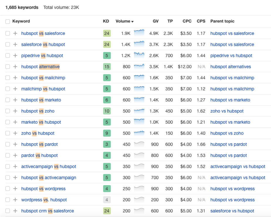
To identify these opportunities, create a list of your competitors and then use a keyword research tool to identify branded keywords that contain “alternative,” “versus,” or “vs.”

Then, you’ll see a list of potential keywords you can target:
Then, do a quick Google search for the best keyword.
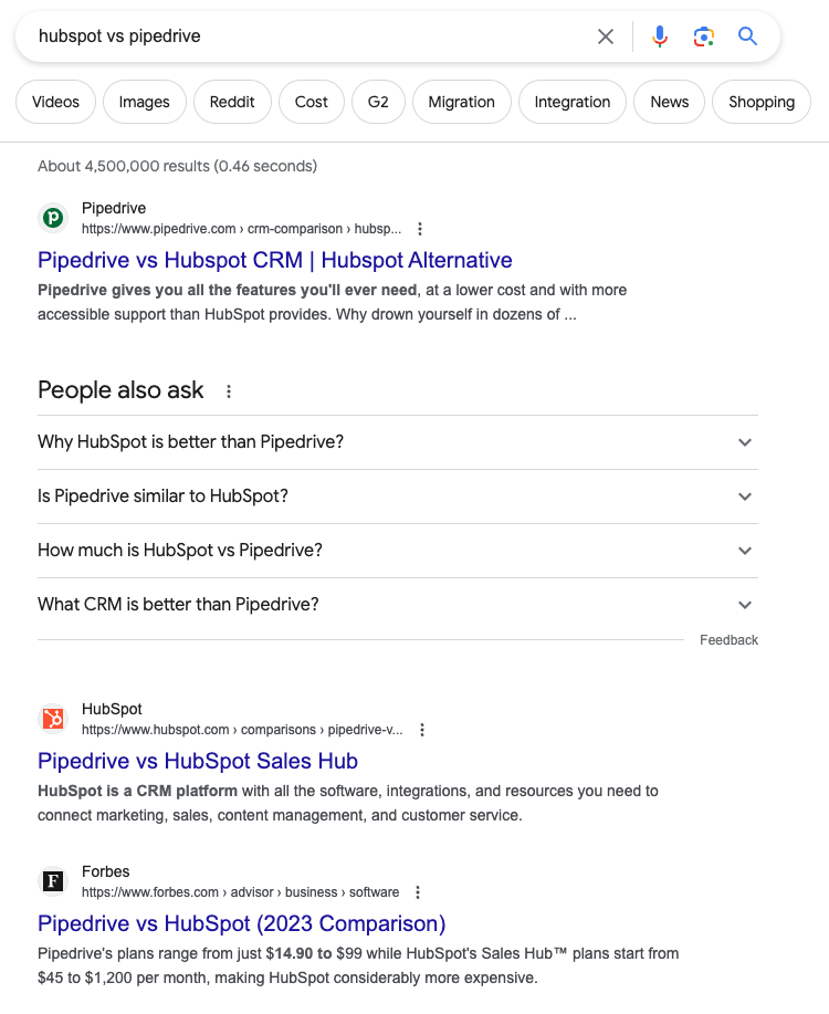
If it’s only review aggregators like Capterra or G2 then you can publish your point of view before competitors do.
If competitors are bidding on the term (you’re seeing ads) then you know that your prospects are likely searching for this already.
Finally, if you see an existing comparison page from a competitor or third party, then you know that you need to create a page of your own to compete.
2. Creating the competitor comparison content (case study)
Once you’ve selected the competitor comparison keyword, how do you create a page that ranks in search engines and converts visitors (without making your brand sound overly salesy)?
We accomplish this by:
- Giving the reader an expert answer to their question (e.g., “what’s the difference between competitor A and competitor B?”). If you do that, the reader will stick around and the positive user engagement signals will help you rank higher on search engines.
- Highlighting our products key differentiators. Your current customers chose your product over the competitors’ product for a reason. To make the landing page convert, all you have to do is list out those unique differentiators that made your current customers choose your product.
Using this approach, you don’t have to be overly salesy or bash your competitors, and your page will convert right-fit customers. This is also the juicy answer that searchers are looking for – they want to know how each product differs.
To give you a practical example of how we structure competitor comparison pages, let’s walk through an example (inspired by this classic Intercom vs Drift comparison page).
BoardOnTrack is a SaaS that helps charter schools better manage their workflows. They wanted to increase sales by improving messaging clarity and ensuring prospects quickly understand who BoardOnTrack is, what it offers, and how it helps the targeted stakeholder achieve their desired results, so we decided to create competitor comparison pages.
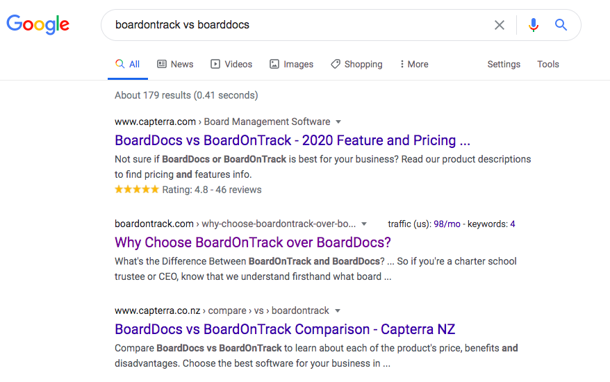
One of the first keywords we chose to target was “BoardOnTrack vs. BoardDocs,” as this was one of the most commonly compared competitors.
The page we created for this keyword was very successful at driving conversions and it also ranked second in Google shortly after the page was published.
Below we’ll walk you through exactly how we crafted this page to rank, drive conversions, and provide a tasteful narrative of the company:
The Headline
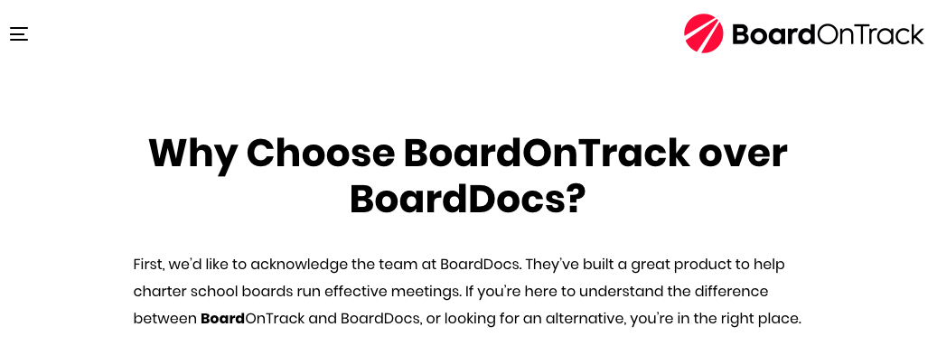
We’ve talked previously about our approach to headlines in our article on SaaS landing pages — how we’ve found that posing questions (as opposed to making generic statements) is often a more effective way of grabbing visitors’ attention and provoking them to read further.
So rather than the standard “BoardOnTrack vs. BoardDocs” headline, we went with the question “Why Choose BoardOnTrack over BoardDocs?” After all, that’s what prospects who type in “BoardOnTrack vs. BoardDocs” are trying to understand.
The Copywriting
Then we open up with a short acknowledgement and nod to BoardDocs to signal to readers that we aren’t here to trash our competitors. We’re here to understand the differences between these two services.
Then we created a section to convey our client’s perspective on the core difference:
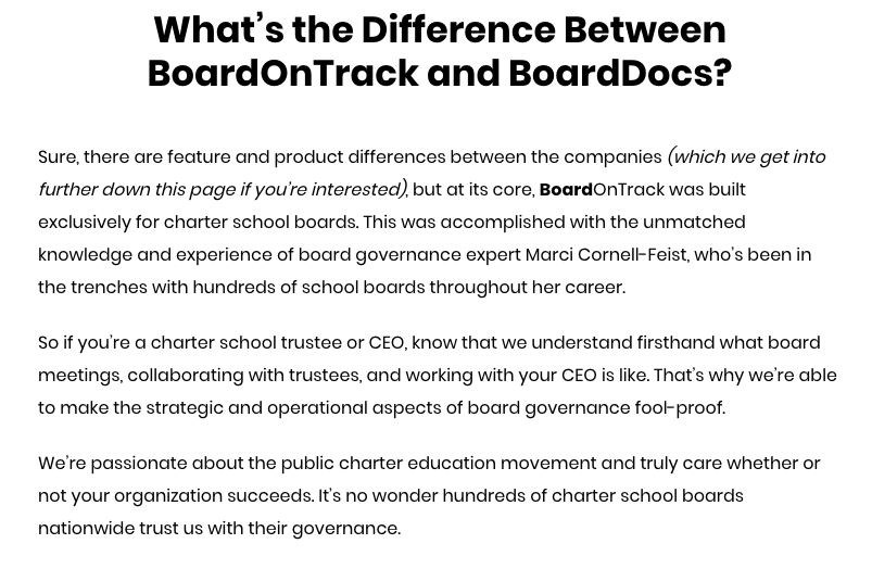
In essence, the difference between the two services is that BoardDocs is for any school board, and BoardOnTrack is designed specifically for charter school boards. So this section was an effort to communicate to visitors that if they’re a charter school, this product has been tailored for their exact needs.
From there, we created a section describing the top five reasons why charter school boards should choose BoardOnTrack:
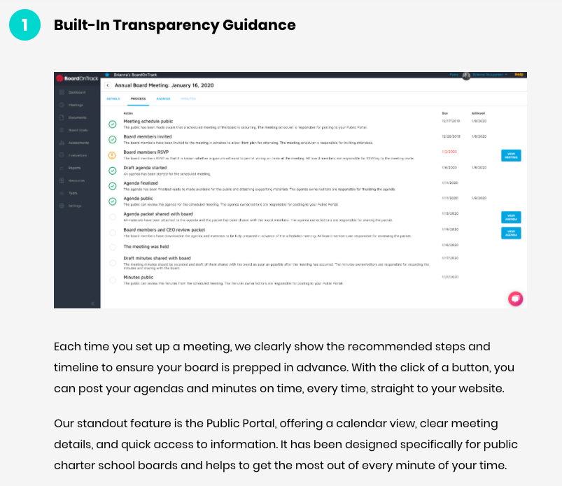
For each reason, we included a relevant product screenshot to help visualize the product for prospects. Then we described in a few short paragraphs how the feature works and benefits users.
Comparison Table
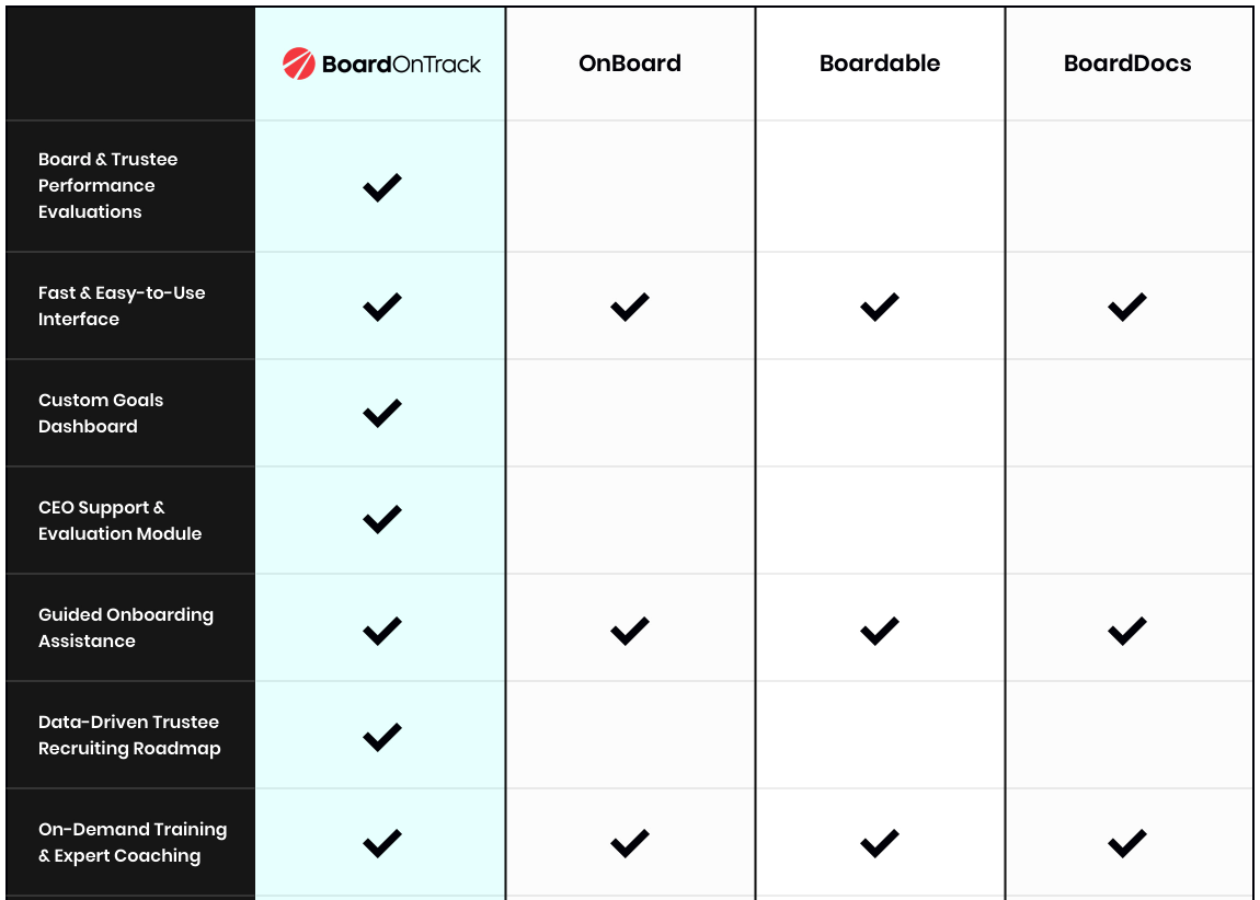
In the next section, we used a comparison table to visualize the differences between BoardOnTrack and BoardDocs. But we limited the amount of features we compared and tried to keep things as simple as possible (contrary to many comparison tables out there with an overwhelming amount of rows).
Social Proof and Testimonials
Then we used logos of charter school boards using their product as social proof:

And customer testimonials to provide further credibility:

One thing we’d do differently next time: If our client had customers who were previously their competitor’s customers, we’d reach out to them for testimonials about why they made the switch. That would make the testimonials even more relevant to the page and thus that much stronger.
Call to Action
And finally, the call to action:

Rather than plugging in multiple CTA’s throughout the page, we stuck with a single CTA at the bottom of the page, inviting readers to join one of BoardOnTrack’s biweekly webinar-style demos. In doing so, we increase the probability that people who book a demo will be a good fit for BoardOnTrack (indicative of having read through to the bottom of the page before signing up).
3. Strategically placing competitor comparison pages on the website to aid SEO efforts and the buyer journey
Competitive comparison pages are part of our SaaS website architecture because they’re valuable for readers trying to make an informed purchase decision.
We identify opportunities on the website where the visitor is clearly at the product selection stage and add a link to the competitor comparison page to help them understand why we’re the best option.
For example, in our partnership with an audience management SaaS, we added a link to the competitor comparison pages to the “Why Us” header. This is because people landing on the “why us” page are clearly trying to figure out what makes their solution unique and different. The competitor comparison page is the perfect opportunity to answer that person’s question.

Adding internal links to competitor comparison pages throughout the website is also beneficial for SEO. The more internal links pointing to a page, the easier it is for crawlers to find it.
Therefore, we also occasionally create category pages, and we’ll also sometimes add links in the footer, as links in the footer are particularly powerful from an SEO perspective.
Optimizing existing competitor pages for related keywords
If you already have competitor comparison content on your website and it’s not getting the results you want, add another step to the beginning of the process above and look at Google Search Console for what you’re already showing up for.
Then, you can refresh this content to optimize it for terms where you’re already in striking distance for, to shorten the time to see results.
For example, one of our clients in the practice management industry already had a “versus” comparison page to compare their SaaS to Phorest, but we noticed in Google Search Console that it was also generating a handful of impressions for the “alternative” keyword framework (“phorest alternatives”).
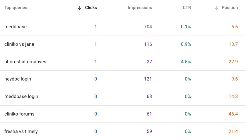
We recognized that this additional keyword could provide more high-quality traffic and Google is clearly interested in ranking the existing comparison page for that keyword.
So the next step is optimizing the page for both of those keywords.
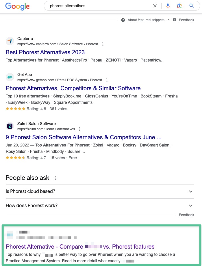
To optimize their vs. Phorest competitor comparison page for the term “phorest alternatives,” here are a few adjustments we made:
- Title optimization: We added the two main keywords to the title tag (in order). Now the title is “Phorest Alternative: Compare [client] vs Phorest Features”
- Meta description: Creating a compelling description of the post that increases clicks not only drives more traffic to your page, but also signals to search engines that your page is more compelling, which can improve rankings.
- H2 keyword optimization: Another recommendation is to add relevant keywords into the H2s that suggest to search engines that the page is a comparison analysis that matches the searcher’s intent. For example, a strong keyword for comparison content is “main differences” as the main intent behind this type of search is to understand differences.
- Included the additional target keyword in H1: The page was already ranking for the comparative term “Phorest vs [client],” but we wanted to also rank for the term “phorest alternative,” so we added that to the H1.
- Included reviews: The client had 5-star reviews on Capterra, Google, and GetApp so we included those images near the testimonials.
While not a direct SEO factor, we also optimize the page for conversions by adding relevant CTAs on these pages. For example, we add a Book A Demo CTA at the end of the piece for the most engaged readers, and a high intent product aware asset like a case study partway down the page.

As you’ll see, this strategy worked well as the page now ranks on page one for “Phorest alternatives” and has a 6% CTR. With these simple optimizations, the client was able to take their existing content and make it significantly more successful by simply optimizing it for additional bottom of the funnel keywords.
What If We Don’t Have Any Branded Competitive Search Terms?
The core of a competitor comparison page is that it targets a query with a branded term.
However, some of the clients we work with don’t initially have any short-tail search volume for competitor alternative keywords with their brand name.
In that case, we often target keywords for two competitors’ brand names and insert your brand name into the journey.
For example, if you have accounting software and your main competitors are Freshbooks and QuickBooks, we might create a comparison chart for the term “Freshbooks vs QuickBooks vs (your SaaS).”
Now, when people search “Freshbooks vs. QuickBooks,” you have the opportunity to rank for that keyword and introduce your brand to the conversation.
We call these 1v1v1 competitor comparison articles, and here’s a sample format we use:

Competitor Comparison Page Case Studies
Below we’ll walk you through a few of the competitor comparison pages we’ve produced for our clients.
Practice Management SaaS
We updated several comparison pages for this client with on-page optimization techniques and ultimately helped those pages increase organic visibility by 124% and traffic by 214.3%.

We also optimized several 1v1v1 comparison pages using the on-page optimization blueprint outlined above, and they achieved similarly excellent results with month-over-month organic visibility increasing by 91% and organic traffic by 83%.

Audience Marketing SaaS
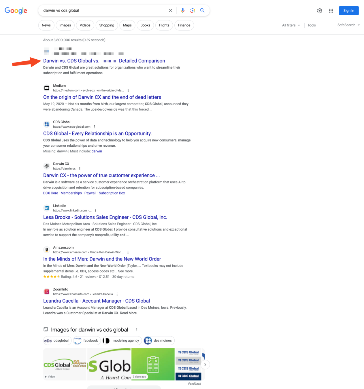
We designed a competitor comparison page for this client, and after publishing, it immediately indexed as the first result for the 1v1v1 competitor “branded vs” search result (even outranking the actual competitor’s results).
This resulted in 109 high intent visits in just the first 30 days of publishing.
Shopify Automation SaaS
Here is an example of how we leveraged this client’s competitors’ branded search traffic with the 1v1v1 playbook to earn right-fit traffic that wasn’t specifically searching for their SaaS.
In this case, we identified that Etsy and Shopify were both top competitors, so we created a competitor comparison targeting these two keywords.
Not only are we able to rank organically for many of these terms, but we’ve also won many of the People Also Asked questions with our landing pages:
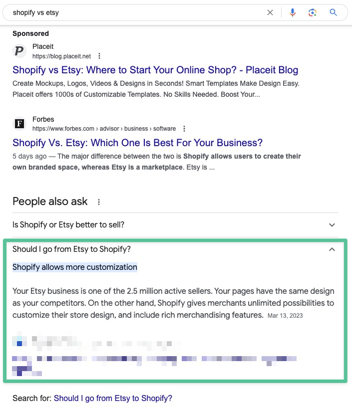
This is a great way to help our client enter the conversation and show our ideal target audience that neither Etsy nor Shopify are the best fit. Instead, our client’s SaaS is the best fit.
We created a similar 1v1v1 competitor comparison page for Shippo and Shipstation:
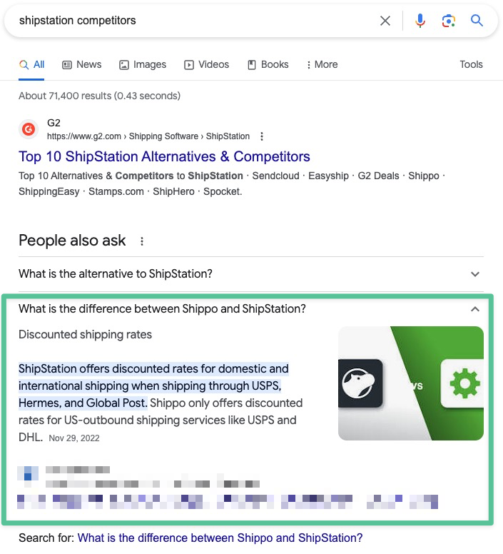
As a result, we’ve been able to significantly increase clicks from our ideal customers:

3 More SaaS Comparison Pages to Take Inspiration From
The following are some additional comparison pages to draw inspiration from, including the elements we think these companies have gotten right.
1. Pipedrive vs. Salesforce CRM

- Meta description: If you look at their meta description, they’re actually talking about comparison points to aid the decision making process between Salesforce and Pipedrive. And we think this approach of showing their intention to make a true comparison (not just focus on themselves) does well to match the narrative that’s already going on in prospects’ minds.
- Sub headline: They make a direct link to the pain points of Salesforce, touching on how it can be difficult to use for people who are less technically savvy.
- G2 and Capterra ratings: Their use of showing how real users rate the two products is a transparent way of signaling to prospects that they have nothing to hide — that they’re confident in their product.
- Customer testimonials: By focusing on how and why customers who used to use Salesforce have come over to Pipedrive, their testimonials are directly related to the content and context of the page.
2. QuickBooks vs. FreshBooks
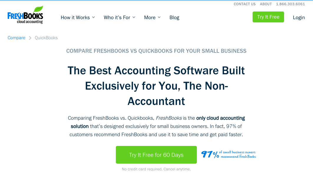
- Headline: By positioning themselves as the non-accountant software, this is likely to resonate with anyone reading who identifies themselves as not an accountant. It provides contrast between themselves and QuickBooks which is used by a lot of professional accountants.
- Sub headline: By stating they’re designed exclusively for small business owners, they further position themselves as the option for non-accountants. And by pairing that with a proof point such as “97% of customers recommend Freshbooks”, they’re able to communicate a compelling case in a small space.
- Testimonials: With the section headline, “Why Other Small Business Owners Made the Switch,” paired with testimonials from users who came to them from QuickBooks, they’re showcasing the specific pain points that real people have felt using their competitor’s product — and signaling how people who have made this switch have been happy with their decision.
- Support contact info and FAQ: By providing a short section with how to contact the FreshBooks support team with questions, they acknowledge that people often need more information to make this decision. And their accordion FAQ section also helps to aid the reader in further understanding their product.
3. Harvest vs. Everhour
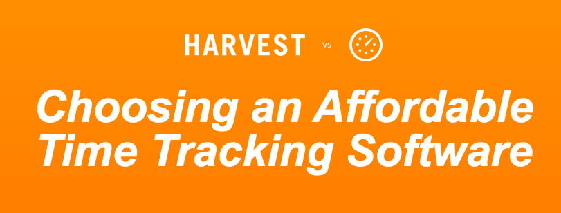
- First impression: Similar to the BoardOnTrack example above, we like how they explain how this page will be different from the existing pages on the topic: “Most of the articles provide a differentiation just on the features of the tools. But we decided to go deeper and make a comparison of products’ principles and concepts. We will also describe how they will influence and, ideally, complement the processes at your company.” In doing so, they signal to prospects how they’ve made an effort to make the page more useful than the others.
- Use of GIF’s: Their use of GIF’s is a great way to show (rather than tell) and visualize what it’s like to actually use the product.
- Communicating differentiation: Throughout the page they do well to show what Harvest’s product can’t do that their product can, helping to position themselves based on their strengths. For example, “Harvest doesn’t sync any additional but crucial data of your project like sections or tags, while Everhour does.”
How To Start Optimizing Competitor Comparison Pages Today
Competitor comparison pages are more than just a content marketing asset for SEO or paid media — they’re a chance to help customers see for themselves whether they’re truly a good fit for your service.
They’re an opportunity to say, “This is what we do and who we’re made for. And this is what they do and who they’re made for.” This can help SaaS companies attract more of their ideal customers and less poorly fit customers who end up churning after 100 days.
Competitor comparison pages are uniquely valuable as they:
- Capture qualified traffic that is at the end of the buyer journey and ready to make a purchase.
- Are excellent sales materials that give your brand an opportunity to demonstrate its key differentiators.
The problem is that most companies don’t know how to effectively optimize them to capture maximum organic search traffic and construct a narrative that tastefully leads visitors to the conversion.
By giving competitors credit where it’s due and helping prospective customers see the real differences between your products, you can increase the effectiveness of your comparison pages and win more of the right customers in the process.
Competitor comparison landing pages are one of the core types of bottom of the funnel SaaS content that we create for our clients. If you’d like to learn more about how to create these pages for your own SaaS website, get your Free Marketing Plan here.
Related Resources
Deep Dives
- 10 Examples of The Best SaaS Landing Pages
- 10 Best Examples of Competitor Comparison Landing Pages in SaaS
- 20 Examples of The Best SaaS Pricing Pages
Related Articles
- Landing Pages vs Web Pages: Which Should You Use?
- Webinar – How to Create Landing Pages that Actually Convert
- Unlock Your Landing Pages’ Potential at InboundTO on Nov. 20
What you should do now
Whenever you’re ready…here are 4 ways we can help you grow your B2B software or technology business:
- Claim your Free Marketing Plan. If you’d like to work with us to turn your website into your best demo and trial acquisition platform, claim your FREE Marketing Plan. One of our growth experts will understand your current demand generation situation, and then suggest practical digital marketing strategies to hit your pipeline targets with certainty and predictability.
- If you’d like to learn the exact demand strategies we use for free, go to our blog or visit our resources section, where you can download guides, calculators, and templates we use for our most successful clients.
- If you’d like to work with other experts on our team or learn why we have off the charts team member satisfaction score, then see our Careers page.
- If you know another marketer who’d enjoy reading this page, share it with them via email, Linkedin, Twitter, or Facebook.