How to Tackle SaaS Homepage Design for Your B2B SaaS Company
Last updated: March 17th, 2026
Your SaaS website’s homepage is where the relationship with your customers begins. Having a homepage that’s clear about who you are and what you do is critical for gaining trust with prospects.
But when it comes to B2B SaaS homepage design, many companies waste time chasing the latest design elements and templates rather than thinking about the objective of their homepage from first principles.
As a result, their homepages are often poorly optimized for doing the one thing that really matters: transforming an anonymous website visitor into a known prospect.
By learning the principles of effective SaaS homepage design, you can increase the likelihood of…
- Making a good first impression on new visitors.
- Lead generation and cultivating a connection with them through your email list.
- Ultimately closing more prospects who first landed on your homepage.
Most blog posts on this topic consist of screenshot examples of various SaaS websites for design inspiration. While these are useful, they tend to lack explanation of the why behind the various designs.
In this article, we’ll feature examples of B2B SaaS homepages, but we’ll also dive into a first principles view of SaaS homepage design. You’ll learn concepts and strategies that will remain applicable in the long-run, regardless of what’s currently trending.
Thinking about designing a new homepage mockup for your B2B SaaS company, but don’t know where to start? Get your Free Marketing Plan here to learn more about how we can help.
You can also listen to an audio version of this article here:
What Your B2B SaaS Company Loses with a Homepage That Doesn’t Connect
Time and time again, we’ve found that there are three main consequences of poor SaaS homepage design. Those implications are:
- Low-conversion rates.
- Inability to build a relationship with visitors who bounce.
- A lack of understanding about your SaaS product’s value.
Missing the boat on these three factors will hurt your bottom-line in ways that aren’t often obvious. Let’s start by examining the first implication: low-conversion rates.
Low-Conversion Rates
B2B SaaS companies that haven’t nailed their homepage design tend to suffer from this problem. They may generate loads of real-time traffic. But few of those visitors actually engage with them beyond their initial visit.
This is because most companies design homepages that rely on branded traffic too early in their marketing. As a result, any bottom-of-the-funnel calls-to-action, such as scheduling a demo or booking a sales call, tend to fall on deaf ears. More often than not, these CTAs underperform on homepages relative to the other SaaS website pages that are more contextually relevant, like product or how-it-works pages.
Inability to Build a Relationship with Visitors Who Bounce
If visitors come to your website and leave without providing you their email, you have no way of knowing who they were or building a relationship with them after they leave.
Email marketing is one of the top ways to convert visitors into known prospects. Remember that most of the traffic visiting your homepage isn’t yet ready to buy your B2B SaaS product. They’re still investigating whether you can provide them with the best solution for your problems.
By capturing their email, you can continue the process of educating them about who you are and what you do. Building an email list isn’t so much about shoving promotions down your leads’ throats. Rather, it’s more about delivering information to people who are already interested in the SaaS product you sell.
A Lack of Understanding the Value of Your SaaS Product
Startup graveyards are filled with plenty of great products that were poorly marketed. Many of these companies simply had their positioning wrong, causing prospects to bypass them for consideration.
Again, think of your homepage as a sniff test for new visitors. When they visit, they’re trying to determine whether they’ve landed in the right place or if they should continue exploring your website further. Their user experience on your homepage will inform their next move.
Refine These 6 Elements to Improve Your SaaS Homepage Design
In this next section, we’re going to walk you through six important elements of homepage design. They are:
We’ll include details about what we see most B2B SaaS companies do wrong in these areas. We’ll also spell out the principles of how each should ideally be addressed.
1. Headlines
Many companies miss the mark with their homepage headlines because they assume average visitors have a higher-level of buyer awareness than they actually do. They also tend to write headlines that speak to a broad rather than specific audience.
But the most common gaffe we see B2B SaaS companies make is writing headers that are bland, declarative statements.
Take Heap, for example, which is a data-analytics platform for over 6,000 companies.
The headline on their homepage is “A Smarter Approach to Product.”
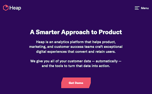
They’re a great company that also happens to offer great software. But what does that headline actually mean? It makes a statement, sure. But it doesn’t encapsulate who they are or even what problems they solve.
We think a better approach is to ask a question. This is a tactic that we rarely see companies take. Yet asking questions encourages visitors to think critically about their problems in the context of the solution your product provides.
If we were to rewrite Heap’s headline in the form of a question, here are a few options we’d recommend:
- Want to understand why your digital experiences aren’t retaining your users?
- Struggling to convert prospects through your products and experiences?
The second way is to make a statement that offers visitors pros without cons. This is an idea that we learned from Conversion Rate Experts. They defined pros without cons as declaring a benefit and pairing it with a pain point that your solution alleviates, both phrased in positive terms.
One company that applies the idea well is our client Structure Studios. When you visit their homepage, the first thing you see is the phrase “Sell More Pools, Landscapes, and Hardscapes”
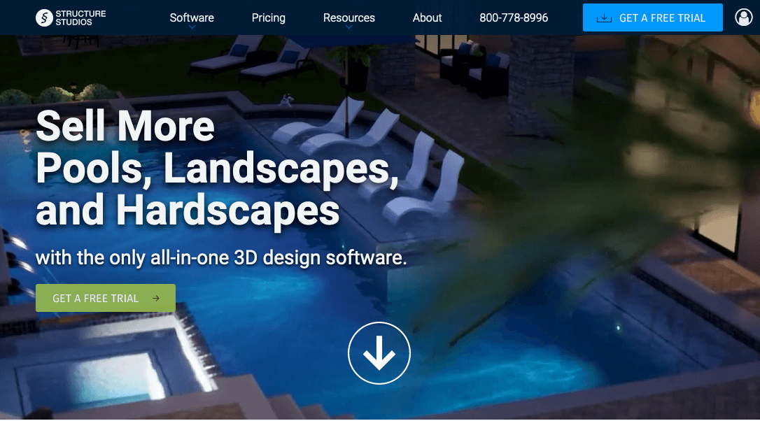
That one statement addresses a major pain point for their target audience: client acquisition. It encapsulates what a customer stands to gain and solve by using their software. And as their headline, it engages the attention span of a visitor immediately.
2. Value Proposition
Many B2B SaaS companies misunderstand the difference between their value proposition and their positioning. On one hand, your positioning answers questions of who and what. Who are you for? What do you do? On the other, your value proposition answers the question of why. Why should someone choose you instead of your competition?
To accomplish the latter, we recommend that B2B SaaS companies use what we like to call the screenwriting technique. It’s the concept of communicating how someone might feel before and after using your product. With the screenwriting technique, you’re trying to get across the transformative, aha moment that your product delivers once someone signs up and starts using it.
Let’s take for example another one of our clients, Truffle POS. They provide online ordering and point-of-sale software to franchise and mom and pop restaurants. To communicate their value proposition, we put the screenwriting technique to work while designing their homepage. In their sub-headline, you’ll notice the following two pieces of copywriting:
- “Increase restaurant profits by over 20% with online ordering and delivery.”
- “Future proof your restaurant today.”
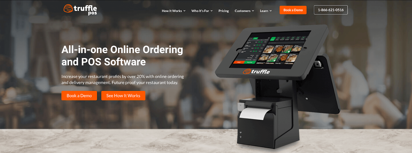
Unlike other competitors, Truffle isn’t trying to promote their status on the market. Instead, they’re communicating their value proposition in a way that gives potential visitors a peek into what they can gain from becoming users.
3. SEO
One major issue we see in regards to SEO is keyword cannibalization. When targeting the same keywords, homepages often end up competing with internal pages in search engine results.
How does this happen? A homepage tends to garner more backlinks, which boosts its authority in the eyes of Google. Meanwhile an internal product page features more relevant content specific to the target keyword.
To fix this, we recommend that B2B SaaS companies implement a concept that might seem counterintuitive. Instead of optimizing, we tell them to de-optimize their homepage. That means to remove keywords that their internal pages already target.
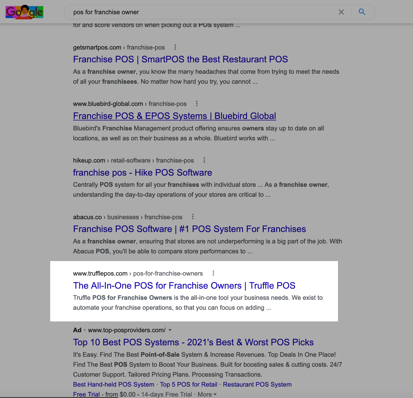
For example, let’s revisit Truffle POS. We helped them design internal pages for specific buyer personas their POS system best serves. One of those pages is a page for restaurant franchise owners.
Other than the internal link back to that page, their homepage is absent of any discussion on that topic. We encouraged them to do this to ensure the homepage doesn’t compete for SERP rankings for “POS for franchise owners”, which is the keyword that the internal page targets.
If you’re a category-creating company, you don’t need to worry about de-optimizing your homepage. As long as your company is well-established among your target audience, you’re welcome to implement more brand and category-creating keywords on your homepage.
What you must be mindful of is your positioning. Be very specific and clear about who you are and what problems you solve. Use your homepage to also showcase how your product works.
4. Lead Magnets
When it comes to highlighting lead magnets on your homepages, there are two approaches to consider. The path you take depends on whether you’re selling a high annual-contract value or low annual-contract value product.
With high ACV products, it’s best to include calls to action for lead magnets above the fold of your homepage. Aside from your headline, sub-headline, and visual of your product, your CTA for your lead magnet shouldn’t be something your visitors should be scrolling to see. You may also consider using a pop-up modal box.
Meanwhile, for low ACV products, it’s best to show how you can help visitors reach that state of bliss they seek. Think back to your value proposition for a second. Remember, you’re trying to get customers to understand why you’re a better alternative than your competition or current solution. Most of the time, people only get this realization after they use your tool.
But aside from well-written messaging as we discussed earlier, you can also show them how they can feel through the use of a tool. When it comes to selecting your lead magnet, we believe it’s best to be useful rather than interesting. People who visit your homepage are there to solve problems, not have fun.
For example, giving them a buyer’s guide to your company’s category is one way to demonstrate value to visitors and capture their email in exchange. A step above this would be some sort of quiz or calculator that demonstrates their expected output if they choose your SaaS product. In this instance, the email capture doesn’t necessarily need to live on the homepage. Instead, include a call to action to a landing page of your tool.
One company that’s done this well is another one of our clients, Carthook. They’re a SaaS product that helps eCommerce stores make post-purchase upsells. Carthook’s prospects often wonder about their return on investment by using Carthook. With that in mind, we helped them create an ROI calculator they could use to build their email database.
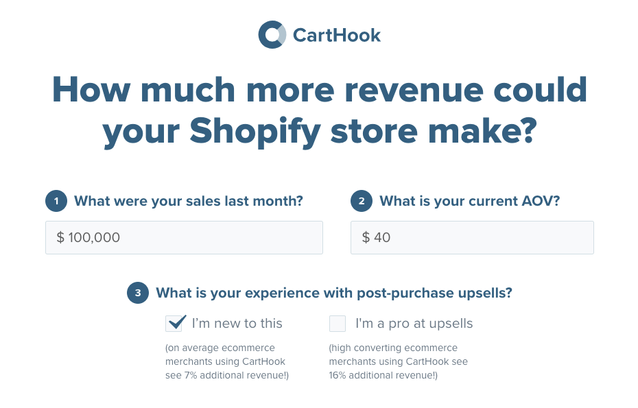
Visitors enter their figures then get their results delivered straight to their inbox. Carthook also provides their results in a pop-up on the page. To get these details, all they need to provide Carthook with is their name and email in exchange.
5. Blog Posts
It’s not unusual for B2B SaaS companies to feature blog content on their home pages. But most of them simply display their three most recent posts in chronological order.
Instead, we think there’s a better way. What we often tell clients to do is feature their most relevant blog posts.
Think of the three biggest problems that seem to pop up in the customer-success process of your company. Once identified, link to articles that get visitors to that aha moment much faster. Feature blog articles with information that gets your customer to realize your product is something they can’t live without.
Another approach is to link to blog posts that address common objections that come up in your sales process. Then, if you haven’t already, blog about them and feature those posts on your homepage.
For example, let’s say one of the questions that comes up in your sales process is what features your software has relative to your top competitors. You could write a comparison post that highlights and positions your product around these differences. Then, you could include a link to this article as one of the top posts on your homepage.
6. Testimonials (Social Proof)
There’s a tendency for most B2B SaaS companies to highlight their achievements on their homepage. They use much of its real estate to talk about how they’re number one in their space or spotlight any awards they’ve won. But talking too much about yourself rather than focusing on customer pain points can erode trust with homepage visitors.
Social proof, like testimonials and case studies, is one way to gain visitors’ trust and earn their permission to build a relationship. Instead of placing these lower on your homepage, we encourage B2B SaaS companies to move them as high up as they can. Effective social proof highlight use cases and buyer personas of the kinds of customers you want to attract. The sooner a visitor sees this kind of content, the faster they’ll know if your product is right for them.
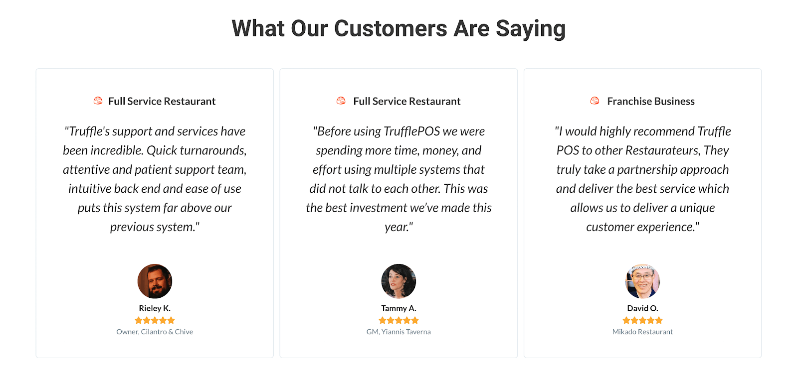
Let’s refer back to the homepage of Truffle POS. Their social proof includes testimonials from both mom-and-pop restaurants and franchise businesses. The reason for this? The mix of businesses included help visitors understand whether the product could be for them or not.
Our Closing Thoughts on Best SaaS Homepage Design
Whenever we speak with potential clients about website redesign, many of them know that their homepage is the first page that needs fixing. Nailing it is critical because it’s the first impression in front of potential prospects. You don’t get any do-overs.
Remember, your homepage is where visitors can learn about who you are and what you do. To accomplish this, your homepage must convey to customers that you’re a SaaS business worth trusting. To do so, focus on refining these six important elements of your SaaS homepage design:
Your homepage’s role is to help you start that relationship with your visitors. To do that, you need their permission. A well-designed homepage can help you transform visitors from just another number on your analytics software to viable prospects who’re ready to raise their hand for your product.
Does your homepage of your user interface struggle to convert visitors into tangible leads? Then, reach out about working with us today.
Related Resources
Deep Dives
- B2B Website Design Trends and Best Practices to Enhance Engagement and User Experience in 2025
- B2B SaaS Website Redesign Checklist
- 14 Examples of the Best B2B SaaS Homepages
- 20 Examples of the Best SaaS Testimonials Pages
- The Ultimate SaaS Rebrand Checklist: Steps to a Successful Business Transformation
Related Articles
What you should do now
Whenever you’re ready…here are 4 ways we can help you grow your B2B software or technology business:
- Claim your Free Marketing Plan. If you’d like to work with us to turn your website into your best demo and trial acquisition platform, claim your FREE Marketing Plan. One of our growth experts will understand your current demand generation situation, and then suggest practical digital marketing strategies to hit your pipeline targets with certainty and predictability.
- If you’d like to learn the exact demand strategies we use for free, go to our blog or visit our resources section, where you can download guides, calculators, and templates we use for our most successful clients.
- If you’d like to work with other experts on our team or learn why we have off the charts team member satisfaction score, then see our Careers page.
- If you know another marketer who’d enjoy reading this page, share it with them via email, Linkedin, Twitter, or Facebook.