Boring, unsexy, incredibly effective: How to improve your SaaS landing page conversion rate
Last updated: March 17th, 2026
When we start working with SaaS companies, it’s not uncommon for us to find that their landing pages have extremely poor landing page conversion rates.
Sometimes, these are as low as 0.5-1%. For context, the average conversion rate for SaaS landing pages is around 2.35%, which highlights the need for improvement.
The downstream effect of this is that it’s significantly harder to get good-fit customers to connect with your messaging and, ultimately, convert. And a poor converting landing page at the start of the customer-journey impacts the revenue that comes out at the end.
However, we regularly see pages that we have created for clients convert between 4-14% and even as high as 20%.
In this article, we’ll share the process that we go through to get our clients these results. We’ll talk about:
- Why SaaS landing pages have such poor conversion rates
- Why differentiated messaging brings such a conversion lift
- The system we use to create high converting landing pages for SaaS companies
By the end of this article, you’ll have a solid framework for creating SaaS landing page copy that will speak directly to your ICP and give you the best chance of converting customers.
If you want help nailing your messaging and creating high converting landing pages, reach out for your Free Marketing Plan. We’ll discuss where you are and how we can help you get landing pages that convert visitors into revenue.
Why SaaS landing pages have such poor conversion rates
Landing pages for SaaS products are famously bad at converting. For many sites, a 1-2% conversion rate from visitor to trial/demo would be exceptional. However, understanding the average landing page conversion rate benchmarks across various industries can provide valuable insights. Optimizing these pages by focusing on design, emotional appeal, and personalization is crucial to achieving higher lead generation and customer acquisition.
There are three main reasons for this:
The first is that it’s really a numbers game.
Most landing pages aren’t meant to convert directly – they’re informational and serve as a place to build awareness.
The other aspect of this is that just because a person lands on your homepage, doesn’t mean they’re ready to buy.
For instance, while writing this article, I reviewed the landing pages of dozens of SaaS products that I will never buy.
The second reason is that they don’t have a system to keeping the page focused on the goal: getting the visitor to a place where they’re ready to take action.
You can test your own landing pages for this problem with the following questions:
- Does your landing page consistently convert at below 3%?
- If you took your copy and put it onto a competitors website, would it look out of place?
- Is the language filled with jargon or industry terms?
If you answered yes to one or more of those questions, it’s highly likely that you would benefit from having a system in place for writing copy that connects with your ICP more clearly.
The final reason, which is really a function of the second, is that SaaS marketers tend to struggle to continually apply differentiated messaging evenly throughout their marketing.
Creating copy based on differentiated messaging can bring some of the most significant conversion lifts of any landing page optimization.
Later in this article, we’ll discuss how you can use our repeatable, systematic approach to develop high converting landing page for your SaaS product.
But first, let’s look at why differentiated messaging brings such a significant conversion lift.
Many people associate ‘landing page’ with a page that stands outside the site’s main structure and primarily serves to be a place that campaign traffic is sent to. But at Powered by Search, we call a landing page any page on the website that is not a simple blog post or archive page
Why differentiated messaging brings such a conversion lift
It’s common to hear SaaS marketers repeat the trope: Talk about benefits, not features.
That’s actually great advice but it’s a tightrope to walk between talking about the benefits of a SaaS product to a potential user and not talking about what the product does at all so that the prospect leaves confused about what using the product might look like on a day-to-day basis.
On the other end of the spectrum, and much more common, SaaS companies tend to be prone to talking about their features on their landing pages to the extent that they barely mention the customer’s needs at all.
The problem with this approach is that it turns the product into a commodity.
If I’m selling a tool for construction management and I talk only about sending invoices, time estimates and inventory lists, then I compete directly with all of the other tools that do the exact same thing.
In B2B SaaS, sooner or later, every product achieves feature parity with its competitors.
And the most common next action is to start cutting subscription prices – which is a race to the bottom.
On the other hand, differentiated positioning can bring a huge conversion lift. Effective messaging can significantly improve landing page conversion rates, which directly impacts customer acquisition and business revenues.
The reason that it works is because it makes it clear how the product can solve a visitor’s pain in a way that is meaningfully different to other options that they may be considering.
However, this whole process relies on having clear positioning. If you have not already clear up your positioning with your team, use the SaaS positioning canvas – it’s our system for delivering clarified, tuned in positioning every single time.
The system we use to create high converting landing pages for SaaS companies
No matter how hard SaaS marketers try: high converting landing pages are not created by magic. Instead, they are the result of a systematic approach to landing page creation.
Including a landing page form is crucial for capturing lead information directly from visitors. A significant percentage of SaaS landing pages feature such forms, and those with fewer fields tend to yield higher conversion rates. These forms are a key component of effective landing page strategies for maximizing lead generation.
We have created hundreds of SaaS landing pages that convert visitors into trials, demos and, ultimately, revenue.
There are three elements to our system for creating high converting landing pages:
- A clearly defined purpose
- A set of coherent, differentiated messages
- A clear visual design
In this next section, we’ll walk through the same process we walk through with all of our clients.
The whole process is run from a single document that we call a content brief.
If you’re following along, you can get started by opening up a Google Doc and typing a working title for this page.
We’ll be putting everything from links to research all the way to lo-fi page design into this one document.
We’ll be working from it right up until the moment we hand it to a designer.
1. A clearly defined purpose
Many SaaS marketing teams outsource their copywriting to a contractor or an agency – and that’s really great. But a commonly overlooked step in that process is being clear about what the goal of each page is. A well-planned landing page strategy is crucial for achieving high conversion rates, as it enhances the effectiveness of landing pages by improving layout, content, and emotional appeal.
Even if you are building a landing page yourself, being clear about your goal for the page will improve your writing 10x.
The best SaaS landing pages take a strong view point of customer pain and then make a focused argument for why their product is the right solution.
So it makes a lot of sense to start with a summary of the narrative you’re trying to build with this page. You only need 5-10 sentences max where you’ll explain:
- What the format of the page will be
- Notable narrative you need to include
- Sections you want to include
- Examples of similar landing pages
It shouldn’t take you long to write this. Think of it as an elevator pitch for the landing page.
Here’s an example of a competitor comparison style landing page I did recently. You can see how specific I got based on the amount of blurring I’ve had to do in order to share this as an example in this article:
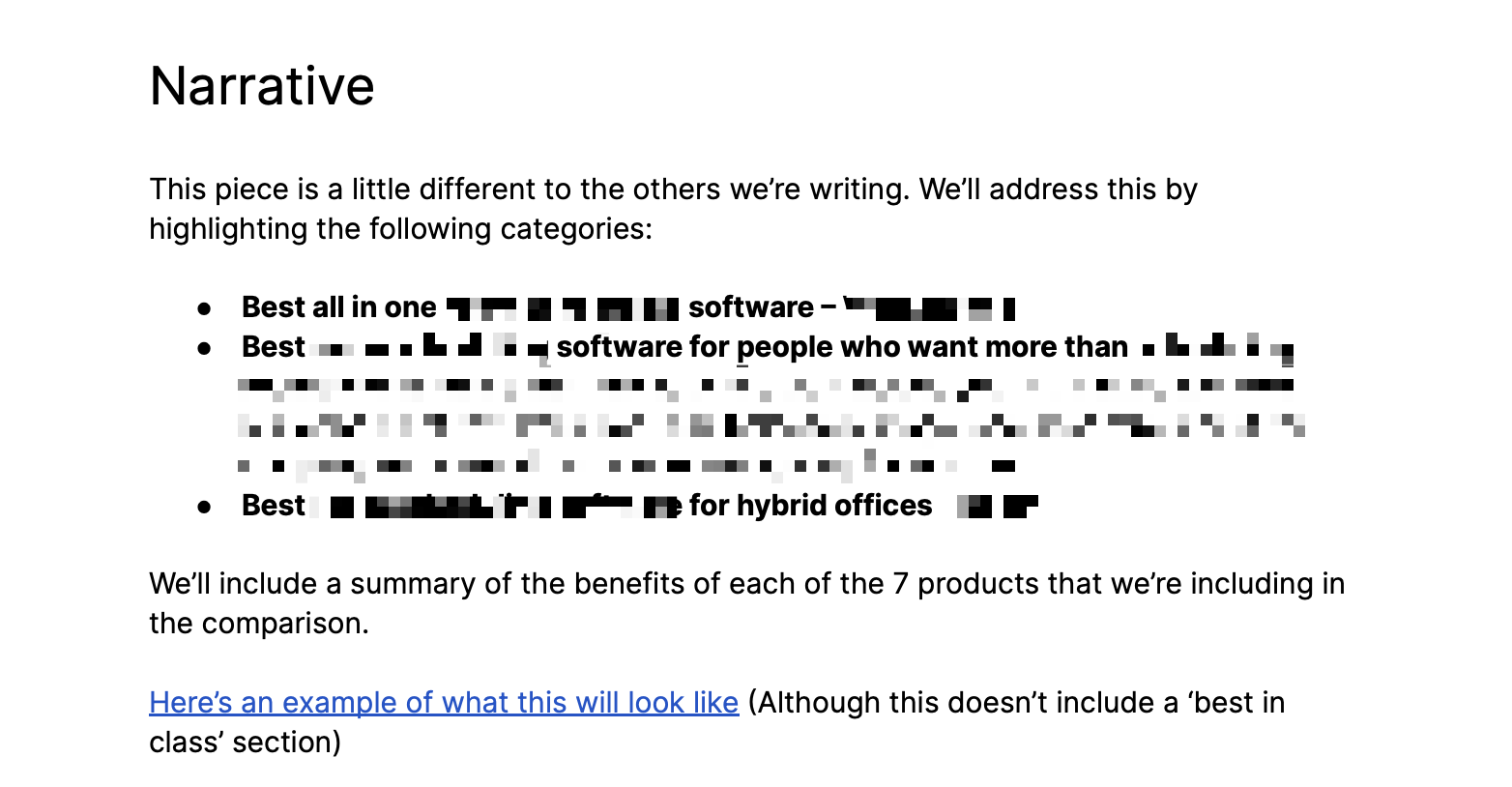
After we’ve finished being clear about the narrative, we’ll create a section titled ‘Positioning.’
The goal of this section is to summarize the positioning of the product either:
- Generally – if this is a top level landing page like a home page, features page or pricing page
- Or specifically – if it’s for a particular segment of your customer base or a use case page
In reality, you should have a strong site architecture that speaks to a range of both specific and general audiences. For more info on our recommended approach, check out the SaaS Authority Architecture.
While writing this section on positioning, you should try to answer these questions:
- In relation to this page, who is our product positioned for?
- What is their specific pain point that caused them to look for a solution like ours
- Why/how does our product solve their problem differently to other options
We tend to work on landing page creation as part of a broader positioning project for our clients and so we will also include links to positioning documentation. This is helpful for anyone who needs to work on this page to access the info easily, which leads to better results.
Here’s an example from a recent landing page brief that I worked on directly. I’ve blurred out any sensitive details to protect our client:
A fleshed out outline
Once we’ve completed the narrative and the positioning sections, it’s time to move to outlining.
Outlining is vital for any piece of content production. It’s quick and easy and it makes writing so much simpler.
To write an outline, start a bullet pointed list in your brief document.
At first, write the 4-5 ideas you’re going to include, summarizing on 1 line if possible. You should be able to do this relatively easily as your pitch and positioning should do the heavy lifting here
Here’s an example of what this could look like for a landing page for a headless CMS.
- Access any content with an API call
- Build a CMS experience that works for you
- Manage content across your organization easily
- Scale content production without scaling infrastructure
Below each one of those bullet points, add a tab or indent and start outlining the specifics of that point. For example:
- Access any content with an API call
- All your content is hosted in one place
- Use GraphQL to access the right thing at the right time
- Boost dev productivity
Your outline will look different every time but if you’re struggling to know what to include as sub-bullets, ask yourself the following question:
How can I support the argument that my solution is the best solution for my customer’s specific pain?
That’ll give you a clear idea of what’s necessary.
2. A set of coherent, differentiated messages
Now that we have a clear outline of our page based on a strong narrative and differentiated positioning, we can start writing the content!
Copywriting is a whole discipline and people spend years getting good at it. Tailoring your messages to the target audience is crucial to improve conversion rates. Conversion rates can vary significantly based on the target audience, so it’s important to create landing pages that resonate with them.
Unfortunately, it doesn’t come easily to most people. You could spend ages learning about it and still not feel that your work is any good.
This is one of the reasons why so many companies like to have agencies like Powered by Search work on their SaaS websites: we’re already experts and deliver consistently good copywriting.
But even if you want to take care of this yourself and don’t feel qualified, there’s a number of formulas that can at least get you to a place of coherence.
Remember: Great artists steal!
Here are four tips that I have seen work consistently for SaaS landing pages:
- Use common formats for writing headlines
- Construct feature descriptions based around the customer’s pain
- Add sub-sections that provide content and build awareness
- Write clear calls to action (CTAs)
Let’s take a look at all of those points in action.
1. Use common formats for writing headlines
Being right at the top of the page, headlines are one of the first things that SaaS marketers end up writing on their landing pages.
It’s not unusual for them to get stuck on this first task and fall into one or two of the following mistakes in the first 5 minutes:
- Using massive cliché or industry jargon – e.g. ‘Time is money. Save both’ or ‘AI-powered xyz’
- Trying to write copy that would be more at home on a billboard (we call this Nike/Apple copywriting) – ‘Make it more human’ (a real headline I found while researching this article – still not sure what the product actually does)
While it’s easy to fall into these traps, neither one helps you convert visitors into customers and most people skip reading headlines like this.
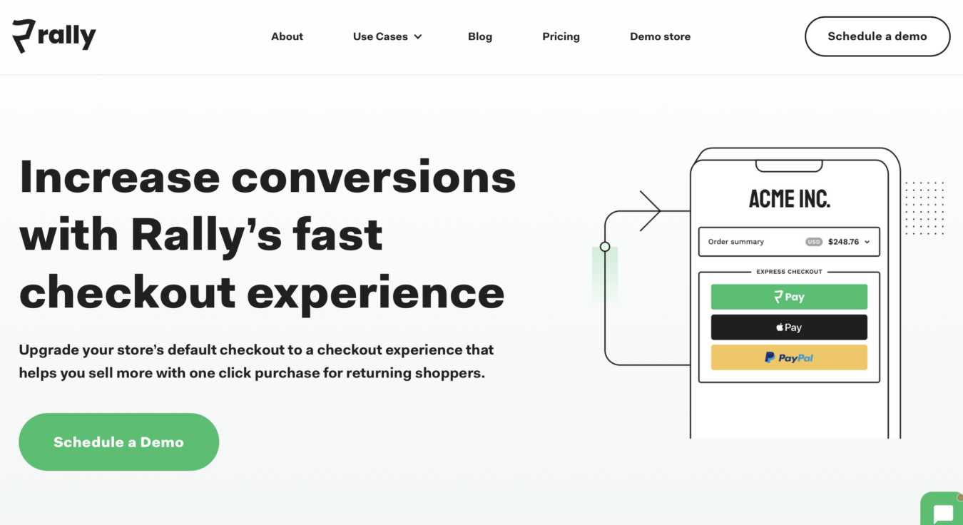
If you think you may be falling into this trap, you should just default to using this simple but incredibly effective formula that we have used on dozens of high converting landing pages:
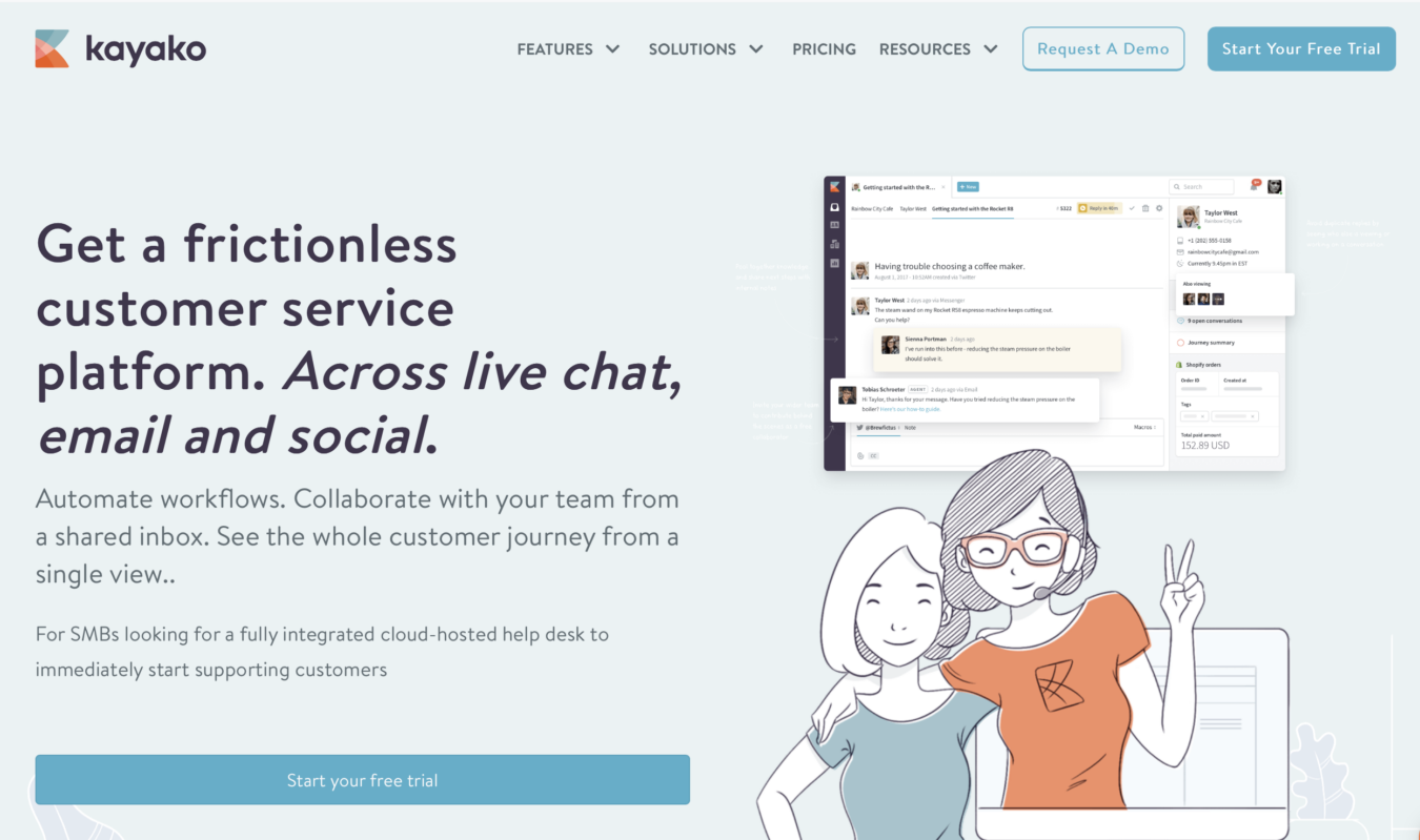
- “Get [Benefit]. With [Feature that gets the benefit].”
This probably seems way too easy. But I have used this formula for years. It is incredibly effective.
Here’s an example from our client Rally who make a headless checkout for ecommerce businesses:
Another example is this one from our client Kayako which follows the formula above almost to the word:
Another formula that we have found to work well is to turn the whole headline into a question. We call this pros without cons:
“What if you could [pro] without [con]?”
An example of this might be:
“What if your team could communicate, without sacrificing deep work?”
There’s really no reason to not use well established headline writing formulas like these. They’ve been proven to work and no-one’s got a copyright on them. Go wild!
2. Construct feature descriptions based around the customer’s pain
One of the most common things you’ll need to include in SaaS landing pages is feature descriptions.
The common (but wrong) way to do this is to make the headline the name of the feature and then write about the sub-features.
Why is this wrong?
Because it goes right back to where we started this article: SaaS marketers who want to talk about their product features so badly that potential customers don’t understand why they would choose any given product over another.
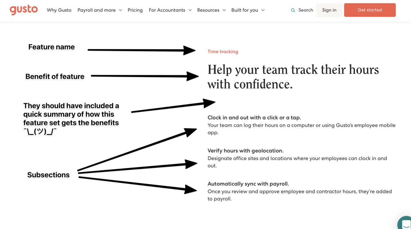
A better way to structure feature sections is this:
Label with feature name
# Benefit of feature as the title ** Summary of the way it works *** Sub sections elaborating
This works so well because it covers off everything that the feature does but aligns it to the benefits that a customer will get by using it.
What does that look like in reality?
Here’s an example from one of my all time favourites Gusto
3. Add sub-sections that provide content and build awareness
In the last tip on writing , we mentioned that it can be very helpful to use sub-sections on feature sections. But using sub-sections can also be useful when you need to elaborate on the point you’ve made in a different way.
For example, under each headline, you have a brief opportunity to elaborate on the point you’ve made with 1-2 lines of text. But you can also add further elements to build on narrative
Here are some ways to use sub-sections that we have found to be incredibly useful:
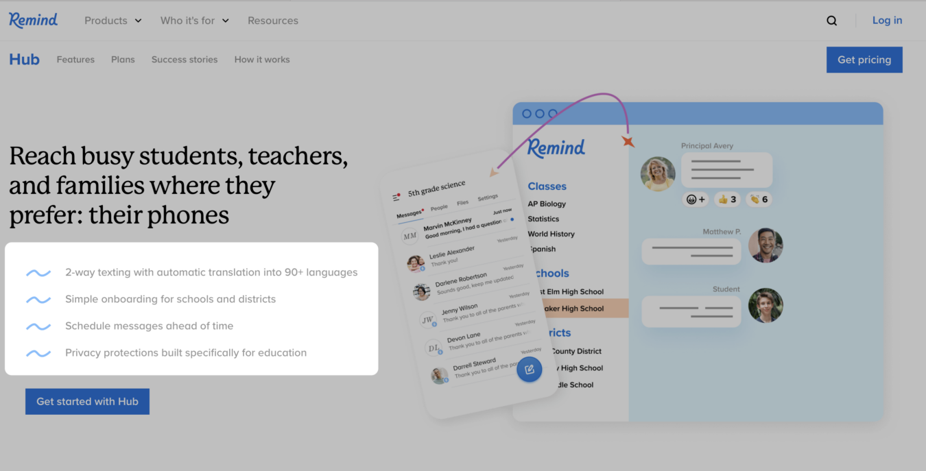
You can add info about sub-features – including additional headlines and straplines like this example from Remind
Or follow Dooly’s example of adding customer testimonials that speak to the features being discussed:
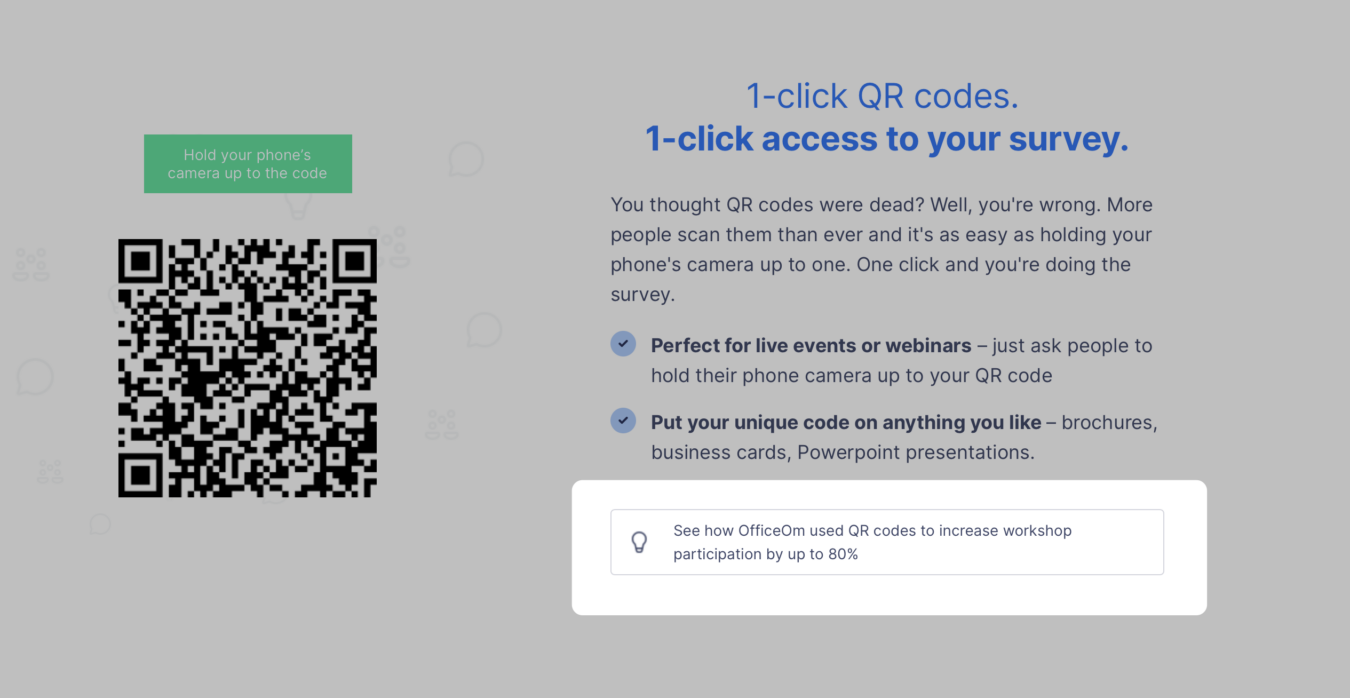
One additional trick is to add links to additional materials to build customer awareness like this example from doopoll
4. Write clear calls to action (CTAs)
One reason that SaaS landing pages don’t convert is because they don’t ask visitors to convert in a clear, sensible way.
Every good SaaS landing page gives a CTA that is clear and well calibrated to the stage of awareness that it’s speaking to.
For example:
- Bad: Get started Good: Start 14-day free trial
- Bad: Contact us Good: Schedule 30 minute demo
Another thing that is particularly effective with copywriting CTAs is to include objection busting microcopy around the CTA itself
Common examples include claims like:
- No obligation
- No credit card necessary
- Use all the features
- Get started in 2 mins
3. A clear visual design
Now that we’ve done the research and used that to write the copy for a clearly focused landing page, we need to put that into a wireframe. A clear visual design is crucial, especially for a SaaS business landing page, as it helps in presenting features, user testimonials, and branding effectively.
But this is terrifying for lots of marketers for many reasons:
- What they have in their head never comes out onto the page
- They feel powerless in getting their ideas out
- The designer doesn’t follow their brief
To make the process of getting to Google Doc to browser is made a lot easier by actually using Google Docs to wireframe your page.
This is a really solid step to take because not only does it lower the risk of a marketer running into the aforementioned problems with their wireframes, but it provides an familiar interface for non-design minded people in your team and other stakeholders to provide comments and feedback on the lo-fi wirefame before you even get it to a designer.
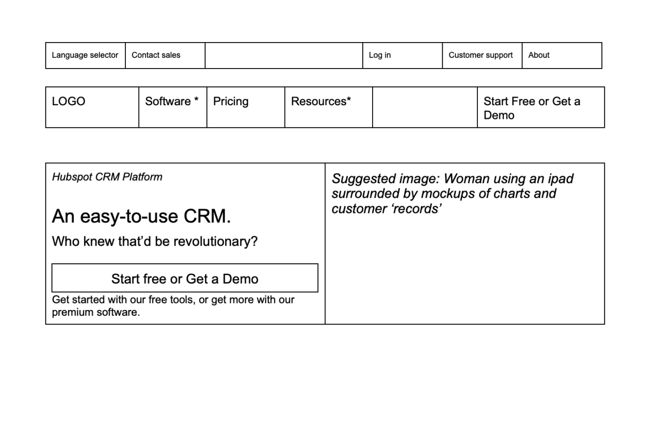
When we work on landing pages for clients at Powered by Search, we always start the design process by using Google Docs’ tables feature to build your copy into a super lo-fi landing page.
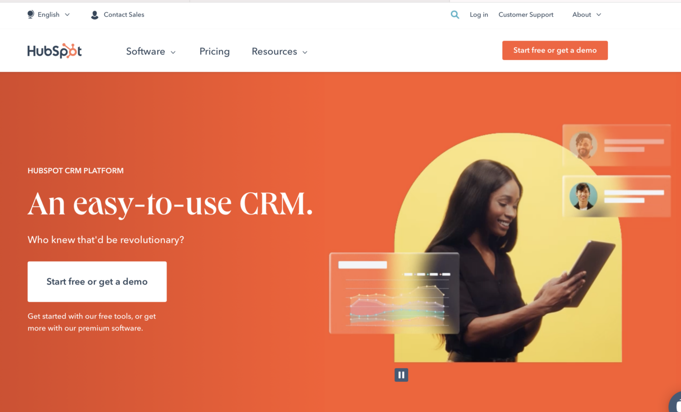
Take Hubspot’s hero for example. It looks like this now that it’s live on their site:
But in a Google Docs wireframe, it looks like this:
Beyond making it easy for your designer and to get comments from your colleagues, why do this?
Firstly, it helps you understand whether your page is going to turn out the way you think it should. Secondly, it shows you where you might need to include additional info to flesh out the narrative of the page.
Once you’re finished with your Google Doc landing page, you can pass off to a designer and developer – but that’s the topic for a future article!
In Closing
It’s extremely common for SaaS companies to create poorly converting landing pages. SaaS businesses often face unique challenges in optimizing their landing pages for conversions due to factors like the intangible nature of software, niche targeting, and longer sales cycles. These challenges generally result in lower conversion rates compared to other industries.
Ultimately this means that they have a much lower pipeline quality than they need and they struggle to continue to hit growth goals.
We have helped many clients overcome this by following a system of landing page creation that focuses on the following:
- A clearly defined purpose
- A set of coherent, differentiated messages
- A clear visual design
The result, for many, is landing pages that convert to trial or demo at a rate of anywhere between 4-20%.
What would it look like if you could replicate that for your SaaS company?
If you want help nailing your messaging and creating high converting landing pages, reach out for your Free Marketing Plan. We’ll discuss where you are and how we can help you get landing pages that convert visitors into revenue.
Related Resources
Deep Dives
- B2B SaaS Landing Page Statistics & Benchmarks
- B2B SaaS Landing Page Checklist
- B2B SaaS Trial Conversion Rate Benchmarks
Related Articles
- SaaS Landing Page Best Practices (Examples + Templates)
- 25 Landing Page Elements for Increased Conversion Rates
- The Ultimate Landing Page Checklist
What you should do now
Whenever you’re ready…here are 4 ways we can help you grow your B2B software or technology business:
- Claim your Free Marketing Plan. If you’d like to work with us to turn your website into your best demo and trial acquisition platform, claim your FREE Marketing Plan. One of our growth experts will understand your current demand generation situation, and then suggest practical digital marketing strategies to hit your pipeline targets with certainty and predictability.
- If you’d like to learn the exact demand strategies we use for free, go to our blog or visit our resources section, where you can download guides, calculators, and templates we use for our most successful clients.
- If you’d like to work with other experts on our team or learn why we have off the charts team member satisfaction score, then see our Careers page.
- If you know another marketer who’d enjoy reading this page, share it with them via email, Linkedin, Twitter, or Facebook.