Does Your Landing Page Match the Scent of Your Ad?
Last updated: March 17th, 2026
Use SCENT to Match Landing Pages to Ad Creative
A confused mind never buys.
When a user is directed to your website, they aren’t thinking. One of the most preventable mistakes businesses make is the poor connection between their ads and their landing pages.
At the end of the day, the connection between the ad and the website needs to speak to people’s lizard brain — not the rational brain. Although humans may seem like logical creatures, we prefer to make decisions based on our instincts. You need to ask yourself the following:
Can users make sense of my webpage in 5 seconds or less?
If it’s not simple enough to make a strong impression within that short timeframe, they’re going to move on.
Here are the 5 factors that improve SCENT between landing pages and ad creatives, and prevent confusion while increasing conversions:
- Single Offer
- Clarity
- Emotion
- Need
- Thank You Page
Let’s walk through each step using real examples of ads we found online.
#1 – SINGLE offer that matches the creative
Look at the following ad:

This ad is great, highlighting free debit transactions and an iPad mini. It’s clearly written and stacks its offer with a strong CTA. But here’s what happens when you click on it:
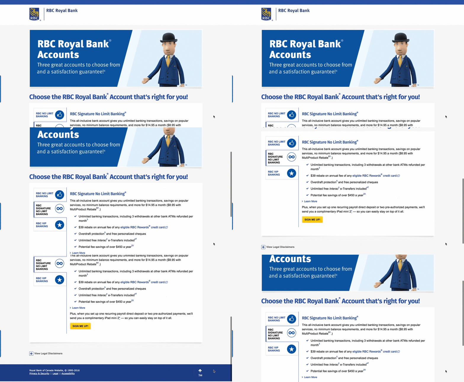
It doesn’t match the creative at all. This page shows you multiple account options, which is confusing for the user. You need to have a single offer that matches the creative ad; less is more. Stick to one offer that matches the ad so your prospect doesn’t have to search around.
Here’s our version:
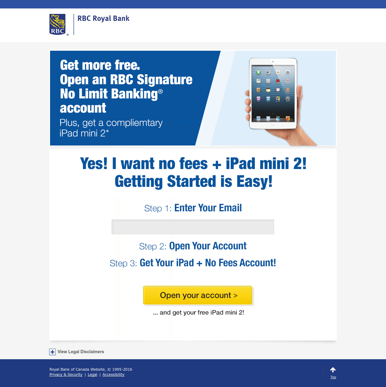
See the difference? You can view the advertised account, the iPad, and it clearly reflects the original ad.
Note: we always ask for the user’s email address first. That way, if they abandon the offer, we can follow up with email marketing. On to the next step…
#2 – CLARITY
Take a look at the ad below:

It shows you a potential to save 20% in the ad. But then it leads to this page:
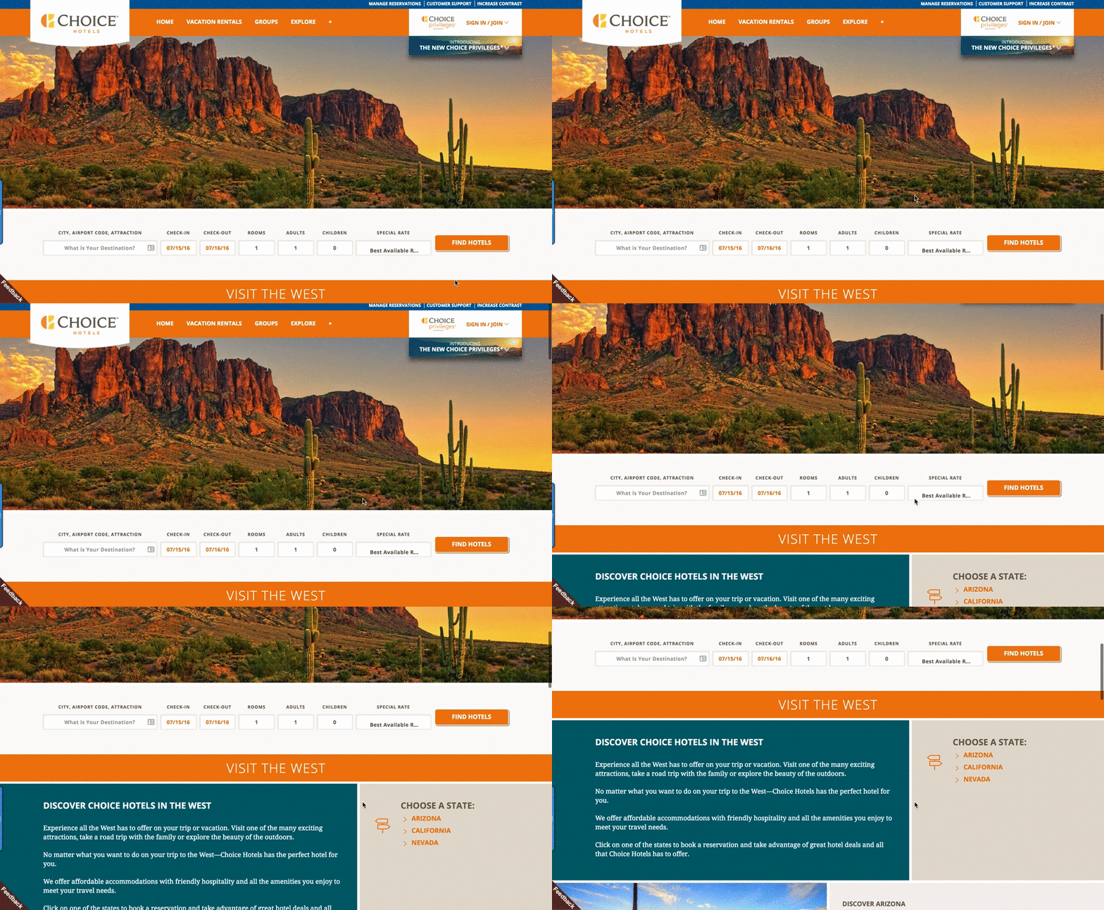
Once you reach the landing page, 20% is nowhere to be seen. What is the user supposed to be looking for? This is confusing, and definitely takes more than 5 seconds to understand.
Here’s the version we made to create better clarity for the lizard brain:
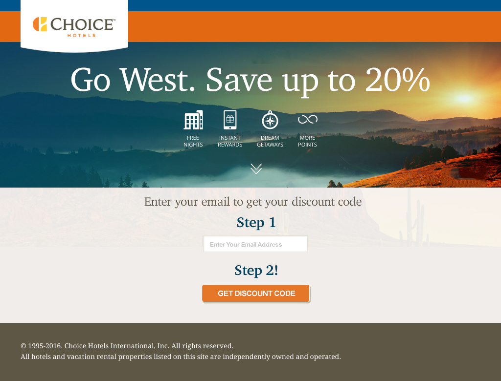
In our version, you go from the ad (whose focus is 20%) to a landing page that has a clear next step. It’s easy to see how this makes more sense to the user. Clarity is key.
(Note: in this version we still collect emails first, allowing us to follow up with the user.)
#3 – EMOTION
Who wants a fun-filled trip with their kids? Check out the ad below:
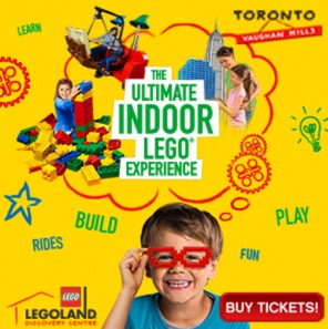
It looks like a great time in the ad! The user wants to have a great experience with their kids, so they click on it to explore that emotion. But where does it lead?
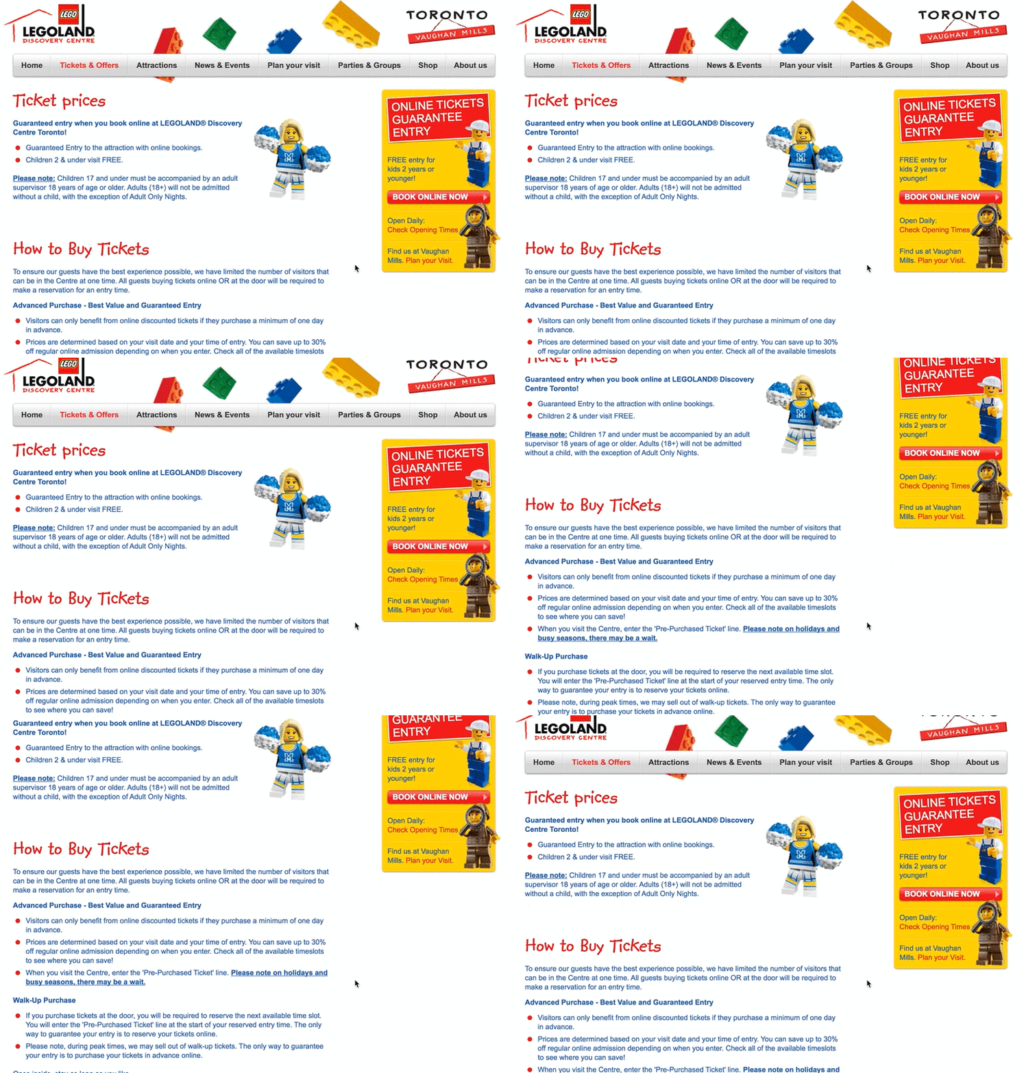
A ton of text.
The user doesn’t know what to do next, and it doesn’t look like the same experience at all. We can do a lot better at carrying through the emotion from the great creative. Here’s our improved version:
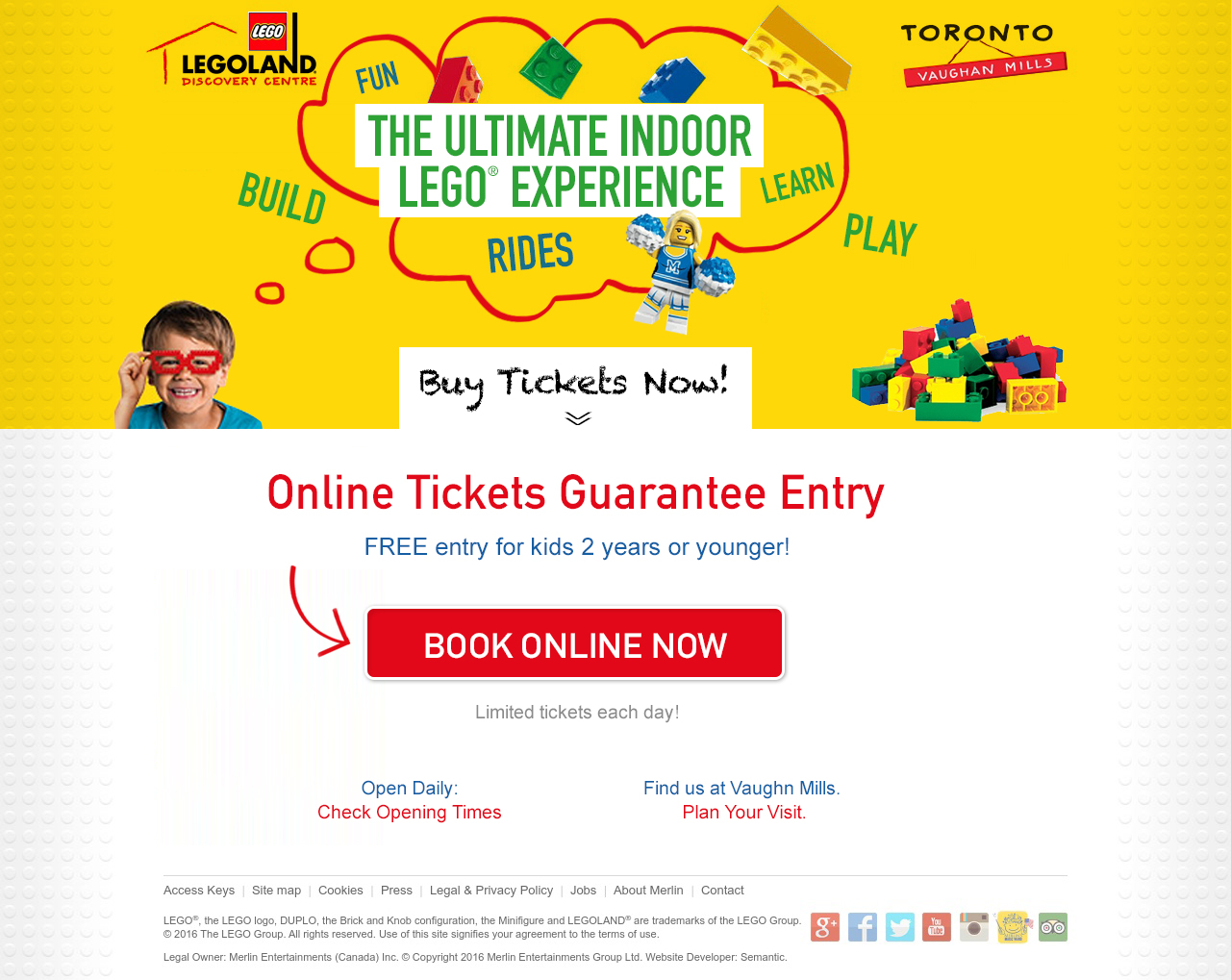
This is much better. Notice the other things we’re adding:
- “BOOK ONLINE NOW” button
- The phrase “Guarantee Entry” to increase fear-of-missing-out
- A directional cue to guide the user to the next step
- A great CTA — and free for kids under 2 years
Remember that you only have 5 seconds to make an impression. Can you guess which page has higher conversions?
#4 – NEED — why do they need to act now?
Here’s an ad with a stellar example of fear-of-missing-out:
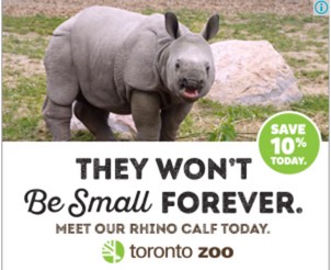
This is a great ad. You get 10% off. It also reminds you that the baby animals aren’t going to be small forever. What happens when you click?
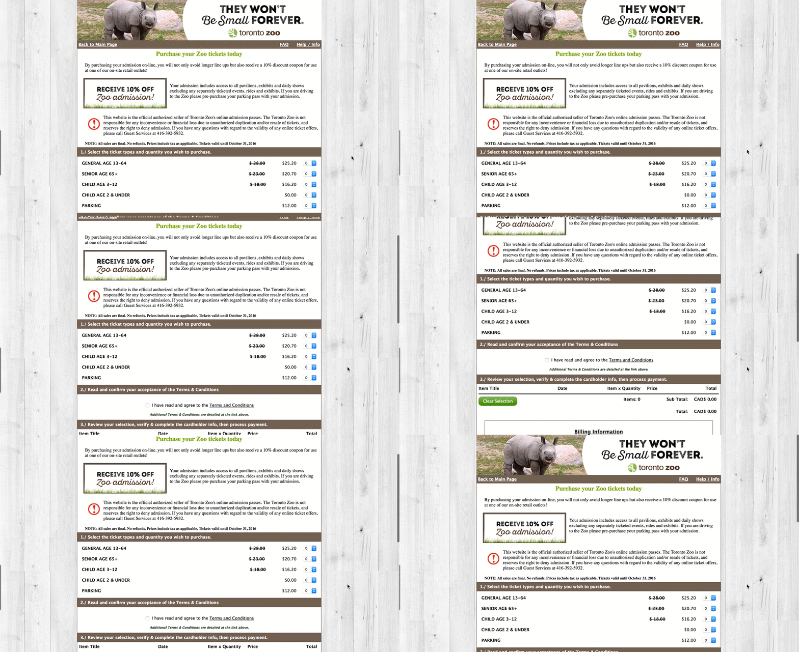
They send the user to a landing page with so much text and so many options, leaving them confused and thinking, “I just want my discount.”
Every time you have too many things for people to do/ click on, you’re going to lower your conversion rate. In this landing page, you can see FAQs at the top among many other options. They don’t even capture the email address right away.
We took a stab at it:
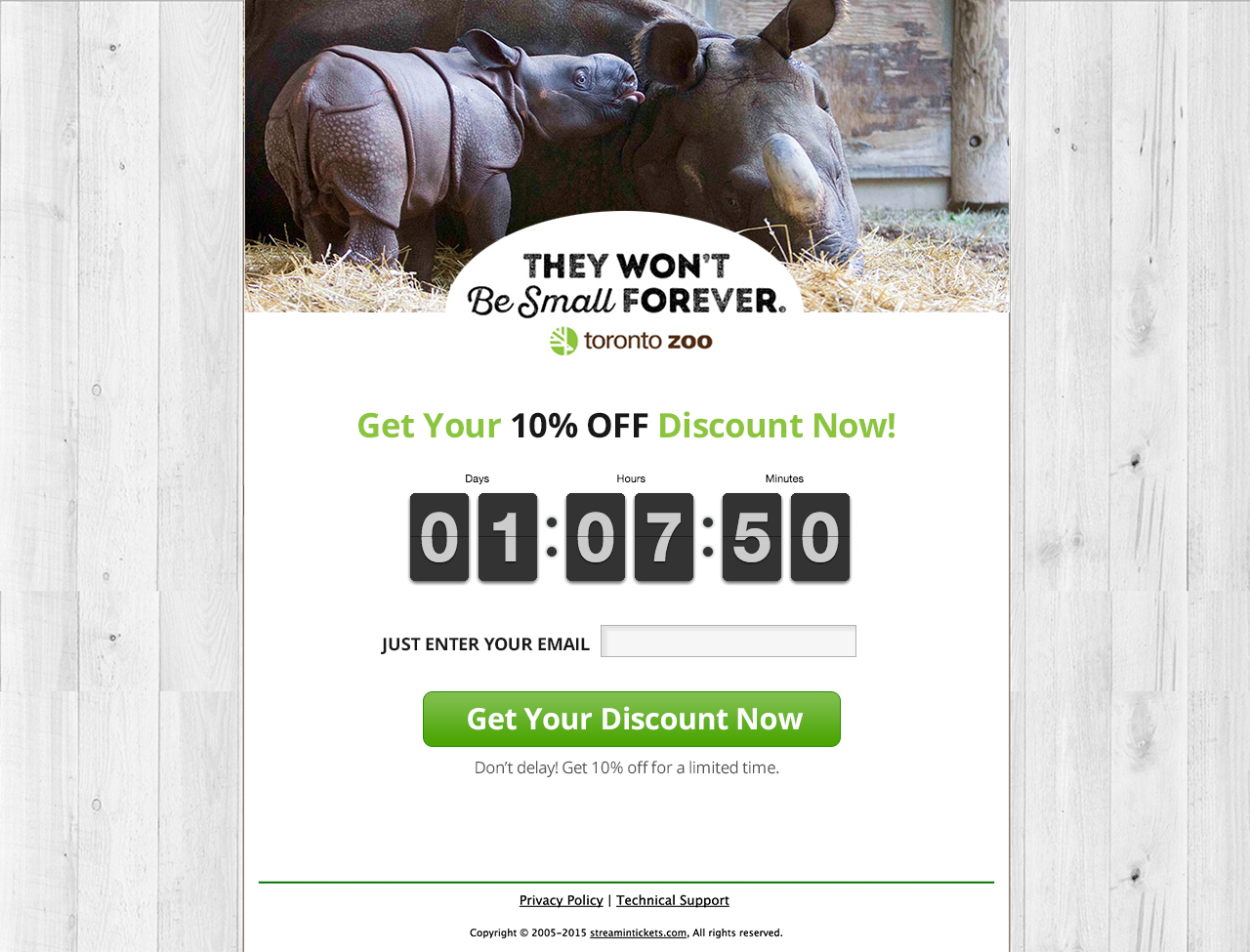
Isn’t that better? It matches the creative. The countdown clock lets us know that the offer is only for today, there is only one option: put in my email. We’re cognizant of the time-sensitive offer because the countdown clock drives the point home.
This landing page is going to increase conversions because the need is clear. This speaks to the lizard brain and quickly connects the landing page to the initial ad creative.
#5 – THANK YOU Pages
A lot of people overlook the confirmation page, not realizing how important it is. We’re going to use Canadian Tire as an example. Here’s what it looks like as a user tries to sign up for their weekly newsletter:
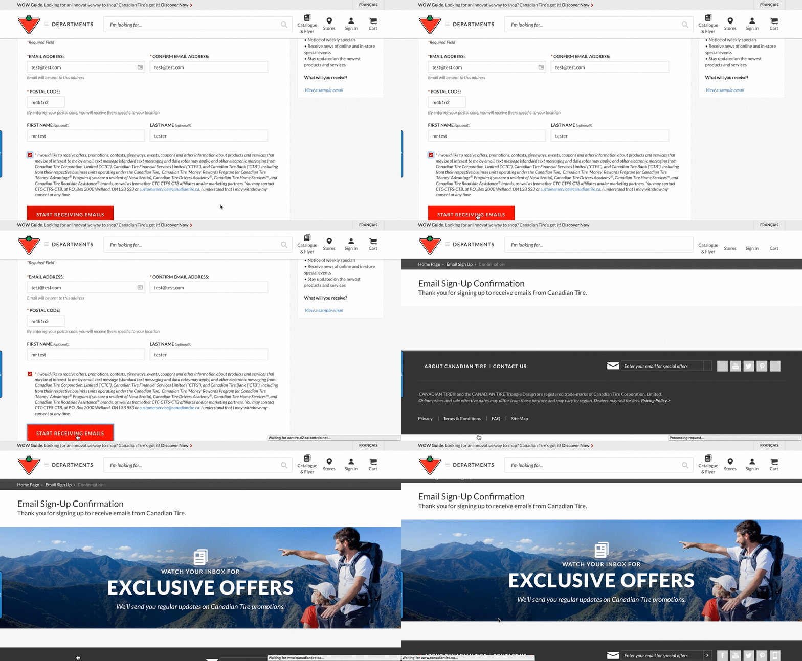
After going through the process, we end up on a page with a man pointing.
This can cause anxiety for the user because it doesn’t immediately make sense. We’re not certain whether or not the email submission has even “worked” on this page. This is not a positive experience, so here’s what we would suggest they do instead:
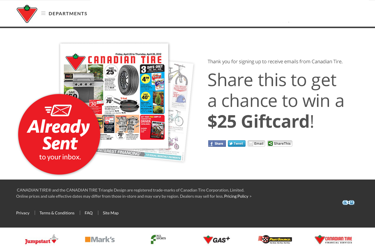
Now you see the flyer, it says it’s already sent, and it gives you an opportunity to go even one step further and share on social media. This is a great opportunity to not just confirm their experience with a uniform SCENT, but also to get people to re-share it— which they will when they have a great experience.
Remember, the SCENT needs to have a smooth experience from the ad creative, to the landing page, to the confirmation page.
Summary
If you want to follow SCENT, you’ll be able to optimize your creative to landing page experience in such a way that optimizes for more conversions. To sum it up, here are the five steps again:
- Single Offer – Keep it to only one offer between your landing page and your creative.
- Clarity – There must be clarity, so don’t clutter the experience with stuff that doesn’t match.
- Emotion – Make sure the emotion feels the same.
- Need – There should be a fear/loss reason for them to act now or opt in now.
- Thank You Page – Don’t forget that the final step of the process is still part of the user experience.
Use this formula and create a pleasant experience for your users, and share this article if it was helpful to you. But remember, this is just one aspect of digital marketing. There many more aspects of digital marketing, and if you need any more help, we would love you to get in touch with us.
In the meantime, check out our other free resources that will take your marketing efforts to the next level, such as our AdWords Checklist below:
[lmpromo]
Related Resources
Deep Dives
- B2B SaaS Landing Page Statistics & Benchmarks
- B2B SaaS Landing Page Checklist
- 10 Examples of The Best SaaS Landing Pages
Related Articles
- SaaS Landing Page Best Practices (Examples + Templates)
- The Ultimate Landing Page Checklist
- Boring, unsexy, incredibly effective: How to improve your SaaS landing page conversion rate
What you should do now
Whenever you’re ready…here are 4 ways we can help you grow your B2B software or technology business:
- Claim your Free Marketing Plan. If you’d like to work with us to turn your website into your best demo and trial acquisition platform, claim your FREE Marketing Plan. One of our growth experts will understand your current demand generation situation, and then suggest practical digital marketing strategies to hit your pipeline targets with certainty and predictability.
- If you’d like to learn the exact demand strategies we use for free, go to our blog or visit our resources section, where you can download guides, calculators, and templates we use for our most successful clients.
- If you’d like to work with other experts on our team or learn why we have off the charts team member satisfaction score, then see our Careers page.
- If you know another marketer who’d enjoy reading this page, share it with them via email, Linkedin, Twitter, or Facebook.