SaaS Landing Page Best Practices (Examples + Templates)
Last updated: March 17th, 2026
If your landing pages are underperforming, the next logical step is to test them.
The only problem is that you need to know why your landing page isn’t converting before you test it.
Is the problem the traffic quality? The CTA? The value proposition/pain point?
If you’re blindly guessing why it isn’t converting and testing different elements randomly, you’ll probably waste a lot of ad budget.
To help you accurately identify why your landing page isn’t performing and solve the problem, here’s the step by step process we use to audit SaaS landing pages.
SaaS Landing Page Optimization Best Practices
Below is the checklist we use to audit SaaS landing pages.
Align Pre-Click Messaging
Have you ever clicked on an ad only to land on a page that doesn’t deliver the resource or asset you anticipated?
Most SaaS companies aren’t making obvious mistakes, like using click-bait messaging to attract leads to an irrelevant landing page.
Instead, pre-click messaging mistakes are often subtle. Here are a few examples:
- Benefit/pain point messaging is misaligned. For example, the landing page may promote a different benefit than the landing page (as seen in the example below). Or, the landing page messaging may simply be too vague.
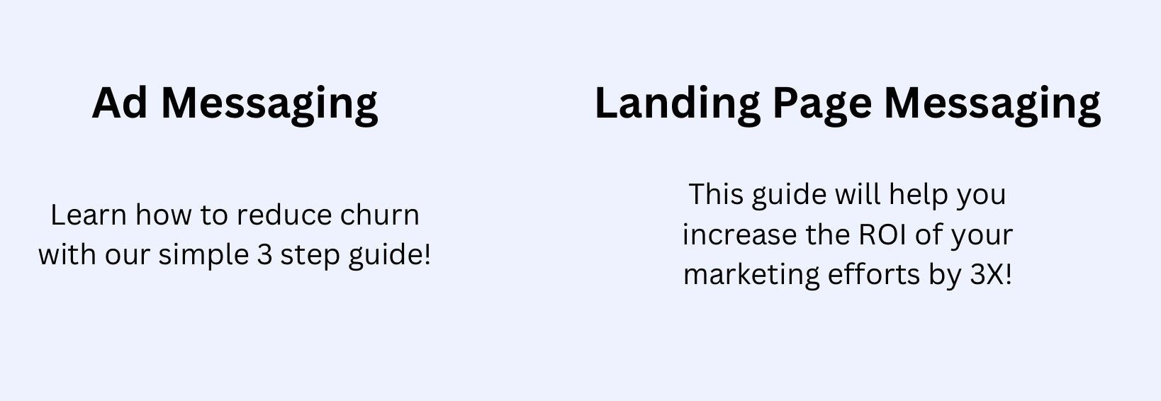
- The pre-click messaging implies education in the form of a free resource whereas the landing page only offers a demo.

Changing the design (colors, fonts, etc.) from the pre-click ad/content to the landing page can also be jarring to prospects and cost conversions.
Instead, maintain consistent messaging, offers, and branding across the pre-click messaging and the landing page.
Align Messaging With ICP
The landing page messaging should target your ideal customer profile, but this simple concept becomes complicated for SaaS companies with multiple ICPs for two reasons:
- The product(s) are ideal for multiple use cases, and/or
- Multiple stakeholders are involved in the buyer journey at different points (e.g., a CTO, individual engineers, etc.).
As a result, the landing pages target the wrong persona.
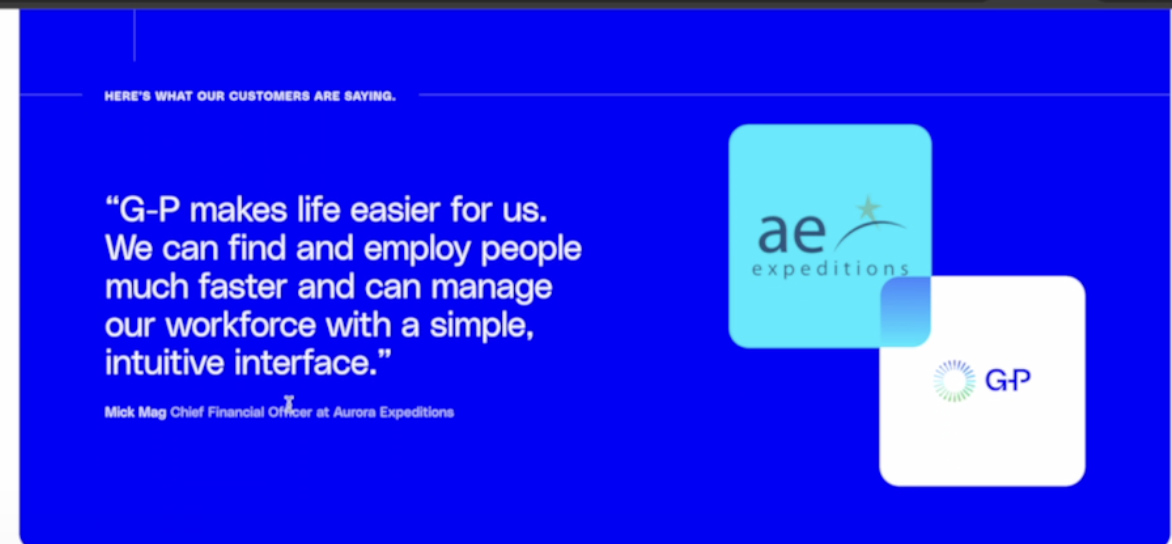
For example, we recently audited a landing page attracting small business owners, though the testimonials were from enterprise customers.
Another mistake we see is marketers leaving the messaging intentionally vague as they know that multiple stakeholders or ICPs arrive land on the page.
However, vague messaging won’t convert any of your prospects.
For example, if you have project management software and serve both agencies and SaaS companies, vague messaging like “get more done in less time” isn’t nearly as compelling as “improve team collaboration to deliver a seamless client experience.”
The solution is to identify your ICP and the stakeholders involved at each stage of the process. Then, create landing pages for each specific ICP.
Optimize Copy To Address Pain Points And Benefits
SaaS landing pages that explain features tend to have low conversion rates because they don’t communicate how the product will solve the visitor’s problem.
For example, this payment processing platform has an estimates feature. It’s tempting to talk about how the estimates feature works, how its dashboards work, and other capabilities it offers.
Yet prospects only care about how it will benefit them, so the messaging discusses what prospects care about – profit-driven, repeatable estimates.
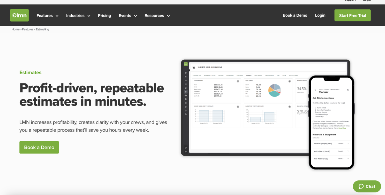
As you scroll down, we talk about the feature in more detail, but always from a benefit perspective. Instead of discussing how the estimates to budget linking feature works, we discuss how it will make the prospect’s business more efficient.
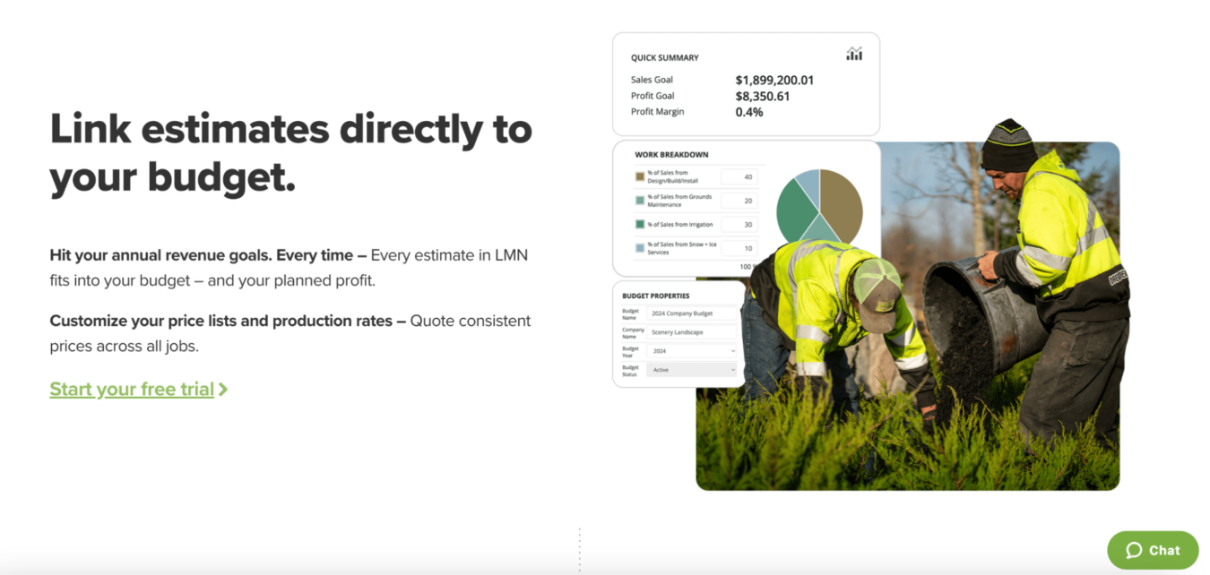
So, instead of discussing features on your landing pages, discuss the main pain points your product solves for existing customers and the benefits it gives them.
It’s also important to refer back to the ICP each landing page is targeting, as each will have slightly different pain points.
For example, a CTO may value team efficiency benefits, whereas an individual engineer may value ease of use benefits.
Similarly, different industries (e.g., restaurants, clinics, etc.) may have different pain points and value different benefits.
Simplify Forms By Taking A Progressive Profiling Approach
Sales wants as much information as possible on any prospect so they can tailor their pitch accordingly and close prospects more efficiently.
However, if you ask for too much information at once, right fit prospects may abandon the form altogether, resulting in fewer total conversions.
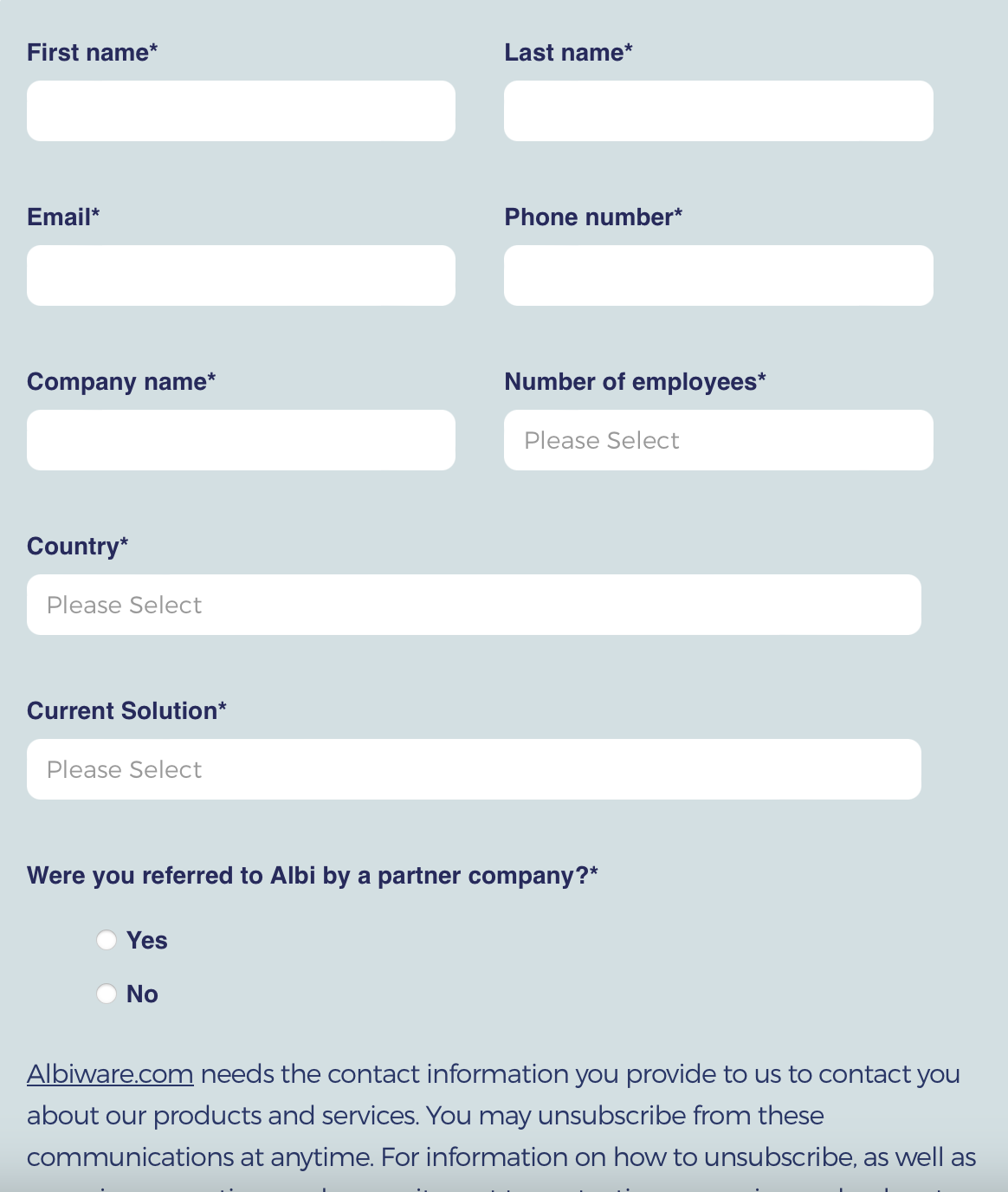
Instead, we recommend a progressive profiling approach where you collect more information over time.
First, ask for their name and email.
Once a prospect provides that information, enroll them into a nurture sequence or use a third-party data enrichment to build out their profile progressively so you can learn more about their company, role, team size, and industry.
A Clear Call To Action Placed Above The Fold
There are common mistakes we see with CTAs that lower conversions:
- Obscure Placement: The CTA button is too small or placed below the fold.
- Unclear Messaging: It’s easy to over-optimize the CTA text, yet doing so can make the CTA unclear. For example, “start streamlining sales” doesn’t clearly communicate what will happen next. Are they scheduling a demo? Starting a free trial? Downloading a lead magnet?
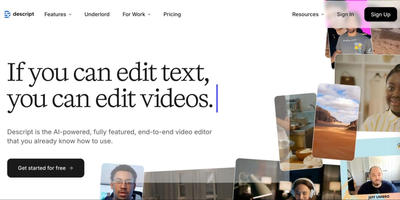
Instead, clearly place the CTA above the fold and ensure it takes up a significant amount of real estate on the page (at least 30% or more).
The text surrounding the CTA button should also communicate what happens after a prospect takes the next step. For example, if it’s “schedule a demo,” state the demo length or what they’ll learn.
Here’s an example of a well-optimized CTA:
Optimize Visual Design For Clarity
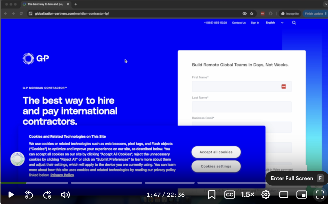
Many SaaS landing pages are littered with unnecessary distractions that create friction in the user experience.
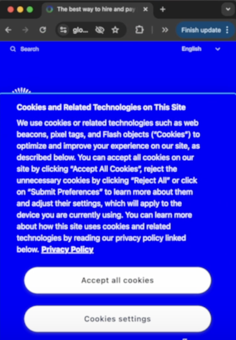
For example, in the SaaS landing page below, users have to close the cookie bars and chatbots before they can see your value proposition.
The mobile experience is even worse:
Another challenge is poorly organized copy.
While longer landing pages aren’t bad, the text should be organized in a way that is easy to skim and clearly communicates the value.
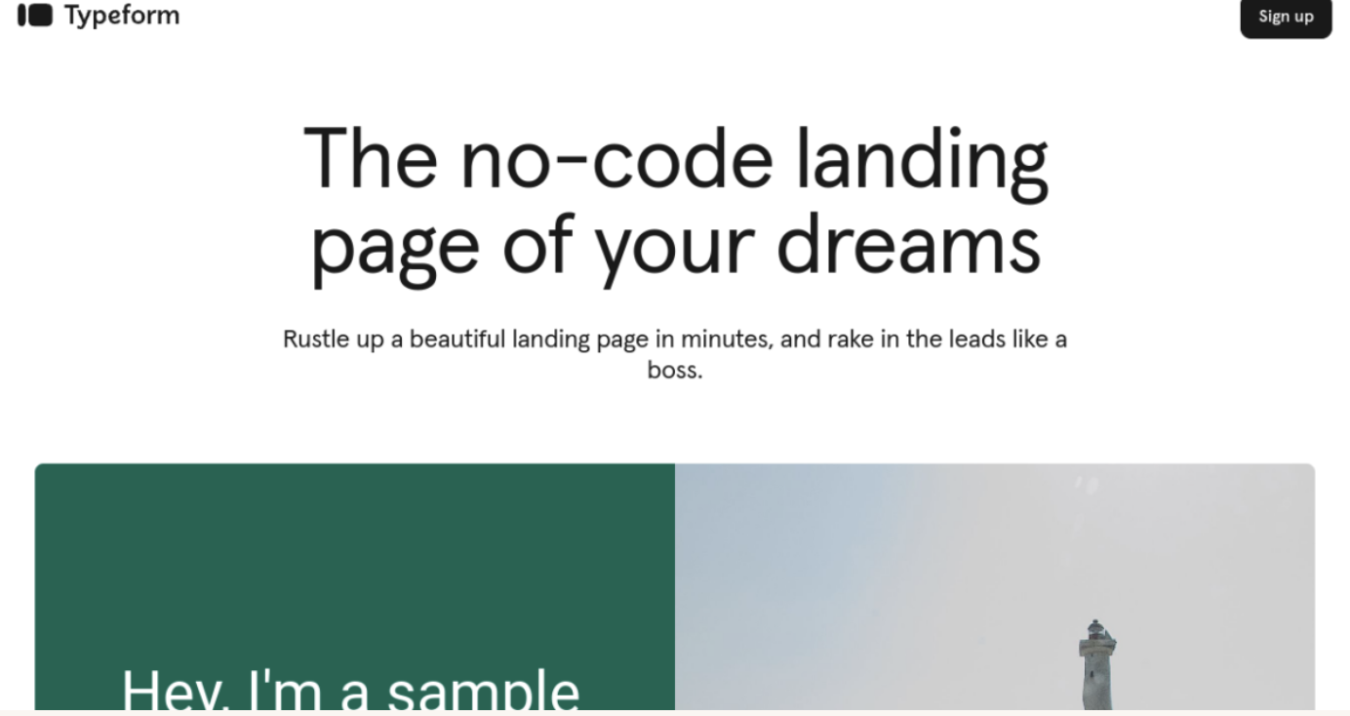
Here’s a great example of a clean, clear landing page:
Deliver An Equally Seamless Mobile Experience
Many prospects are probably viewing your page on their mobile devices, so apply all of the best practices mentioned above to the mobile version as well.
The form fill should also be easy to fill out on a mobile device. Prospects will likely abandon it if it’s too small or difficult to type.
You can also compare mobile and desktop conversion rates. If the mobile conversion rate is significantly lower than the desktop conversion rate, revisit the design best practices above.
Optimize Post Click Experience
Prospects need to attend a demo or use the product during the free trial before they’ll convert, and the post-click experience heavily impacts whether or not they’ll proceed in the customer journey.
If the thank you page is confusing and doesn’t deliver what prospects want, they’ll likely abandon it and drop out of the buyer journey.
For example, if someone clicks to schedule a demo but doesn’t immediately see a calendar to schedule a time (e.g., they have to scroll for it) on the thank you page, they’re less likely to schedule a demo.
Another mistake is sending prospects to a landing page that says they will be emailed a calendar link. If prospects have to search for the email in their inbox, you’ll likely lose them as they become distracted by other emails.
Instead, the thank you page should give prospects what they signed up for and the next steps to take to proceed in the buyer journey.
Here’s an example of a well optimized thank you page following an asset download.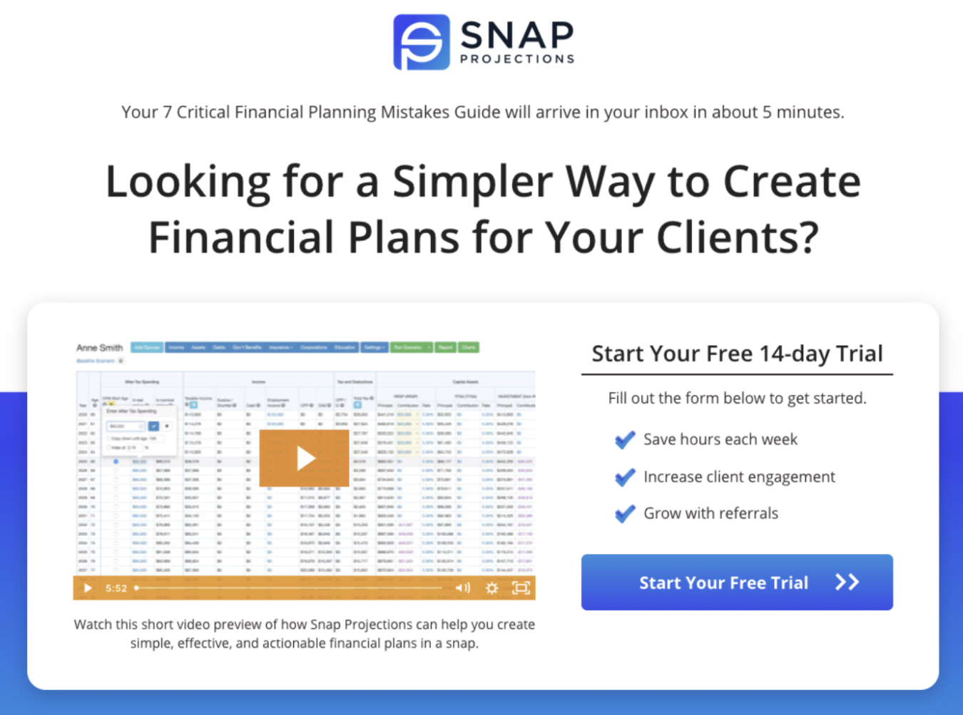
After receiving the asset or scheduling the demo, keep prospects engaged through email marketing.
For demo signups, we use a 14 day nurture sequence of five emails, three of which illustrate how the product solves three relevant pain points.
When prospects see how the product can solve their problems, they’re more likely to show up to the demo as they realize it’s the solution they need. The demo will also be more productive as prospects will be familiar with how the product works and can ask more advanced questions, requiring less follow-up after the demo.
If a prospect signed up for a free trial, the nurture sequence can educate them on using the product to achieve specific outcomes. Assuming your product delivers meaningful value, it’s a no-brainer for right-fit prospects to convert when they use it correctly.
Another often overlooked opportunity to improve conversions is sending a no-show sequence that immediately offers another opportunity to book the meeting if they didn’t attend.
For free trials, we offer an extension so they can continue using it if they need more time and provide links to resources to help them use it effectively.
SaaS Landing Page Examples
We’ve discussed specific best practices for creating a high-converting SaaS landing page, and while there isn’t a single perfect landing page template, here’s a checklist of components every landing page should include:
- Headline with a clear value proposition
- Testimonials/proof points from your target audience
- Pain points/benefits
- Clear CTA
If you want some inspiration as you create your own landing page, here are a few examples of landing pages we’ve improved.
Use Case Examples
- Globalization Partners: Highlighting mistakes in current landing pages and proposing optimized versions. https://www.globalization-partners.com/meridian-contractor-lp/
- Full Fabric: Before and after mock-ups to showcase improvements in messaging and form simplicity. https://www.fullfabric.com/book-demo
- Albi: Addressing issues like visual clutter, form complexity, and messaging alignment. https://go.albiware.com/book-a-demo
Get More Help Improving Landing Page Conversion Rates
Above is the step by step process we use to improve SaaS landing page conversion rates, but there isn’t a single template perfect for every landing page.
Your product, demo structure, the prospect’s familiarity with your product, and a variety of other factors impact the nuanced differences in the copy and structure of your landing page.
Therefore, if you want more personalized help improving your landing page conversion rates, reach out to our team today. We’ve run hundreds of tests across dozens of SaaS landing pages and can help you dial in yours.
Reach out for a free marketing plan today.
Related Resources
Deep Dives
- B2B SaaS Landing Page Statistics & Benchmarks
- B2B SaaS Landing Page Checklist
- 10 Examples of The Best SaaS Landing Pages
Related Articles
- The Ultimate Landing Page Checklist
- Boring, unsexy, incredibly effective: How to improve your SaaS landing page conversion rate
- Does Your Landing Page Match the Scent of Your Ad?
What you should do now
Whenever you’re ready…here are 4 ways we can help you grow your B2B software or technology business:
- Claim your Free Marketing Plan. If you’d like to work with us to turn your website into your best demo and trial acquisition platform, claim your FREE Marketing Plan. One of our growth experts will understand your current demand generation situation, and then suggest practical digital marketing strategies to hit your pipeline targets with certainty and predictability.
- If you’d like to learn the exact demand strategies we use for free, go to our blog or visit our resources section, where you can download guides, calculators, and templates we use for our most successful clients.
- If you’d like to work with other experts on our team or learn why we have off the charts team member satisfaction score, then see our Careers page.
- If you know another marketer who’d enjoy reading this page, share it with them via email, Linkedin, Twitter, or Facebook.