18 Examples of The Best SaaS Resource Pages
Last updated: August 30th, 2024
Are you concerned that your SaaS website’s resources page isn’t as impressive and effective as it could be?
As you may well know, a SaaS resources page can be a great way to target leads at the top and middle of the sales funnel. If it’s not performing as well as it could, you might be missing out on chances to convert leads, so it’s crucial to revamp it for better customer engagement.
We can help you design an effective resources page by showcasing 10 inspiring website resource page examples. Explore how these SaaS companies have enhanced their websites with additional resources and value, and get inspired to elevate your own.
Squarespace
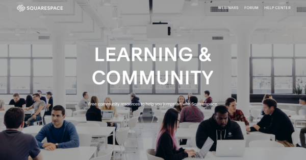
Squarespace is a popular codeless website builder known for their beautifully designed templates. So, it’s no surprise that their resource page, called Learning and Community, is also visually appealing.
The layout is well-organized, making it easy to navigate the page and learn.
In the header bar, you can navigate to webinars, forum, and help center, but you’ll also find these sections as you scroll down the page. The page design is minimalistic and uncluttered, with no visible guides or other content. To access them, you have to navigate to those pages. In the footer, you can also find links to more resources, like the Squarespace blog, a marketplace to hire a designer, API documents, and various Squarespace social media communities.
Thinkific
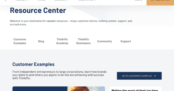
Thinkific is an eLearning platform that allows anyone to create and monetize their skills by developing online courses. Their resource page provides a host of information to help users get the most out of the platform.
The header bar has links to other pages on the website, but as you scroll down, you’ll see navigational categories within the resource center curated to cater to different user needs. There are customer examples, a blog, the Thinkific Academy, Thinkific Developers, community, and support, all well laid out so the page doesn’t seem overcrowded. There’s also a strategically placed call-to-action “get started free” both at the top and bottom of the page, encouraging visitors to start their course creation journey.
BigCommerce
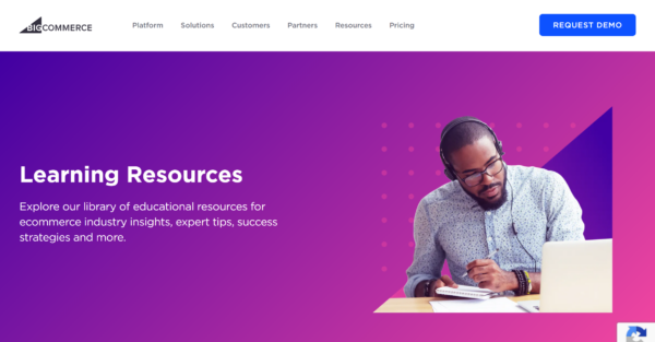
BigCommerce is an e-commerce platform that gives business owners all the functionality they need to create an online store and manage inventory, orders, and marketing. They have a learning resources page where you can find a ton of additional information.
This page has everything from featured articles covering industry insights to analyst reports, ebooks, case studies, and the BigCommerce blog. For more detailed learning materials, they also have webinars, live events to register for, and the BigCommerce University, which hosts a range of courses. Navigation between the different sections is straightforward and there are further links to the rest of the website in the header and footer.
Figma
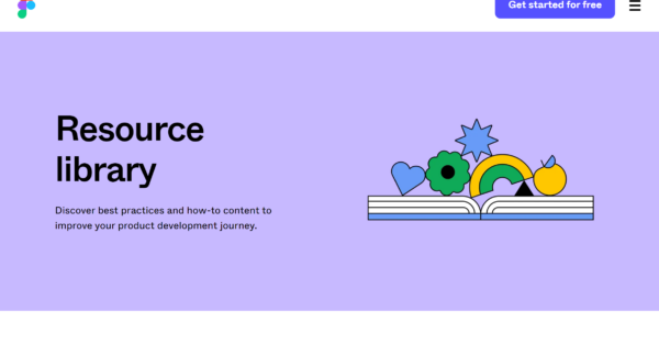
Figma is a collaborative design tool for all kinds of web applications. Its array of powerful tools may initially seem overwhelming, which is why they’ve stocked their Resource Library with plenty of helpful information.
The overall style of the page is bold with a large font size but minimal text, which makes all the details stand out really well. They have learning and development articles split into categories like design basics, UI design, prototyping, and design systems. You’ll also find articles related to the FigJam Whiteboarding tool and how it’s used for diagramming, brainstorming, and other purposes.
At the bottom of the page, there is a collection of pre-made templates, categorized accordingly, and a form to create your free account. There’s also a CTA button that reads “get started for free” and follows you down the page as you scroll, which is a neat UI feature.
Asana
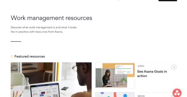
Asana is a project management tool for organizing tasks, keeping track of deadlines, and team collaboration. They have a highly structured resources page that helps users explore the benefits of the platform further and find helpful learning materials.
At the top of the page, you can see a video demo of the platform in action, a couple of ebooks, and another video tutorial. As you scroll down, you’ll notice they’ve organized their resources into hubs like operations, marketing, and IT. And as you scroll further down the page, you can explore all articles in order of date published, starting with the latest ones. You can filter these by topic to find exactly what you need.
Keap
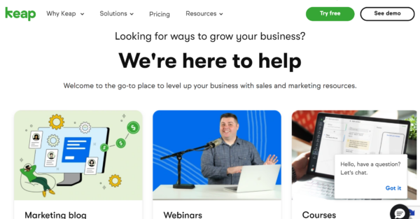
Keap is an all-in-one CRM platform that combines sales and marketing and comes with built-in automation functionalities that are especially beneficial for small businesses. They include a range of resources to help customers grow their businesses and build a strong customer connection using their tools.
On the resources page, you’ll see three featured sections – the marketing blog, webinars, and courses. These sections are expanded on as you scroll down, and you can see some featured articles from each. Keap has also included an interactive lifecycle automation self-assessment. Users can also access the Keap Academy for free course packages, subscribe to their newsletter, or if they need more assistance, there’s a chatbot functionality.
Mailchimp
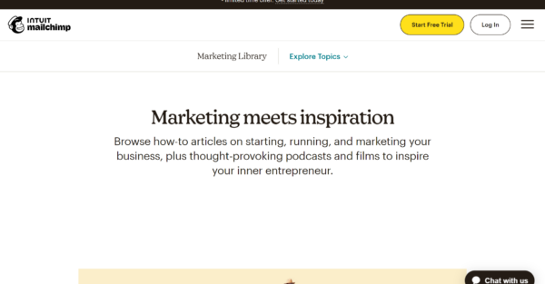
Mailchimp is a leading email marketing tool that can help businesses build healthy mailing lists and boost revenue. On their resources page, they have a collection of business tips and customer stories to inspire and motivate.
At the top of the page, you can immediately navigate to your topic of interest with a dropdown filter or scroll down through several trending articles. You can explore content by topics like business stages, marketing tactics, and customer success stories. You’ll also find visual sections for different kinds of content, like podcasts and guides & tutorials, as well as the Mailchimp Academy and Mailchimp Experts, where you can hire a consultant or email marketing professional. The page ends with a newsletter signup form at the very bottom.
Calendly
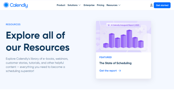
Calendly is a scheduling automation platform perfect for busy entrepreneurs, small businesses, and global companies. They have a very simple and clean resources page that includes a library of content to inspire and educate.
As you scroll down, you’ll see a navigation bar that directs you towards ebooks & guides, webinars, customer stories, a blog, video tutorials, and the help center. Each section has three featured pieces of content and you’ll also find the annual “State of Scheduling” report at the top and bottom of the page. Lastly, there’s a link directing visitors to the help center in case they haven’t found the right material to answer their questions.
Leadpages
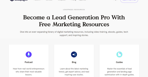
Leadpages provide all the necessary functionality for businesses to build high-converting landing pages with ease. They have a particularly extensive resources page that contains everything from podcasts, a blog, and guides to webinars and downloadable resources.
At the very top of the page, you’ll see the different resource categories, and right after, you can sign up for their mailing list for all the latest industry news and marketing trends. Scrolling down the page, you’ll see several featured articles from each category. Leadpages offer free coaching from lead generation experts that you can easily schedule from this page if you have an account. There are also free downloadable resources like guides, checklists, and worksheets, all readily available.
Canva
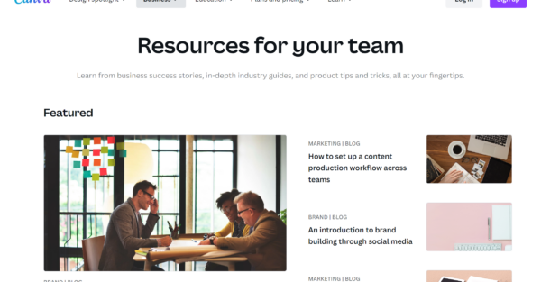
Canva is a superb graphic design tool that almost anybody can use to create visuals for posts, presentations, posters, videos, or logos. Despite it being simple to get started and use, they provide a high-quality resources page, packed with a range of product tips and tricks.
The first thing you’ll see is a selection of featured articles, followed by the full collection you can filter by topic and content type. Below this, there are templates, how-to guides to help with getting started on Canva, and inspiring customer stories. They provide case studies by industry so visitors can better understand how Canva could work for their business. And at the very bottom, there’s a CTA to sign up for a free account.
Tableau
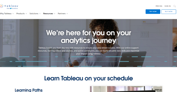
Tableau is a powerful analytics software for processing and analyzing business data. The software can be complex, so it makes sense that the first section on their resources page is for learning materials. They include quick links to video tutorials, e-learning courses, webinars, and onboarding instructions for those getting started with Tableau.
As you scroll down the page, you will find links to helpful documentation like articles, whitepapers, the Tableau blog, and a gallery of example data visualizations. A collection of featured customer stories adds social proof value to the page, and visitors can easily explore all of the customer stories. There is also a CTA for developers to learn more about customizing Tableau using the provided APIs and methods to automate data analysis.
Visitors can connect with others through the Tableau Community, and there are links to the help page and the Tableau Knowledge Base for those who have more questions. The page ends with clear calls-to-action buttons for trying and purchasing Tableau.
Semrush
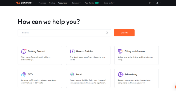
Semrush’s resources page for their SEO and website performance analysis platform is well-organized and user-friendly. It features a prominent search bar and topic categories for easy navigation.
Scrolling down the page, you’ll see links for the Knowledge Base, Blog, and Semrush Academy, accompanied by social logos to encourage visitors to follow Semrush on social media. A support CTA is strategically placed near the bottom of the page for users who haven’t found the information they need. The page concludes with quick links to popular articles.
Carrd
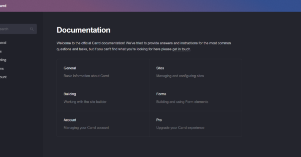
The Carrd resources page is the perfect example of short, sweet, and simple. The platform is designed to build landing pages or simple one-page websites, which explains their minimalist resources page.
On their resources page, they provide answers and information to their most common queries, organized into six topic categories: general, sites, building, forms, account, and pro. The buttons are located in both the sidebar and the main part of the page for ease of navigation. If visitors are left with additional questions after going over the page, there is a link to get in touch with the team.
PandaDoc
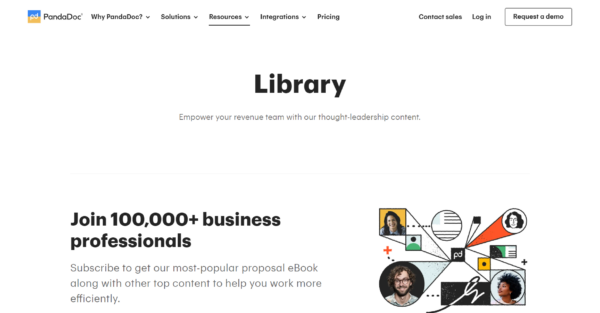
PandaDoc is a contract management and e-signing tool. Their library of resources includes their full range of thought-leadership content that can be filtered by type of content: ebooks, podcasts, virtual events, and in-person events.
At the top of the page, they have included a lead magnet to get visitors to subscribe and receive their most popular ebook for free. This is a clever tactic because users looking for more information about the tool and showing enough interest in the product can start engaging with personalized marketing content.
Unbounce
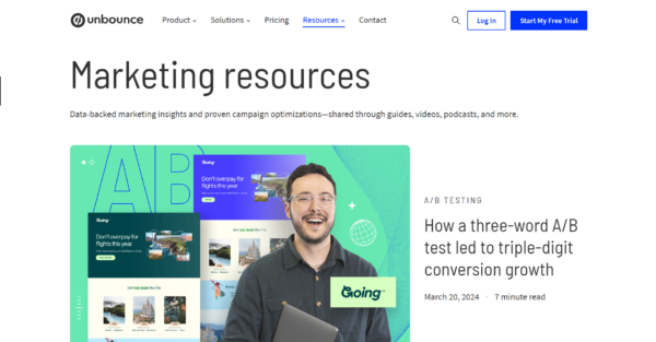
Unbounce is a landing page builder packed with tools to optimize marketing efforts. Their resources page effectively presents a large volume of content. It includes product-specific information and marketer advice, organized into categories such as landing pages, marketing AI, campaign strategy, and conversion optimization.
The page uses strategic content placement and tailored copy to address specific user needs. For example, a user who is specifically looking to optimize their campaigns will be drawn to “Optimize” in the section about creating your best campaign. The same content can also be accessed within the conversion optimization category below.
They have also wisely included a signup form for the mailing list in the middle of the page rather than at the bottom. This can be more effective at achieving signups because the user might not scroll all the way to the bottom.
SurveyMonkey
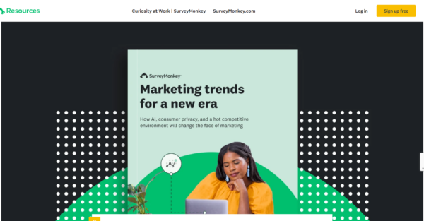
SurveyMonkey is a popular survey creation, management, and analysis platform, and they’ve done something very interesting with their resources page – much of the content is accessible to members only.
The page displays a range of articles, guides, infographics, case studies, videos, and webinars, filterable by survey target audience. The CTA to sign up appears in multiple locations—in the header, within the content on the page, and at the bottom of the page. This, combined with the fact that many articles are behind a paywall, is a good encouragement to create an account.
Pipedrive
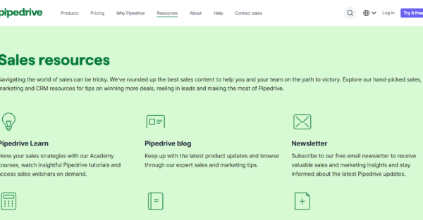
Pipedrive is a CRM tool that helps get the best out of your entire team – both sales and marketing. Their resources page is split into sections with materials specifically aimed at those in sales, marketing, or general CRM. There is also a section that educates visitors about Pipedrive, how the product compares to competitors, and how the software can be used.
The page features more educational materials such as courses, guides, ebooks, webinars, reports, and a newsletter. There’s even a helpful tax calculator tool and various free templates. There’s no excessive distracting imagery on the page, only simple logos and graphics. The page concludes with a CTA to try Pipedrive for free.
Bynder
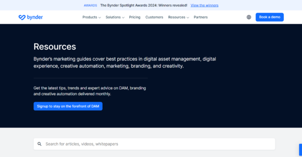
Bynder is a digital asset management platform. They begin their resources page with a CTA to sign up for a monthly newsletter with all the latest information and expert advice. Then as you scroll down, you will see a selection of featured articles with keyword search and category filtering options.
The page includes sections for essential digital asset management content, brand management content, and a DAM toolkit. The newsletter signup CTA is located not only at the top of the page, but also in the center and at the bottom of the page. This CTA saturation makes it easier for a user to sign up.
What Should Your Resource Page Include?
The purpose of a resources page is to provide additional materials that help customers and prospects find answers to their questions, but it’s also a great opportunity to move a lead from one stage of the sales funnel to the next.
Typically, a SaaS resources page will include:
- How-to content
- Podcasts
- Videos
- Blog
- Webinars
- Ebooks
- Courses and learning materials
- Community forums
- Marketplace
One key factor in a good resources page is the ease of navigation, particularly if your page is content-heavy. The content should be split into logical categories that align with user intent or topic, while the quality of the content, which is another key factor, will ensure users stay on the page longer and browse further. Powered by Search can help with all things content-related, including developing a winning content strategy, so visit our page for more info.
How To Design A Resources Page With Conversion in Mind
How your pages and the overall structure of your website are designed is not just for show and aesthetics.
All too often, a website is built using bits and pieces of inspiration and needs requirements from various teams. It’s then pieced together in the most logical format but ends up underperforming, which is expected because it hasn’t been built with the customer journey in mind.
At Powered by Search, we’ve established an authority architecture framework that ensures all the interconnecting pages are designed and structured for maximum efficiency. We cover this in-depth in our Saas Website Best Practices blog post, where we explain how and why this model works time and time again, so feel free to check it out.
In Summary
These 10 website resource page examples show you the variety of materials and content that can be displayed and provide an excellent demonstration of how to organize your resources for easy navigation.
If your SaaS business is growing or you’re planning to scale soon, why not take our SaaS scalability score self-assessment? This obligation-free assessment will give you an understanding of where your business currently stands against the competition. It’s a worthwhile starting point, so we encourage you to try it out.
What you should do now
Whenever you’re ready…here are 4 ways we can help you grow your B2B software or technology business:
- Claim your Free Marketing Plan. If you’d like to work with us to turn your website into your best demo and trial acquisition platform, claim your FREE Marketing Plan. One of our growth experts will understand your current demand generation situation, and then suggest practical digital marketing strategies to hit your pipeline targets with certainty and predictability.
- If you’d like to learn the exact demand strategies we use for free, go to our blog or visit our resources section, where you can download guides, calculators, and templates we use for our most successful clients.
- If you’d like to work with other experts on our team or learn why we have off the charts team member satisfaction score, then see our Careers page.
- If you know another marketer who’d enjoy reading this page, share it with them via email, Linkedin, Twitter, or Facebook.