18 Examples of The Best SaaS Blog Index Pages
Last updated: August 30th, 2024
A blog with quality content can be a powerhouse for driving organic traffic, and a well-made index page is crucial for maximizing its impact.
An effective SaaS blog index page makes your blog easy to navigate. It lets visitors instantly find the topics they’re searching for, ultimately leaving a positive impression of your SaaS brand.
So, what does a good blog index page look like and what exactly should it include? Let’s explore this first, and then we’ll inspire you with some of the best SaaS blog examples that’ll help you get started on your own B2B SaaS blog design.
What Your Blog Index Page Needs To Include
The blog index page organizes your blog content so it’s easier for visitors to find the information they want and peruse related material. There isn’t a strict set of guidelines for blog design, but the aim is to provide a smooth and functional user experience.
A good starting point for a blog index page includes the following elements:
- Header – This can be a sticky header that follows the user as they scroll down or fixed. Typically, it also includes a navigation menu.
- Navigation menu – Depending on the amount of content on the blog, you may need to have several navigation menus.
- A summary or introduction to the blog – This is a good way to introduce the purpose of the blog, while some blogs include featured posts to give visitors a gist of what the content is about.
- Blog categories – Organizing your blog posts into categories helps visitors find the content they want instantly. In addition, having a way to filter or search posts is just as important, particularly with large content libraries.
- Email signup form – Having a mailing list will help you maintain engagement and activity on your blog.
- Footer – This is a good place to have navigation links to the rest of your website and more information about your SaaS product.
You’ll also notice that the following SaaS blogs have several featured or most recent blog posts displayed front and center on their index page. This strategy effectively attracts visitors, as the featured articles are typically either high-performing or specifically tailored to target customers at different stages of the sales funnel.
Without further ado, here’s our curated list of the best SaaS marketing blog examples.
Squarespace
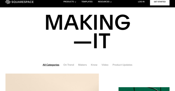
The Squarespace blog index page is just as you’d expect it to be given their reputation for design – it’s well-organized but also fun and engaging. The blog posts are grouped into five categories, and you can easily filter by category or scroll down to see the most recent blog posts.
There’s some animation on the screen as you scroll down but the overall design is minimalistic and clean – there’s not too much happening that can distract the user. They’ve also managed to sneak in one CTA button to start a website with Squarespace, while at the very end of the page, they’ve included a signup form to join their mailing list.
Miro
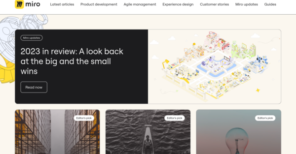
Miro has a simple and user-friendly blog index page. Instead of using a filter function, all blog categories are neatly displayed on the page header. The page starts with several featured blog posts, followed by a chronological list of the other posts.
There are no CTA buttons on the blog index page, but there are links to other pages and resources in the footer. Overall, it’s a lightweight and well-organized blog index page.
ZenDesk
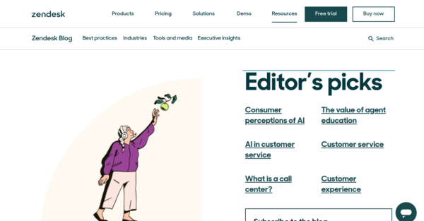
ZenDesk have a neatly designed blog index page. Blog categories are placed in a sticky header that follows you down the page for easy navigation. Then there’s a collection of Editor’s picks on the right-hand side of the page, where visitors can see a collection of featured articles that are most likely the top-performing blog posts.
The email signup form is placed front and center for quick conversions. As you scroll down the page, you will see a snippet of the four most recent blog posts in each category. At the bottom of the index page, you’ll find guides, research, and case studies – it’s all there.
HubSpot
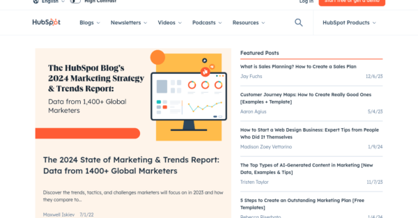
The HubSpot blog is a very popular platform and they have a lot of content to manage. The page begins with recent featured posts and the HubSpot 2023 Marketing Strategy and Trends report to draw in visitors.
You’ll then see collections of blog posts broken up into several categories for easier navigation, and a carousel of their recent video content. The content HubSpot produces doesn’t end with blog posts – in the sticky header, you’ll see newsletters, video channels, podcasts, and a range of educational resources.
At the very bottom of the page, visitors can select their preferences from the content categories and subscribe to receive email updates.
Figma

As you can see, Figma has a beautifully designed and highly visual blog index page. The animation at the top of the page can be distracting, but once you scroll down, you’ll be drawn to the relevant blog topics and attention-grabbing headlines.
After the featured articles, you’ll see a selection of blog articles organized into several categories. There’s also a mailing list signup form, and at the bottom of the page, you can filter and search through all of their blog posts.
Asana
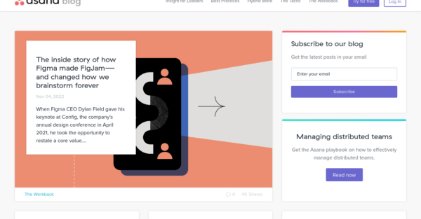
The Asana blog mirrors the structured and methodical look of the product itself, yet it’s concise and to the point. Right away, you’ll see a mailing list signup form along with a guide on using Asana to manage remote teams. From there, you’ll dive into a collection of blog posts arranged in chronological order.
You can’t filter blog posts by category in the traditional way, but you can find the categories at the bottom of each post snippet.
Stripe
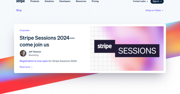
Stripe has opted for a minimalist look to their blog by not displaying a large number of blog posts on their index page. To explore more content, you’ll have to click on the category tabs.
Unlike other SaaS blogs, they don’t have a mailing list signup form, but they do have a link to their Twitter/X page. They also encourage feedback from readers by including a link to their contact page. The header and footer both have links to the rest of their content, like the product information and pricing pages.
Toggl
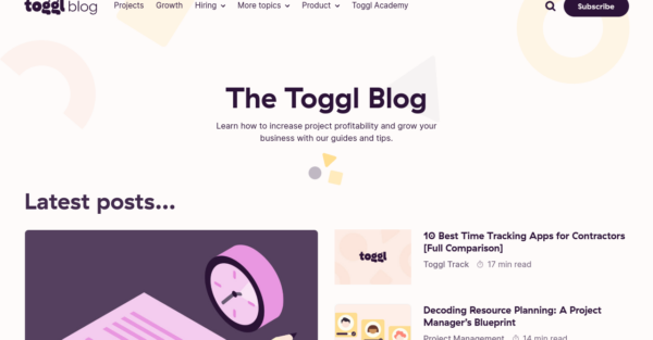
Toggl offers a range of tools for managing projects and teams, and their blog is a valuable resource. Their blog index page starts with a clear statement of its purpose: to provide guides and tips to help with business growth. It also features a selection of the most recent blog posts.
They have different block sections for the different post categories so visitors can quickly find exactly what they’re looking for. There is a CTA directing visitors to their products along with some social proof in the form of review site scores. At the very bottom of the page, you’ll find the mailing list signup form.
Flowmapp
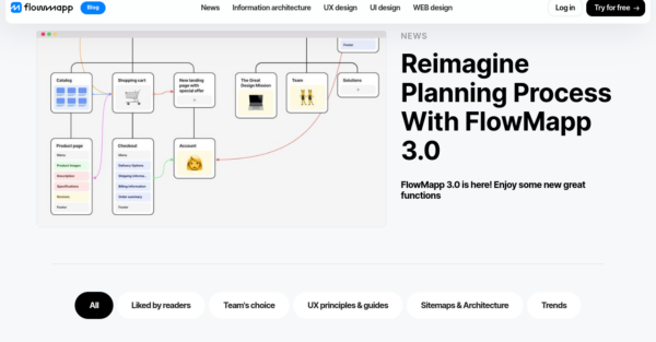
Flowmapp have a minimalistic blog index page that includes all the essentials. At the top of the page, they feature a recent update post highlighting a new product release. Below that, you can explore their extensive collection of blog content.
To navigate through different blog categories, you can use the tabs in the header or filter the results by topic. In the footer, you will find additional links to more resources on the website, as well as social media links and scores from review sites.
Klaviyo
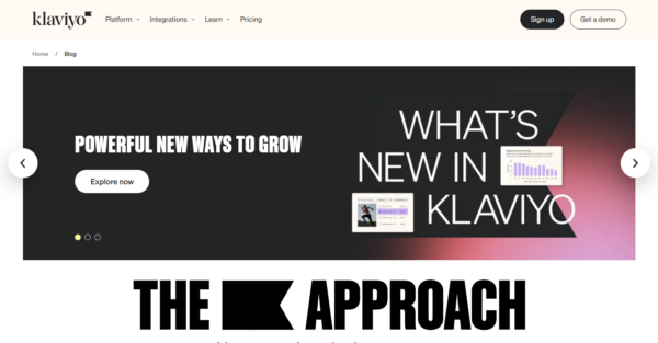
The Klaviyo blog index page features an attention-grabbing layout. It begins with a slider showcasing featured articles and a call-to-action (CTA) to explore the platform. Users can select blog categories or scroll down to view the latest articles and success stories. There’s also a strategically placed customer testimonial that adds to the social proof.
They’ve included a lead magnet to download the 2024 Benchmark Report before continuing with featured blogs in different categories. Additional email marketing resources are also provided, and the category filter is repeated at the bottom for easy navigation. This ensures the user can find what they’re looking for without having to scroll back to the top. A nice finishing touch is the newsletter sign-up CTA.
Databox
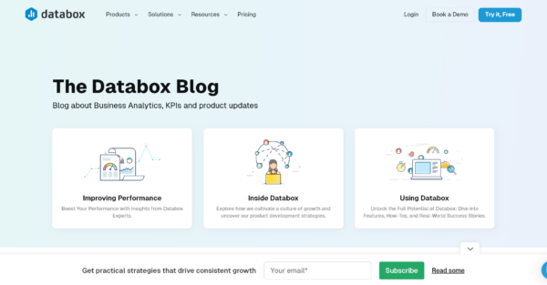
Databox has a very organized blog index page that lets users quickly find answers to their data and analytics queries. The first element block contains three categories of content, all designed to drive interest in the product: improving performance, using Databox, and the Databox team’s approach to business growth.
Featured articles with high interest or traffic are displayed next, followed by a CTA for free sign-up or demo. The page ends with highlighted articles from analytics and marketing categories, and another CTA for free sign-up or demo.
BambooHR
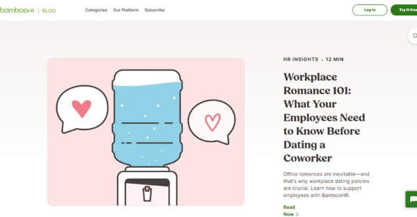
The BambooHR blog contains a ton of articles on all things HR, from the ethics of an office romance to tips for nailing your next performance review, along with articles on the benefits of using HR software and use cases.
The page starts with a primary featured article, followed by a non-categorized, visually interesting article display. A large lead magnet that draws the reader’s attention is prominently displayed on the right-hand side of the page, followed by a sign-up CTA that’s positioned mid-page rather than at the bottom.
PandaDoc
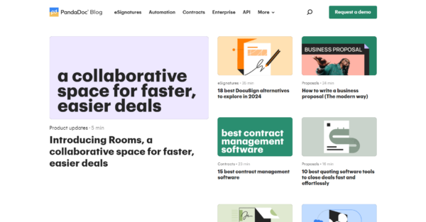
The PandaDoc blog starts with a collection of featured blog posts. A nice design choice is the image animation as the cursor hovers over each image. After the featured posts, all the blog posts are displayed in a date-ordered grid format and are filterable by topic.
Halfway down the page, they have included a CTA to schedule a demo of the product before adding additional resources, including podcasts and a section for product updates. The page ends with a lead magnet to get access to their ebook and newsletter.
ActiveCampaign
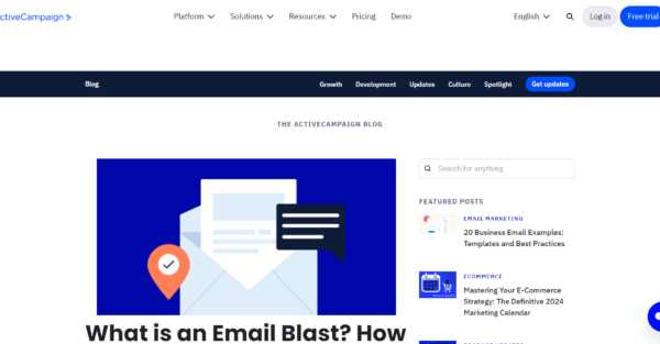
ActiveCampaign’s blog index page is geared towards conversion, whether that’s a newsletter or a free trial sign-up. The page starts with several featured posts, a search bar, and a newsletter sign-up CTA.
A sticky header bar follows the user down the page with all the blog categories easily in reach. Each section features an article with an image and three brief summaries, just enough to encourage a user to click to explore more. There is a page break enticing the visitor to a free course on sales automation, followed by a section of the best-performing blog posts. The page ends with a repeated newsletter sign-up and free trial CTAs.
Mixpanel
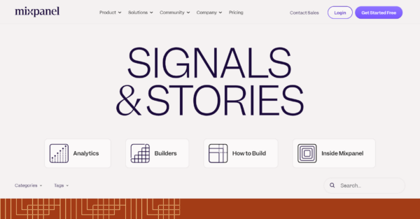
Titled “Signals & Stories”, Mixpanel’s blog is very unique. The blog page has a minimalist design with text-only content and geometric designs. A collection of blog titles is listed vertically, allowing users to filter by category, tag, or search using keywords.
Towards the bottom of the page, they have placed a CTA to subscribe to the newsletter, and the very last element is the “Let’s Build” CTA, which takes the user to a free account sign-up page.
Drift
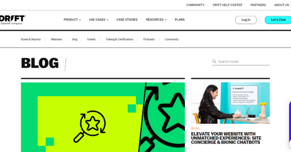
The most interesting feature on the Drift blog index page is the collapsible live chat bar on the right side of the page. When expanded, it offers search functionality and a randomized article recommendation. Otherwise, all blog posts are presented in a grid format and organized by date published. The page includes a search bar at the top and ends with a sign-up CTA.
Pipedrive
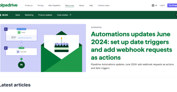
The Pipedrive blog index page is short and concise. It maintains brand consistency by using the same color palette as the other pages on the website.
It starts with a featured article, followed by the latest articles and blog categories like sales, marketing, and product updates. The sticky header bar follows the visitor down the page and includes the different blog categories, along with another section for case studies. The page ends with a simplified free account sign-up form.
Webflow
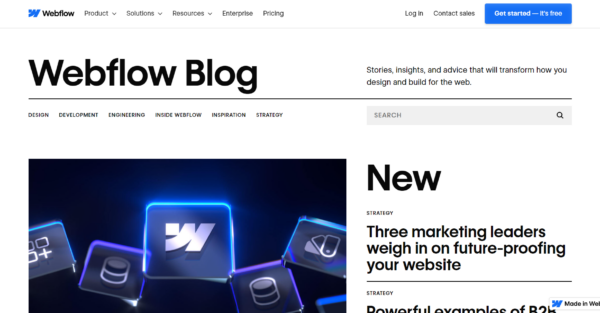
Design is a major priority for the Webflow blog, considering it’s a website builder. There is a lot of movement on the page from the underlined and bold text and interactive elements, with ample white space between them.
The page includes a search bar, blog categories, the latest and most popular articles, and a carousel of ebooks and webinars. To break up the page, they have inserted a banner promoting the Webflow conference for 2024 and a link to purchase tickets. This is followed by a newsletter sign-up CTA and a customer testimonial in bright pink that’s impossible to miss.
At the end of the page, there’s a grid of all the blog articles. The copy is powerful and the bold text and bright colors make this a very effective blog index page.
Align Your Page Structure to Your Content Strategy
To increase conversions, it’s crucial to have a well-executed content strategy that caters to the needs of potential customers at every stage of the sales funnel. However, it is also important to consider the impact of your page layout on this strategy.
When we discuss aligning the page structure with the content strategy, it’s not simply about aesthetic appeal, but rather about guiding the user’s journey. One effective approach recommended for SaaS websites is to include feature posts on your blog index page that cater to users at both the top and bottom of the sales funnel. This ensures that your content is relevant and engaging to a wider range of potential leads.
Wrapping Up
A well-organized blog index page not only functions smoothly but also makes it easy for visitors to locate the desired content, so make sure to optimize it for user-friendly navigation.
It can be extremely beneficial to seek external expert guidance when it comes to content strategy, and in particular, SEO strategy. Luckily, this is something we can help with! We provide a range of content marketing services that include content creation support, strategy consultation, and editorial calendar advice, so feel free to let us know what you need.
If you are curious about the current status of your SaaS business, we encourage you to get your SaaS Scalability Score.
What you should do now
Whenever you’re ready…here are 4 ways we can help you grow your B2B software or technology business:
- Claim your Free Marketing Plan. If you’d like to work with us to turn your website into your best demo and trial acquisition platform, claim your FREE Marketing Plan. One of our growth experts will understand your current demand generation situation, and then suggest practical digital marketing strategies to hit your pipeline targets with certainty and predictability.
- If you’d like to learn the exact demand strategies we use for free, go to our blog or visit our resources section, where you can download guides, calculators, and templates we use for our most successful clients.
- If you’d like to work with other experts on our team or learn why we have off the charts team member satisfaction score, then see our Careers page.
- If you know another marketer who’d enjoy reading this page, share it with them via email, Linkedin, Twitter, or Facebook.