The 6 Keys for Effective Calls to Action
Last updated: November 21st, 2013
You want to know what the best calls to action (CTAs) have in common and how you can take advantage of those strategies for your own CTAs? You’ve come to the right place: this guide outlines the components of effective calls to action and provides many examples.
1. Clutter-free and simple
First of all, effective CTAs are VISIBLE and EASY TO SPOT. That means they are not drowning in a sea of information and images.
Take a look at the following example from Typing Master.
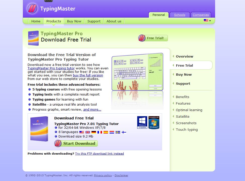
There’s not really that much on the page — after all, it’s a small page — but the information is cramped, there are numerous images and icons that compete for the eye’s attention, and there are too many clickable, distracting options near the two CTAs that might lead the visitor away from the page rather than further down the sales funnel. The eye roams everywhere on the page except to the two CTAs.
The point to take away: whitespace is important. There is a bit of white space around the “Free Trial!” button, but there isn’t enough white space on the page for the eye to know where to rest to gain the information the visitor needs before clicking that button.
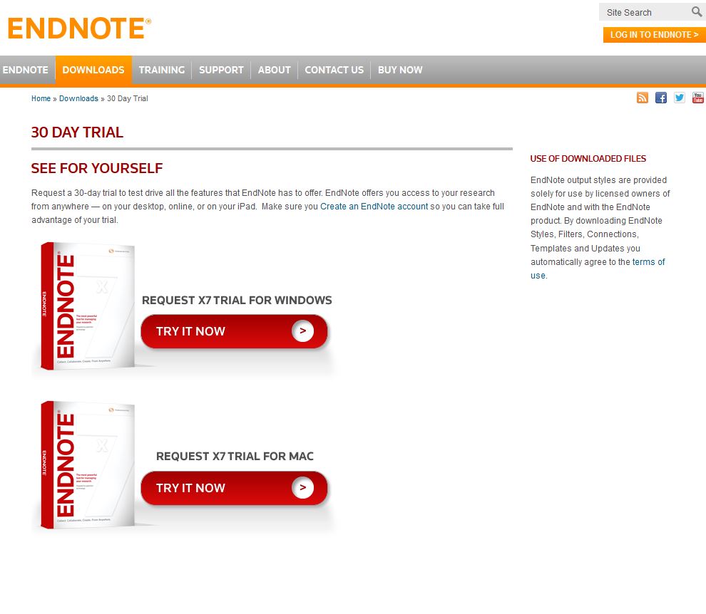
Compare with the following example from EndNote, which is concise rather than chockfull of text, leaving room for white space that drives the eye down towards the buttons.
Make it as simple as possible for your customers to do exactly what you want them to do. This principle also applies to lead capture forms requesting customer information in exchange for a free e-book or an email newsletter or anything else. The more fields there are to fill out, the more barriers you place between your customer and the action you want them to complete.
2. Optimal placement: above or below the fold?
Tradition holds that above the fold is best. The reasoning is that it helps your customer know immediately what action to take, helping ease them down the sales funnel.
But increasingly, prominent voices such as Kissmetrics and Unbounce are making the case that placing the CTA below the fold can actually increase conversion rate. Imagine someone coming up to you at a social event and saying, “I have a free offer for you; are you interested?” Before you accept the offer, you will probably want to know what it is and what it requires from you.
Visitors on a webpage are the same, so having your CTA lower on the page, after enticing information about your offer, makes sense. Having directional cues like arrows pointing down or pictures of people looking down makes visitors want to find out what is lower on the page.
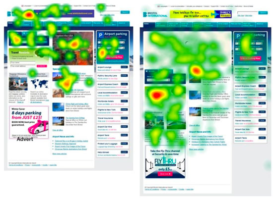
Another trick is to use white space (again!) effectively to get people to scroll down the page. The following heat map from Unbounce shows that online visitors are more likely to scroll down if there is less content above the fold.
Of course you shouldn’t provide more information or more space just so that your CTA is below the fold… Include as much information and as much space as you need – not more, not less – and let your CTA fall wherever it makes most sense, whether above or below the fold. Don’t be afraid to experiment, try different things, and see what works best in your case.
3. Text that gets clicks
Effective CTA copy…
…is action-oriented
Tell the reader exactly what to do. Buttons like “Next” are ineffective because they don’t incite the reader to take any action. If you want action, start with an action word: a verb.
…is specific
Tell the reader exactly what will happen when they click that button. “Click here” and “Submit” are ineffective because they are not specific about what the reader would accomplish by clicking the button. Try “Sign up for newsletter” or “Learn more about retirement funds.” You tell the reader exactly what they get by clicking.
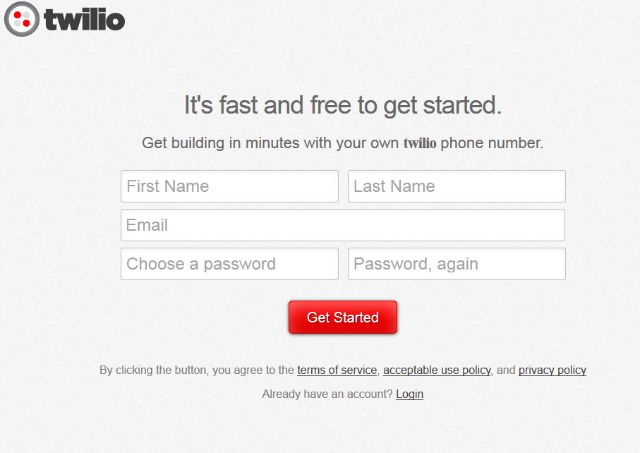
The following CTA from Twilio is action-oriented, but there’s not enough information about what I would be getting started with. I would get a Twilio phone number… but what is that? What would I get building with it? There isn’t enough information on the page to warrant taking the requested action.
…shows value
Show the reader they get something valuable in exchange for clicking. Free ebooks, free trials, free samples… “Free” is a great way to provide value up front. Wouldn’t you be tempted by “Try this program for free”? You can still show value when your CTA entails something that isn’t free. If your CTA is for the visitor to purchase something, instead of “Buy this keyboard,” try “Get this keyboard.” Get reminds readers that they receive something in exchange for their money.
…eliminates anxiety
Allay your potential customers’ fears by making it clear that there is no risk involved. If you don’t require credit card information for the trial you’re offering, specify it! If you have a money-back guarantee, note it! “Free” works well here too because it means there’s no investment on the visitor’s part that could go awry. For example, “Free trial” means they can try your product before committing to it, making it an easier decision.
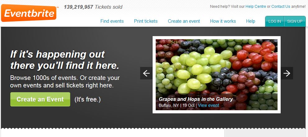
Here is a great example of a CTA that is action-oriented, specific, shows value and eliminates anxiety:
Create an Event starts with an action word, it specific about what the visitor would be accomplishing, and the hard-to-miss mention that it’s free beside the CTA button provides value and reduces anxiety.
4. Buttons that get attention
There are different things you can alter to call more attention to your CTA buttons.
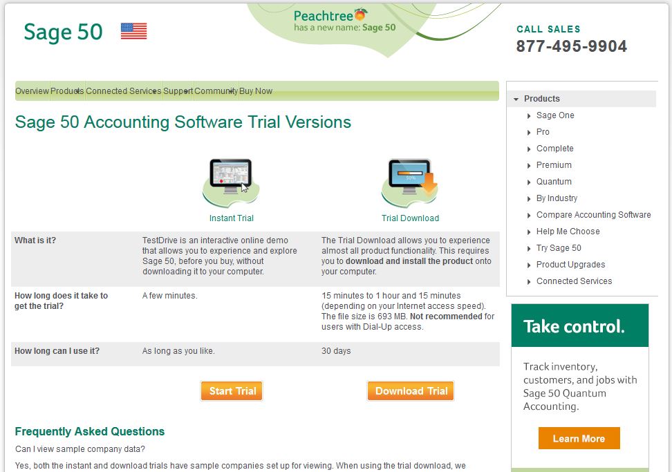
- Size: If your button is too small, it might be missed or ignored. In the following example from Sage, the eye is drawn towards the “Take Control” element rather than “Start Trial” or “Download Trial.” The reader who might have been interested in the trial could have their attention diverted away from this page before taking any action.
- Colour: Red is often promoted as the most effective button colour for higher conversion rate. But don’t start changing the colour of all your buttons just yet because it’s not that simple. Red isn’t always more effective, and not with all audiences. What matters more is knowing what works best with your audience, and bringing attention to the button. If your page is already awash with red, it won’t make sense to have a red button because it will get lost on the page. Contrast with the rest of the page is more important than the colour itself to bring attention to your button.
- Shape: A button with an unusual shape or embellishments can draw more attention to itself than a simple two-dimensional rectangle. Particularly, buttons with embedded arrows or shaped so that they taper to a point towards the right call to mind forward motion, inviting the visitor further along the sales funnel.
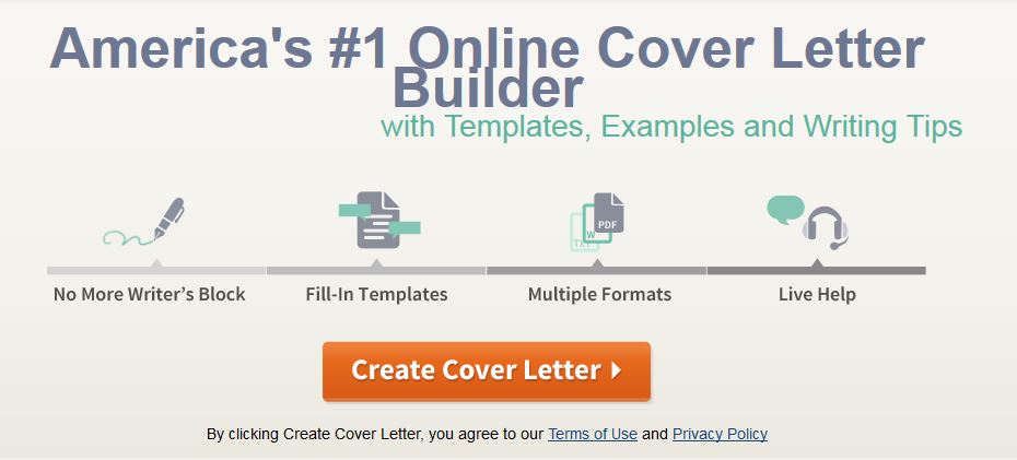
This call to action button from Cover-Letter-Now gets attention right away: it’s large, contrasts with the rest of the page in colour, and implies forward motion.
5. An image is worth a thousand clicks
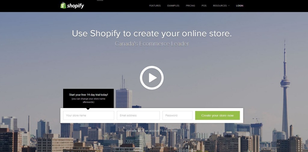
Images of your product or people using your product help give substance to your offer by showing that the product or the service is real, it has shape, people use it, people like it. Even more effective than images is video, which can increase conversion by 80%. A good example of effective video use is Shopify’s home page call to action:
Interlude: Best practices illustrated
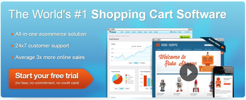
Wondering what a CTA that does all of the above looks like? Something like this:
This call to action on one of Volusion’s landing pages is simple, uncluttered, and provides an image of the product, which is also a video about the product. The CTA button is large, contrasts with the rest of the colours and implies forward motion. The text is action-oriented (“Start”), specific about your action accomplishes and gets you (a free trial), shows value (it purports to be the best, suggests ease by mentioning the all-in-one solution and the 24/7 customer support, and mentions the potential for increased sales), and reduces anxiety (no fees, commitment or credit card).
But the real reason this CTA works is not that it applied all the best practices. The real reason it works is because it does what it needs to do for the targeted audience in that context. Which brings me to…
6. The top tip: test. Test, test, test.
Knowledge of what generally works best should not be confused with what works best for your customers and your website. Maybe your customers form a specific demographic that diverges tremendously from the general online population, and they are averse to red buttons. Maybe having more mandatory fields on your lead capture form would result in a higher conversion rate.
Use the foregoing tips as places to get started, and use one of two forms of testing to find out what will be most effective in your context:
- A/B testing: Having two identical pages and changing only one element on the page to see which version of the element gets the best response rate.
- Multivariate testing: Testing multiple elements on the page at once to see which versions are most effective with your audience.
Keep testing, keep improving, keep reaping the benefits!
What you should do now
Whenever you’re ready…here are 4 ways we can help you grow your B2B software or technology business:
- Claim your Free Marketing Plan. If you’d like to work with us to turn your website into your best demo and trial acquisition platform, claim your FREE Marketing Plan. One of our growth experts will understand your current demand generation situation, and then suggest practical digital marketing strategies to hit your pipeline targets with certainty and predictability.
- If you’d like to learn the exact demand strategies we use for free, go to our blog or visit our resources section, where you can download guides, calculators, and templates we use for our most successful clients.
- If you’d like to work with other experts on our team or learn why we have off the charts team member satisfaction score, then see our Careers page.
- If you know another marketer who’d enjoy reading this page, share it with them via email, Linkedin, Twitter, or Facebook.
