14 Examples of the Best B2B SaaS Homepages
Last updated: March 16th, 2026
Tailored for B2B SaaS marketers looking to improve the look and feel of their website’s home page, the examples in this article are not just pretty interfaces. We’ve handpicked 14 homepage designs that stand out with their unique aesthetics and functionality, ranging from bold and modern to more traditional, that’ll hopefully inspire you to elevate yours.
Of course, to create a homepage that effectively communicates your brand story and product value, you also need to include the elements that make a winning SaaS homepage design. So, before we get to the examples, let’s see what they are.
What Makes a Great B2B SaaS Homepage?
A great SaaS homepage design effectively combines the following elements:
- Snappy headlines
- Clearly outlining the value of the product
- Good use of SEO
- A hook – CTA
- Featured blog posts
- Customer testimonials
A great SaaS homepage design needs to grab the visitor’s attention, clearly articulate what the product does and its unique benefits, and reassure with testimonials.
Overly fancy and complex homepages can be confusing to mentally process, which can result in losing the visitor’s interest. In addition, too much happening on the screen often leads to slow page loading times, which is another thing you want to avoid. This is why, sometimes, restructuring your website architecture is essential for creating a more user-friendly and effective homepage.
Then there’s content marketing, a very valuable tool for B2B businesses. Content marketing is an affordable way to increase engagement, lower bounce rates, and build a relationship with your customers, which is why investing in a content marketing consultant can be the best way to enhance your online presence.
Now that we’ve got that covered, let’s inspire you with some homepage examples.
The following SaaS website examples are listed in no particular order. Some are major B2B SaaS companies you already know, while others are smaller startups, but all have one thing in common — they’ve mastered the art of SaaS homepage design.
Squarespace
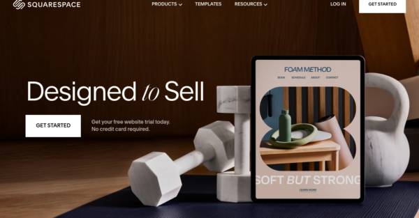
Squarespace is a well-known website builder with e-commerce functionality, probably best known for its enormous library of beautifully designed templates. Their homepage has a minimalist style to it without excessive animations or content. The text is short and simple and tells the visitor exactly what they want to know about the product.
Figma
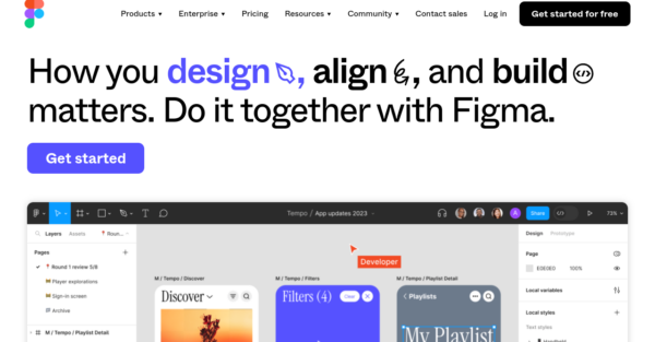
With its fun animations and visuals, Figma is the complete opposite of Squarespace. But considering that Figma is a design platform, it makes a lot of sense. The site is easy to navigate, seeing as all the materials and resources are placed in drop-down menus at the top of the screen and again in the footer. As you scroll down the homepage, you see large, clear call-to-action buttons that direct the visitor to other pages to learn more.
Kikin
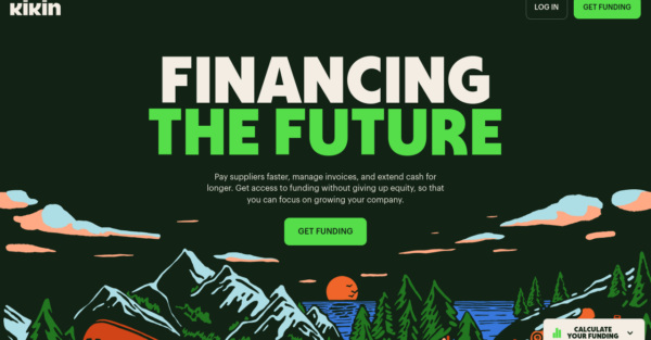
Kikin is a UK-based fintech company that allows companies to manage their incoming and outgoing finances, as well as access corporate funding. Their website design is notably edgy and modern, and clearly explains how it works and how it benefits businesses. The CTA for calculating your funding potential is positioned center-stage, so it won’t be missed. There’s also an FAQs section at the bottom and a link to their blog in the footer, but otherwise, it’s uncomplicated with minimal clutter.
Remote
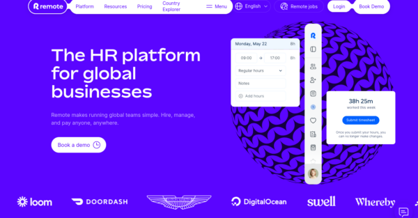
Remote is an all-in-one HR solution for globally distributed remote teams. The homepage displays a snapshot of the dashboard and clearly outlines what the platform is about. The animations and images are not excessive and are built in a way that highlights the features as you scroll down. A chatbot pops up to provide extra guidance, and there are plenty of additional resources, all of which are neatly located in the footer at the bottom of the homepage.
Klaviyo
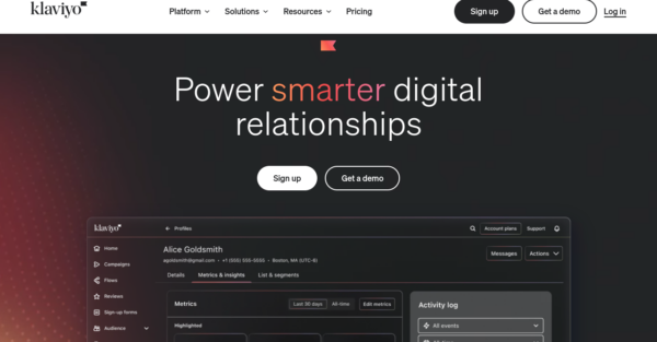
Klaviyo is a marketing automation platform with a particular focus on email and SMS marketing. They have a very animated homepage that keeps the user interested as they scroll down. Images for the different features have a hover-over animation that changes to show a little text summary. They even have several short video testimonials, but you can explore more through a link. At the end, you have the option to learn more and see how Klaviyo helps agencies, developers, and ent-level companies.
Brevo
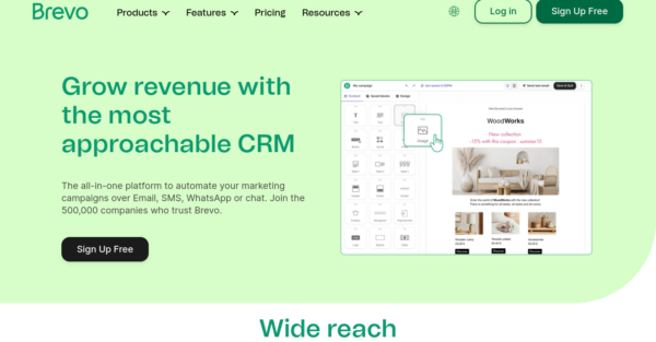
Brevo is a convenient CRM platform for all your business needs. Their homepage is yet another one designed with a minimalist approach but still tells you everything you need to know, just with fewer words and imagery. They include testimonials and their overall star ratings from major review sites, like Capterra and Trustpilot. Everything else – the blog, help center, integrations, and community forum – is tucked away in the footer of the homepage.
Asana
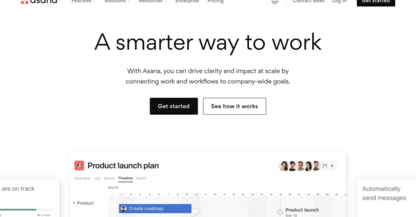
Asana is a workflow management tool built for both remote and in-house teams. Their homepage is a good example of what an effective B2B SaaS homepage should look like, with buttons directing you to find out how different departments make the best use of Asana’s tools and functionality. They clearly explain why Asana is a better tool for the job than other similar tools on the market, include case studies from major corporations, and make it easy for visitors to get started by viewing a demo or accessing more resources.
Grabee
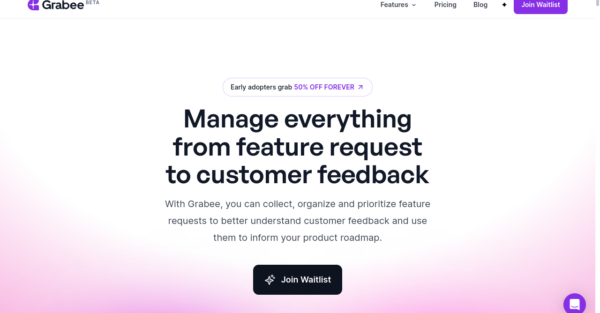
Grabee is a specialized SaaS tool for collecting and managing product feature requests and feedback. They detail the benefits that come from using the tool and the problems it helps solve. In addition, they include a stack of customer testimonials and further information on the tool’s features. While there’s more text than some other homepages here, there’s also a lot of white space to break it up, making everything readable.
Onfolk
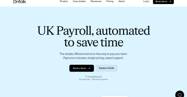
Onfolk is a nifty payroll automation service specifically for companies based in the UK. They provide an excellent example of yet another minimalistic homepage design without too much text or too many images. Onfolk explain how they solve the problem of overcomplicated payroll systems by saving their clients’ time and hassle. You can scroll through customer testimonials to see what others think and book a demo with one simple click.
Qonto
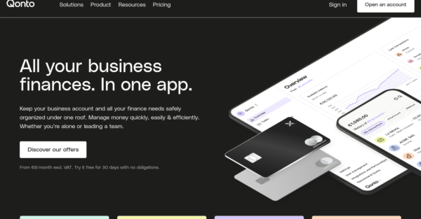
Qonto is an app used for managing business-related finances, like invoicing and accounting. Their homepage has some subtle animations and highlights on-hover functions that bring it to life but aren’t too distracting. All the available features are explained concisely, there are a couple of “Learn more” CTAs, and that’s it – short and sweet. Everything else can be found in the footer or header drop-down menus.
Slite
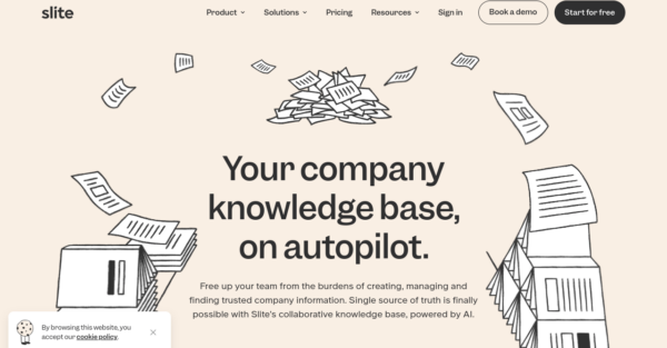
Slite is a knowledge base for companies powered by AI. As you scroll down the homepage, you’ll easily understand what it’s used for and how it can improve your business as a whole. You can see a recording of the AI-powered knowledge base in action as well as customer testimonials and case studies. The most pressing questions are all answered, and everything else can be found in the footer.
Groove
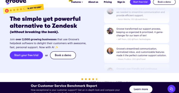
Unlike the pattern we’ve seen with the other homepage examples, Groove starts its homepage with a collection of customer testimonials. It then walks you through the features and functionality that highlight what this helpdesk SaaS can do. Also, in contrast to the other examples, Groove has placed a summary of their pricing information on the homepage. This ensures visitors get all the information upfront.
Attio
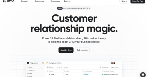
Attio is a do-it-yourself CRM management tool that gives you the ability to customize the functionality you need. The first thing you see on the homepage is a video of the dashboard in use, which instantly gives you an idea of how it works. There are some other subtle animations as you scroll down, but otherwise, the homepage is kept uncluttered. They include customer testimonials and plenty of opportunities to find out more, with CTA buttons used frequently throughout.
Lemon Squeezy
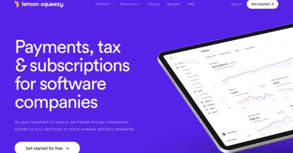
Lemon Squeezy is an all-in-one payment platform for managing business financials. They get straight to the point on their homepage with a clear statement outlining why their tool is the right solution for companies. You can then explore the different features in more depth and see examples of checkout pages. The messaging is highlighted by some block animations and there are plenty of CTAs to redirect the visitor to further information. Naturally, they also have some customer testimonials included.
Ghost
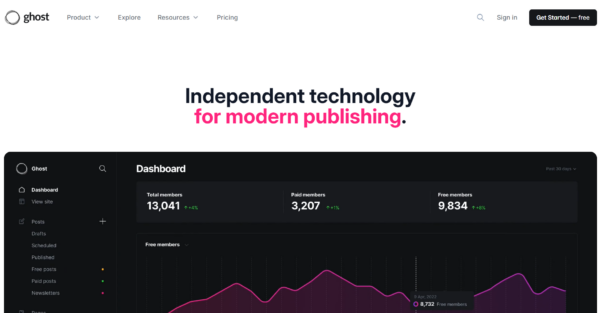
Ghost is an open-source CMS, meaning its users are also its financial backers and influence how the platform grows. It was originally developed with independent media in mind, but it’s suitable for a wide range of users, from personal bloggers to large content writing agencies.
The homepage features large text and animated images showing how the platform looks and works. They’ve included social proof in the form of a mosaic displaying examples of customer usage. The page clearly explains what you can do with the platform and the possible integrations. They also include details specifically tailored toward their different target audiences – creators, publishers, and businesses.
Welcome
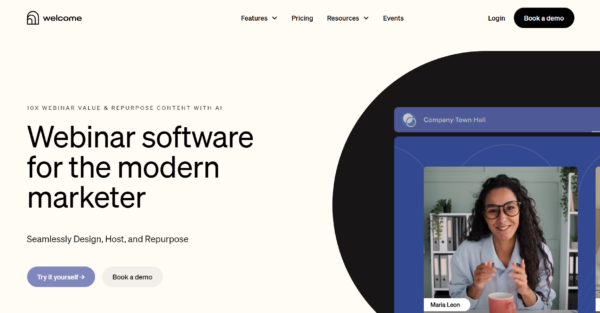
Welcome is a webinar platform designed for marketers to host engaging virtual events for customers and new leads. Their homepage is not long, but it contains just the right amount of information to capture attention and educate users about the product.
They mainly focus on social proof – a carousel of customer logos is one of the first things you see, followed by some statistics to show how effective video content can be for marketers. Further down the page is an in-depth customer case study, and all blocks are designed to encourage users to click on the link to find out more. As you can see, they’ve minimized the amount of text on their homepage while still providing an overview of features and functionality.
Spline
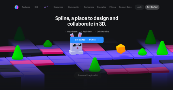
Spline is a 3D design tool that helps product designers, developers, and agencies seamlessly develop interactive 3D designs that serve many purposes. Their homepage is created in a way that instantly displays product functionality, with plenty of animations and examples. It’s designed to be in dark mode, which is something that appeals to their target audience of developers and designers. The first example design is interactive so you can get a good look at the product’s capabilities, followed by additional examples. There’s also a collection of social proof that includes major brands like Scale, Shopify, Google, and Amazon.
Coherence
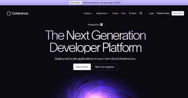
Coherence is a platform for developers to build, test, and deploy their code through their own cloud infrastructure. To help build trust in the platform, they have a carousel of customer logos and a couple of customer reviews that you can expand for more detail. They have a nice wireframe design illustrating how the platform connects all your GitHub repositories, environments, and other resources. They speak directly to customer pain points, addressing topics like data security, compliance management, scalability, and value for money.
Pitch
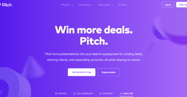
Pitch is a collaborative presentation tool that enables teams to develop standout presentations that will easily win over new clients. An animated image at the top of the page shows how the platform looks and works. Other animations unfold as you scroll down the page, making the homepage design very engaging. There is a collection of clickable templates that show a variety of options for users. Then, in a series of steps, they show you how to get started with Pitch. Another neat feature on the homepage is the interactive review section. Users can select their line of work – business owner, designer, sales, or marketing – and a relevant review will appear.
Beehiiv
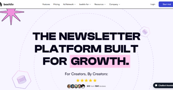
Beehiiv is a no-code newsletter platform with the catchphrase “newsletters made simple” because it’s so easy to use. The design and layout are the first things you’ll notice about the homepage. It’s neat and free from clutter, allowing the user to get straight to the point – how does the product work? They clearly outline how you can create newsletters, publish them, grow your contact list, and monetize your newsletter. They have many satisfied customers, which is made clear with the social proof carousel of client logos. Their homepage also includes a chatbot assistant, which is a valuable customer support tool.
Attentive
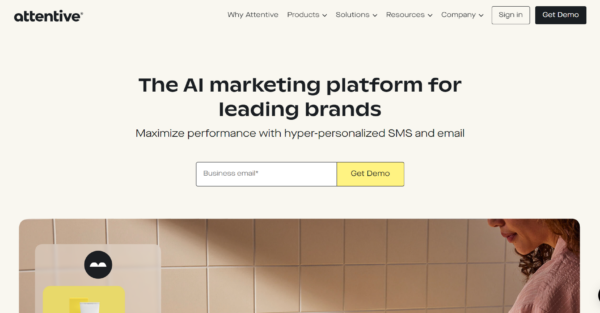
Attentive is an SMS and email marketing tool that incorporates AI technology to produce hyper-personalized messaging. They have opted to keep the homepage design simple, with lots of white space between elements. The product and its use and benefits are clearly outlined. They cover how the technology helps acquire new customers, generate right-fit leads, personalize communication, and integrate with other platforms. Detailed customer examples reaffirm how the product can be used in a real situation with a range of different business types. Finally, there is a CTA to try a demo.
Lattice
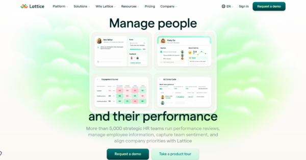
Lattice is an HR management software used by over 5,000 strategic HR teams globally. The homepage starts by outlining what users can do with the product – for example, manage employee information, run performance reviews, and capture team feedback. Then, there’s social proof highlighting that the platform is used by major brands like Webflow, Loom, and Discord. As you scroll down the page, you’ll see a clear value proposition. Lattice helps managers to not only coordinate their team but also facilitate higher performance. They touch on pain points by telling visitors they can do less paperwork and more people work, which results in a better employee experience overall.
Databox
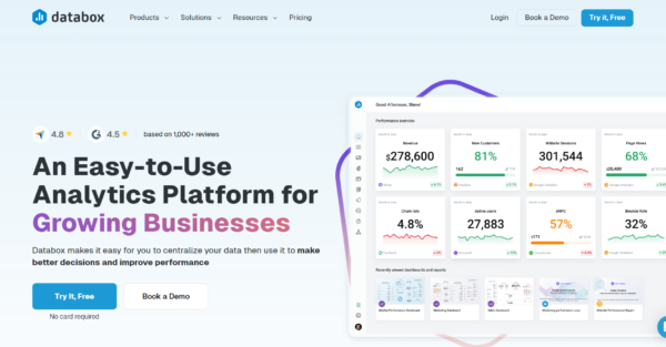
Databox is a business analytics platform that incorporates real-time graphs and interactive dashboards. A nice feature of their homepage is the before and after comparison tables that show how using Databox can resolve a customer’s problems. As we know, a picture tells a thousand words, and all the visualizations are cleverly designed to minimize text and maximize the information a reader absorbs. They have clearly addressed the value proposition and why Databox is a beneficial tool. We also like the section that covers how other companies use Databox, which can be explored based on company type, solution, or team. All of this is concluded with a selection of in-depth case studies.
Matomo
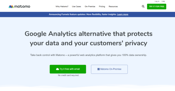
Matomo is a high-security alternative to Google Analytics, which is their primary selling point. They offer a way to analyze and boost website performance while maintaining 100% data security. The homepage begins by explaining how users can get started in three easy steps and showing how the dashboard looks. They prominently display rating badges from popular review sites like Capterra, Software Advice, and GetApp. The homepage is concise but effectively communicates that Matomo can solve user problems and offers the necessary functionality and customer support. It concludes with a carousel of customer testimonials and a CTA to try it for free.
Kajabi
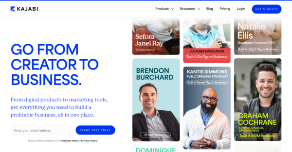
Kajabi is an online sales platform for courses and coaches. They have a beautifully designed homepage that immediately sends the visitor’s focus to its customers and their success using the platform. They go into detail about the platform and how it can be used to build a revenue stream from online courses, podcasts, coaching, or to create a community. They include information about customer support, templates, and the platform functionality. There is a lot on the homepage, but they’ve kept the text to a minimum and let the images do the talking. Finally, they end the page with more social proof – a collection of customer testimonials.
In Summary
Having a stellar homepage is part of the puzzle to growing your SaaS business. To know where to start with growing your B2B SaaS, calculate your SaaS scalability score here.
Related Articles
Dive deeper into specific topics covered in this guide:
- SaaS Website Redesign: How We Used the Authority Architecture Framework to Rebuild This POS Software Company’s Website
- 7 Steps to a Successful Website Redesign
What you should do now
Whenever you’re ready…here are 4 ways we can help you grow your B2B software or technology business:
- Claim your Free Marketing Plan. If you’d like to work with us to turn your website into your best demo and trial acquisition platform, claim your FREE Marketing Plan. One of our growth experts will understand your current demand generation situation, and then suggest practical digital marketing strategies to hit your pipeline targets with certainty and predictability.
- If you’d like to learn the exact demand strategies we use for free, go to our blog or visit our resources section, where you can download guides, calculators, and templates we use for our most successful clients.
- If you’d like to work with other experts on our team or learn why we have off the charts team member satisfaction score, then see our Careers page.
- If you know another marketer who’d enjoy reading this page, share it with them via email, Linkedin, Twitter, or Facebook.